Data Visualization
Data Visualization is a critical part of Data Science. Exploratory’s simple UI experience is designed for Exploratory Data Analysis from the ground up.
Its rich and wide range of features helps you understand the characteristics of data, discover the hidden trends and patterns, and evaluate the differences in the context of uncertainty.
Its rich and wide range of features helps you understand the characteristics of data, discover the hidden trends and patterns, and evaluate the differences in the context of uncertainty.
Pivot Table
Create Pivot Tables with various aggregate functions, color formatting, and custom calculations.

Super Table
Present your data in a table format with super flexible and rich formatting options.

Understand Variance
Understand the variance of your data by visualizing the distribution with various types of charts.

Histogram

Density Plot

Boxplot

Violin Plot
Error Bar
Visualize uncertainty with Confidence Interval or other options.

Word Cloud
Find which words are more frequently used.

Heatmap
Find patterns from the combinations of categories.

Scatter Matrix
Find how two numerical variables are correlated to one another for all the combinations.

Map
Create a map quickly to visualize your data as circles or areas with pre-optimized maps.

Map Extension
Bring your own GeoJSON files or select one of the Map extensions to visualize your data on various map types.

Features Designed for EDA
There are many features inside the charts that are designed to make Exploratory Data Analysis easier. They make it possible to discover hidden patterns quickly by looking at the data from various points of view.
Categorize Numbers
Numbers can be automatically transformed into categories.

Window Calculation - % of Total
A bar chart can be transformed into a ratio bar with the window calculation feature.

Window Calculation - Cumulative
Accumulative aggregations can be done quickly inside the charts.

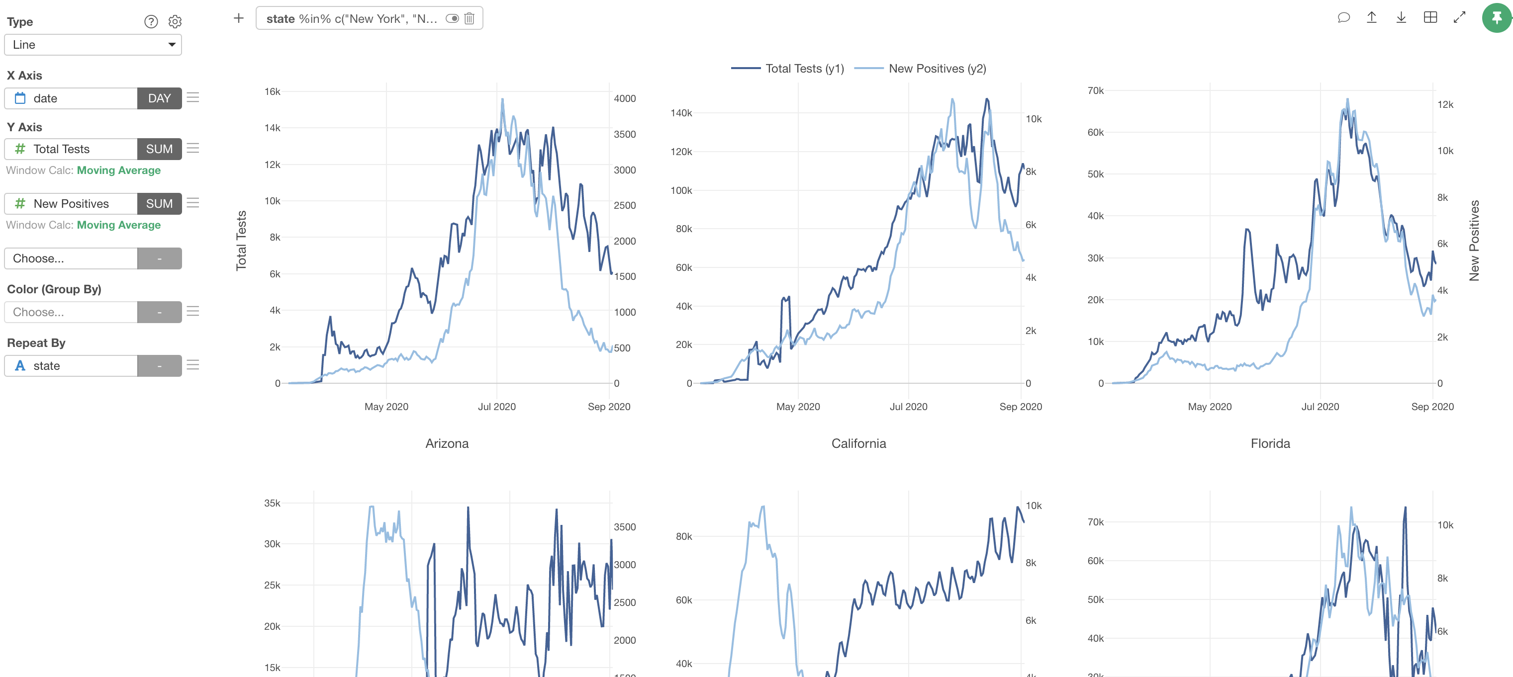
Window Calculation - Moving Average
Calculate the moving average or other aggregations directly inside the chart.

Visualize Outliers
Detect the outliers by visualizing them with various options inside charts.

Limit Values
Sometimes, there are too many categories to show. In such cases, you can limit them based on a condition. For example, you can show only the top 30 countries or countries with sales greater than $1,000.

Various Numeric Functions
Transform numbers directly inside the chart with functions like Log, Standardize, Square.

Visualize Paths on Map
Visualize the path by connecting the dots.

Comment
Add rich formatted comments whenever you find new insights while exploring the data.

Highlight
Highlight a few data points to reveal the hidden trends or compare them against the rest.


Trend Line
Show a trend line that simplifies the trends and the patterns inside the data.

Reference Line
Show reference lines to add context to your charts. patterns inside the data.

