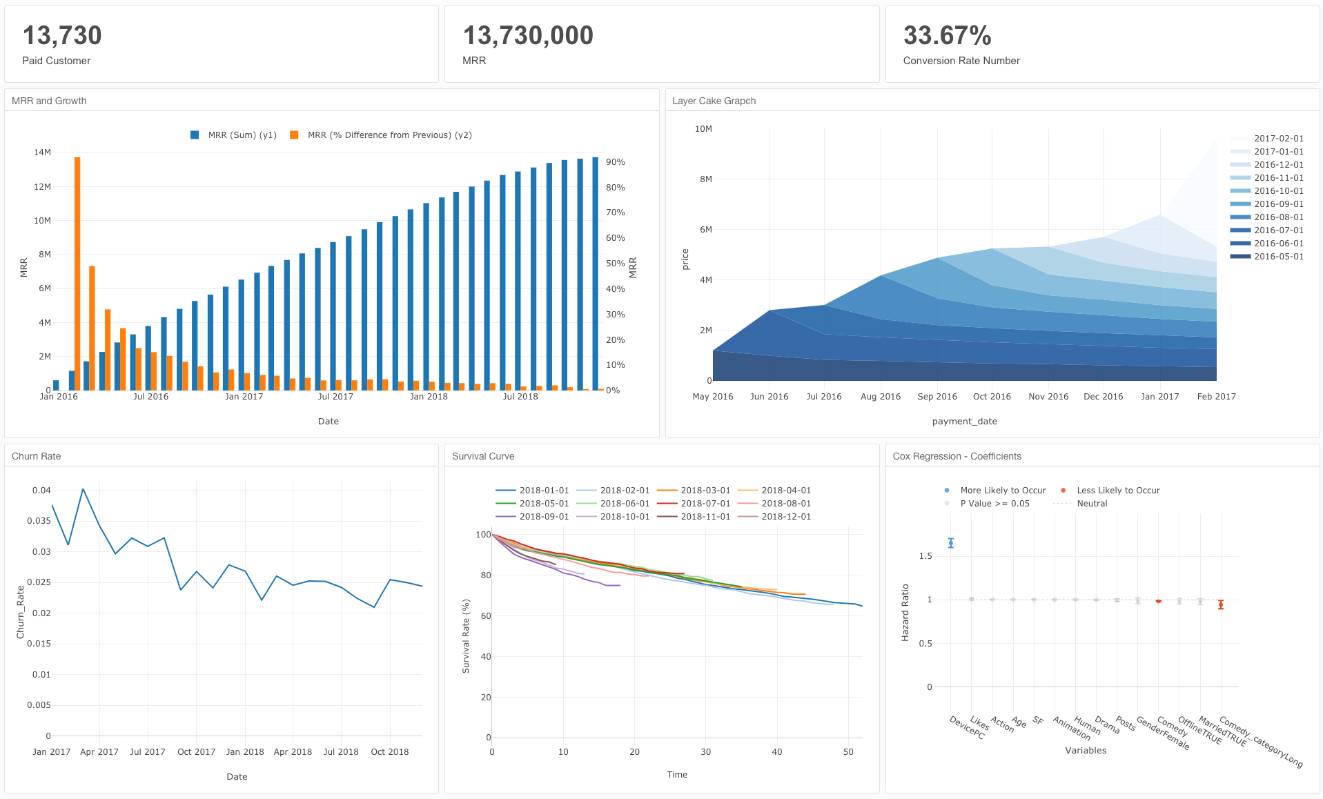
How to make a layer cake chart commonly used in SaaS cohort analysis
Introduction
Unlike the one-time-fee business, SaaS (Software as a service) and Subscription business generates revenue every recurring year or month. Therefore, people monitor metrics like MRR(Monthly Recurring Recurring Revenue) and ARR(Anuual Recurring Revenue).
And needless to say, it is important to monitor how acquired customers continue your product or service on a monthly or yearly basis.
To monitor this data, we can use a chart called “Layer cake chart”. Today, I will introduce how you can make it.
Data
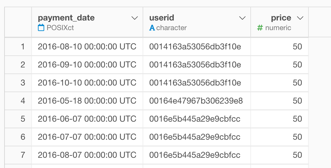
Let’s say you have a transactional data for payment like below.
You can download the data from here.
Definition
- payment_date - Date when the customer paid.
- userid - A unique id for each customer.
- price - The amount customer paid. In this case, it is fixed at $50 per month.
Once you imported the data, you can find below things from the summary view.
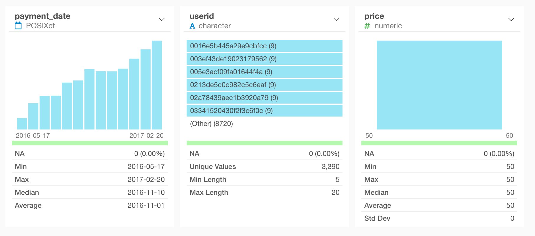
- The payment date starts from 05/17/2016 and ends on 02/20/2017.
- There are 3390 customer in total including customers who churned.
Visualize MRR
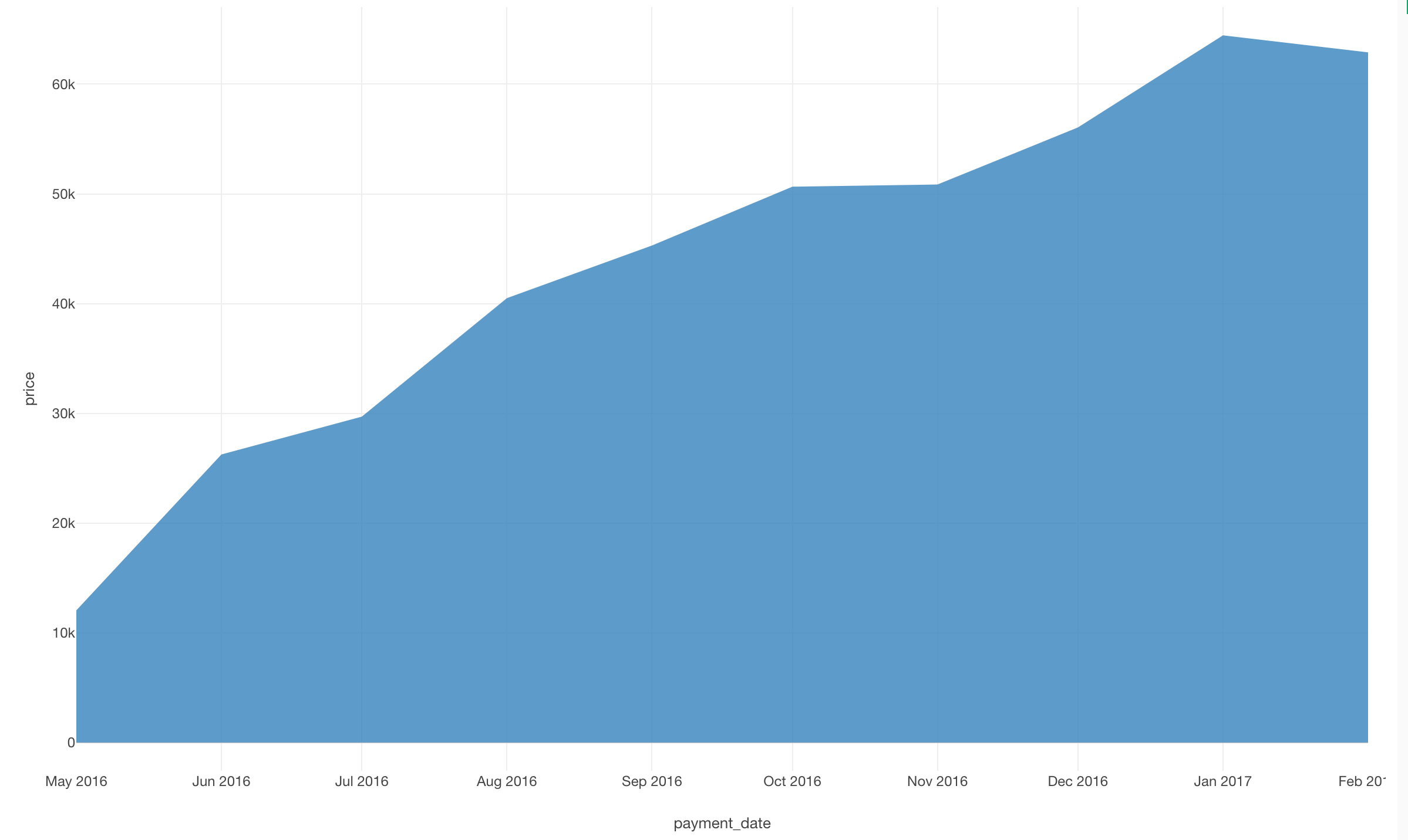
The layer cake chart is made of an area chart, so let’s start visualizing MRR with it.
Move to the chart view and select “Area” for chart type and assign “payment_date” to X axis and “price” to Y axis.
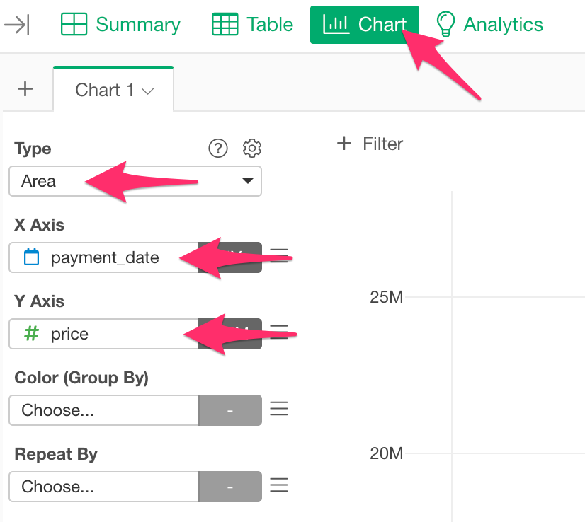
And after that, choose “Floor to Month” for X Axis’s scale.
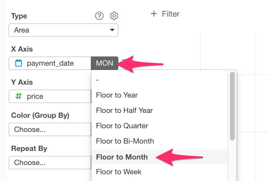
Now you succeeded to visualize MRR.
Mutate subscribed date for each customer
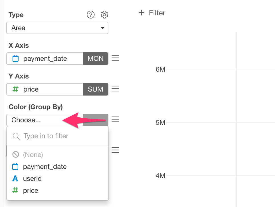
Since the layer cake chart is a color-coded version of the MRR area chart based on each subscription start timing, you want to assign it to the “Color (Group By)” to get the expected shape.
However, unfortunately, the original data does not have a column for each customer’s subscription start timing, so let’s process the data and add a column for it.
Let’s get back to the table view. Like the table above, you want to make groups based on each “userid”, so select “Group by” from the column header menu of “userid”.
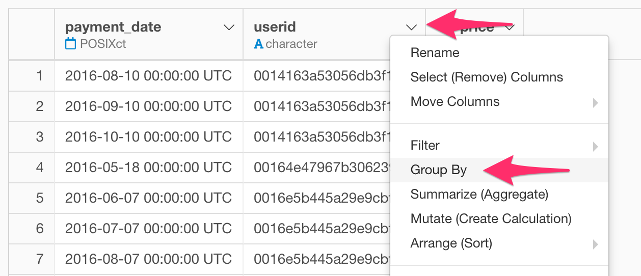
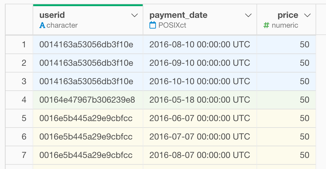
Now, shown in the previous figure, you can see that the data has been grouped.
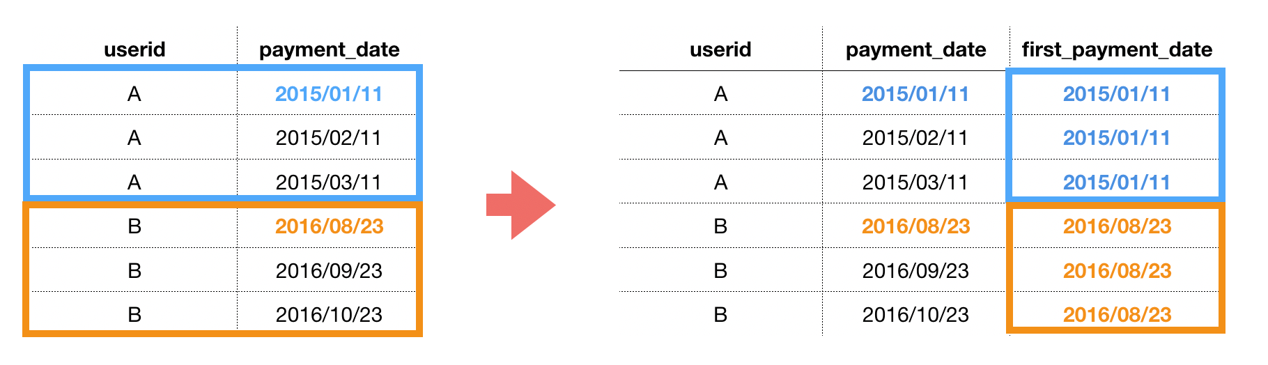
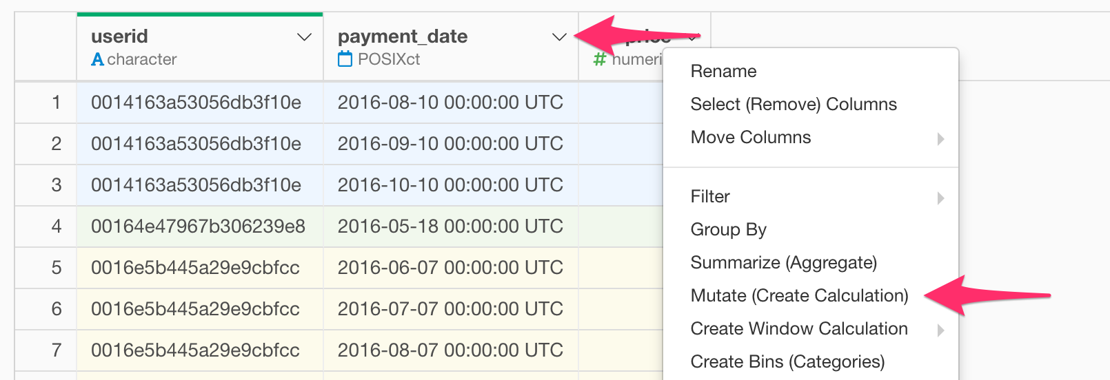
Next, let’s add a column for a subscribed date. Click Mutate (Create Calculation) from the column header menu of “payment_date”.
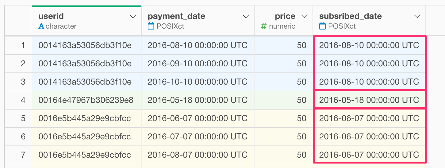
Then a dialog to create the calculation is displayed. As the subscribed date could be said as the minimum value of “payment_date”, you can use a function called min function that calculates the minimum value. Let’s type calculation as follows.
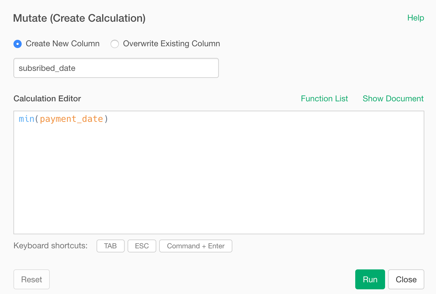
Finally, the minimum value of “payment_date” for each customer, that is the column of subscription start date is added as “subscribed_date”
Make a layer cake chart
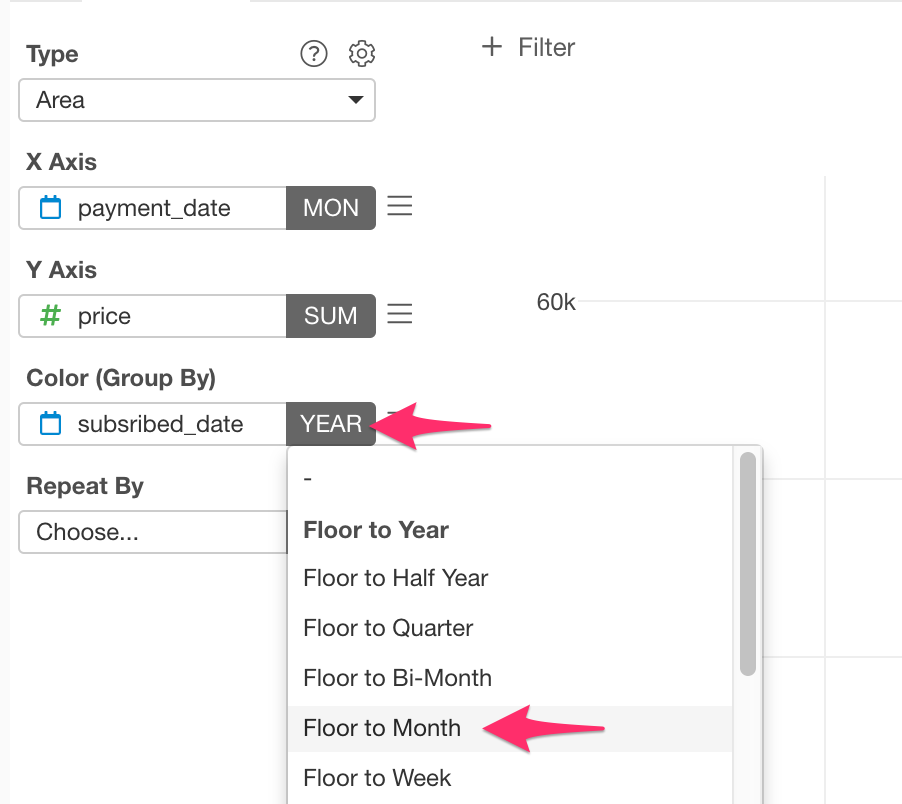
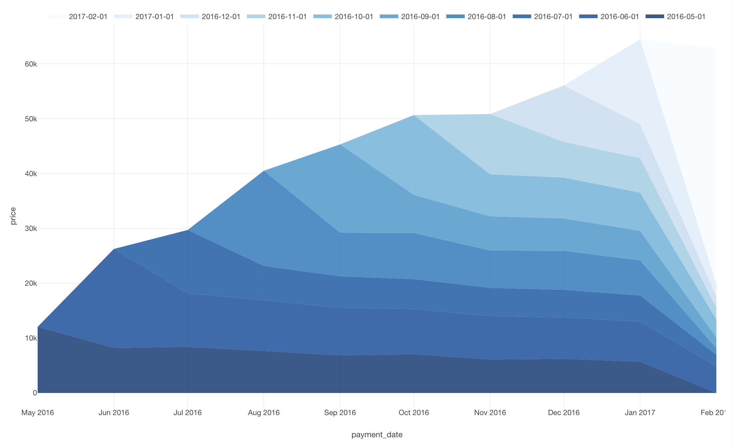
Let’s go back to the chart view and assign “subscribed_date” to the Color (Group By).
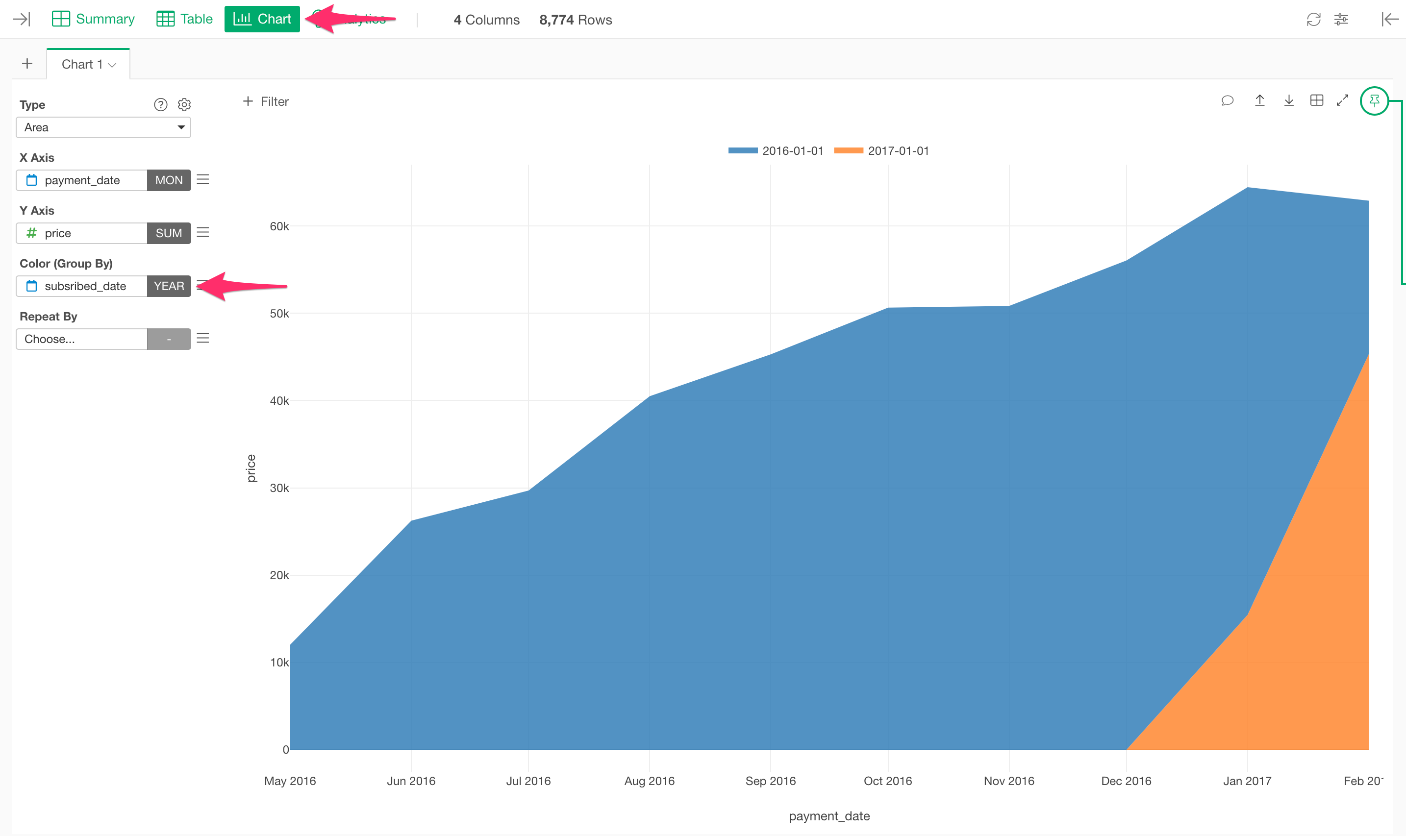
Like the X axis, the scale is set as “Floor to Year” so let’s change it to “Floor to Month”.
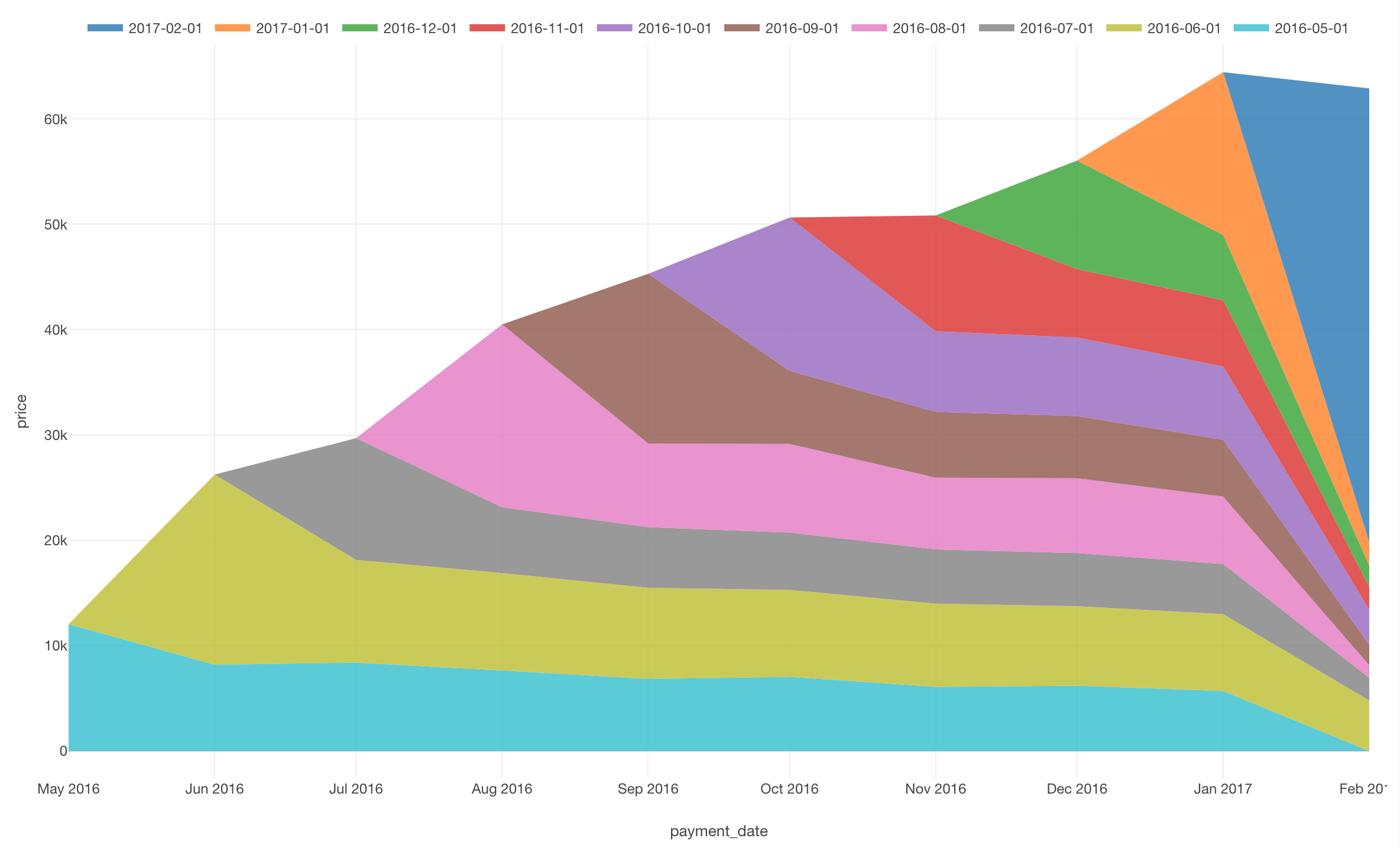
Maybe the chart showing up is a bit different from your expectations.
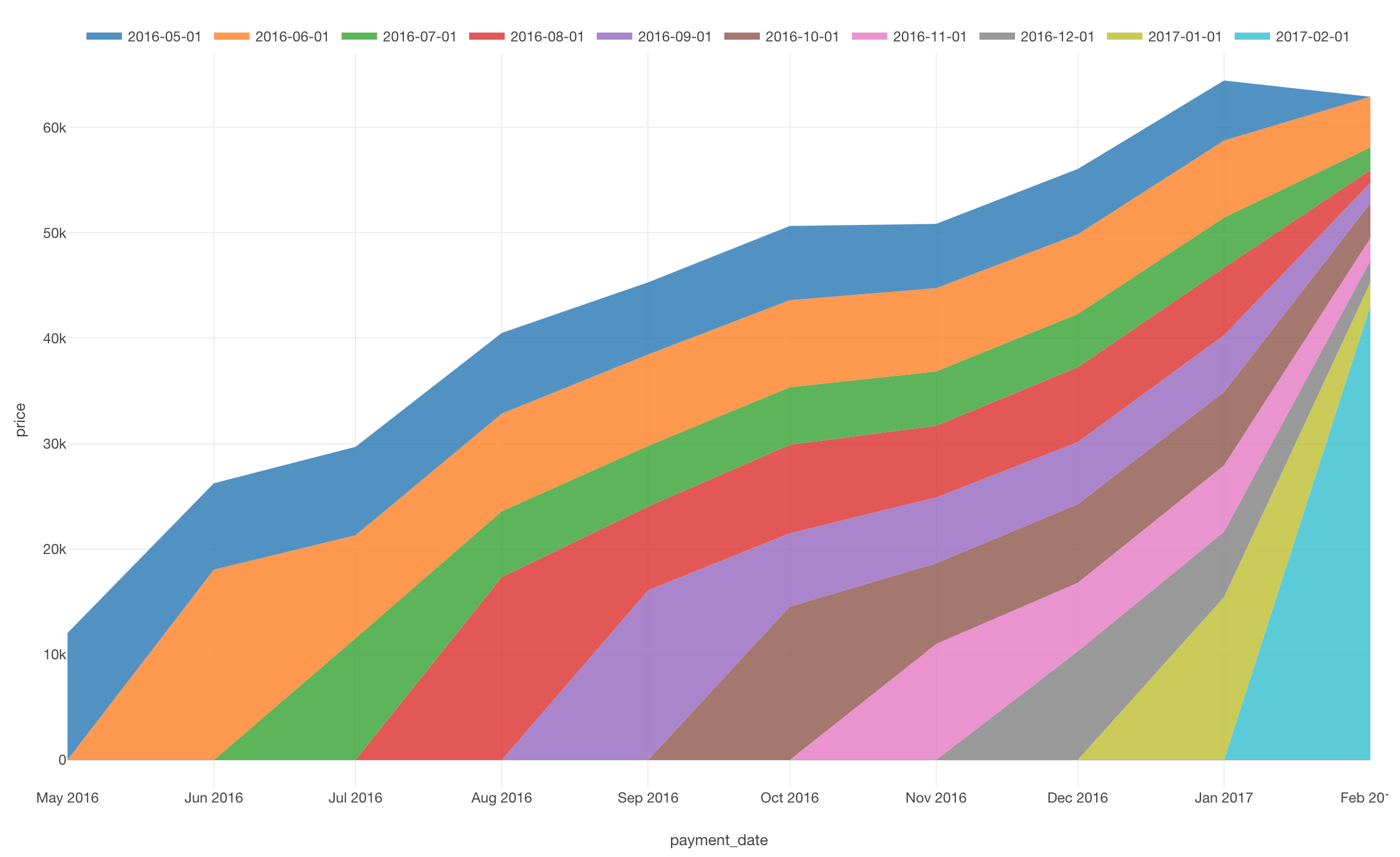
In the chart above, the new incoming customer’s cohort is on the bottom layer with the old customer’s cohort layered on top.
Reversing this order, which means putting incoming cohort on the top layer, it would be more intuitive.
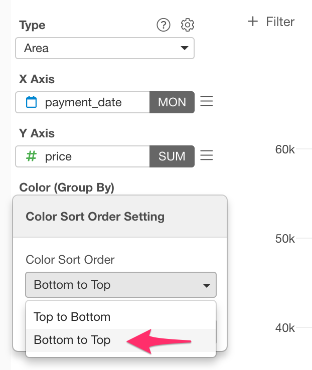
Seeing is believing, let’s reverse the order of the chart colors. Select “Color Sort Order” from the color setting menu.
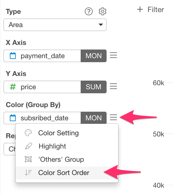
Then select “Bottom to Top” from the setting screen.
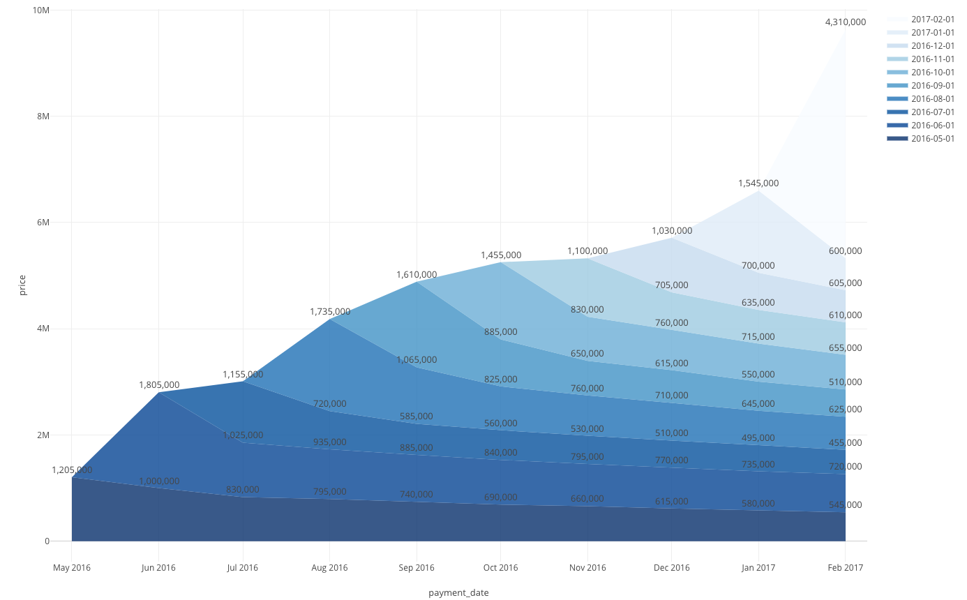
Now you got an intuitive layer cake chart!
Adjust appearance
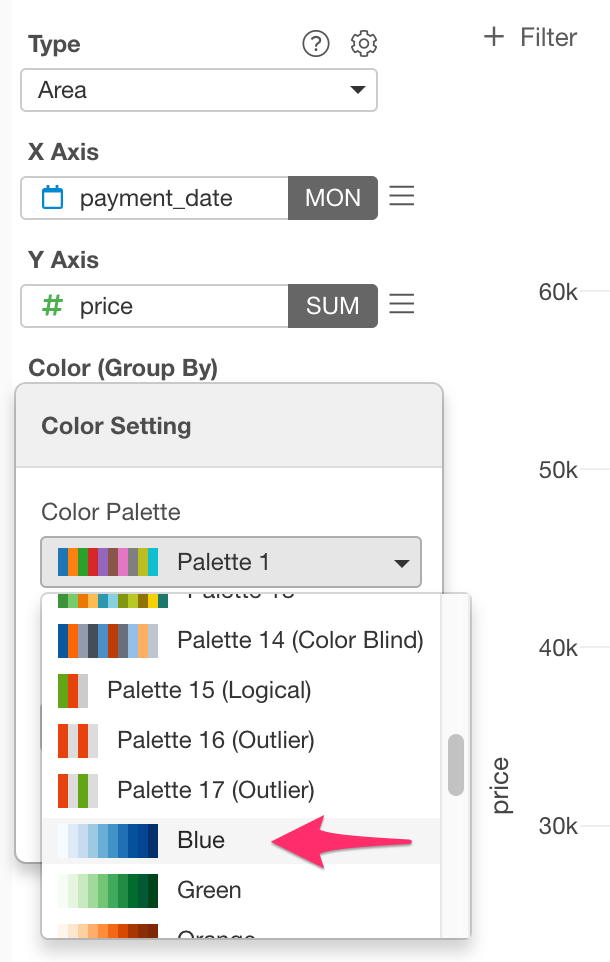
Change color palette
Let’s change the color palette and make it more intuitive. Click the Color (Group By) menu and select “Color Setting”.
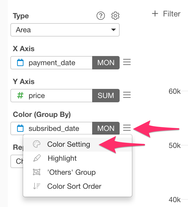
For this time, let’s use the blue palette.
Now the color palette has changed.
Display numerical values above the chart
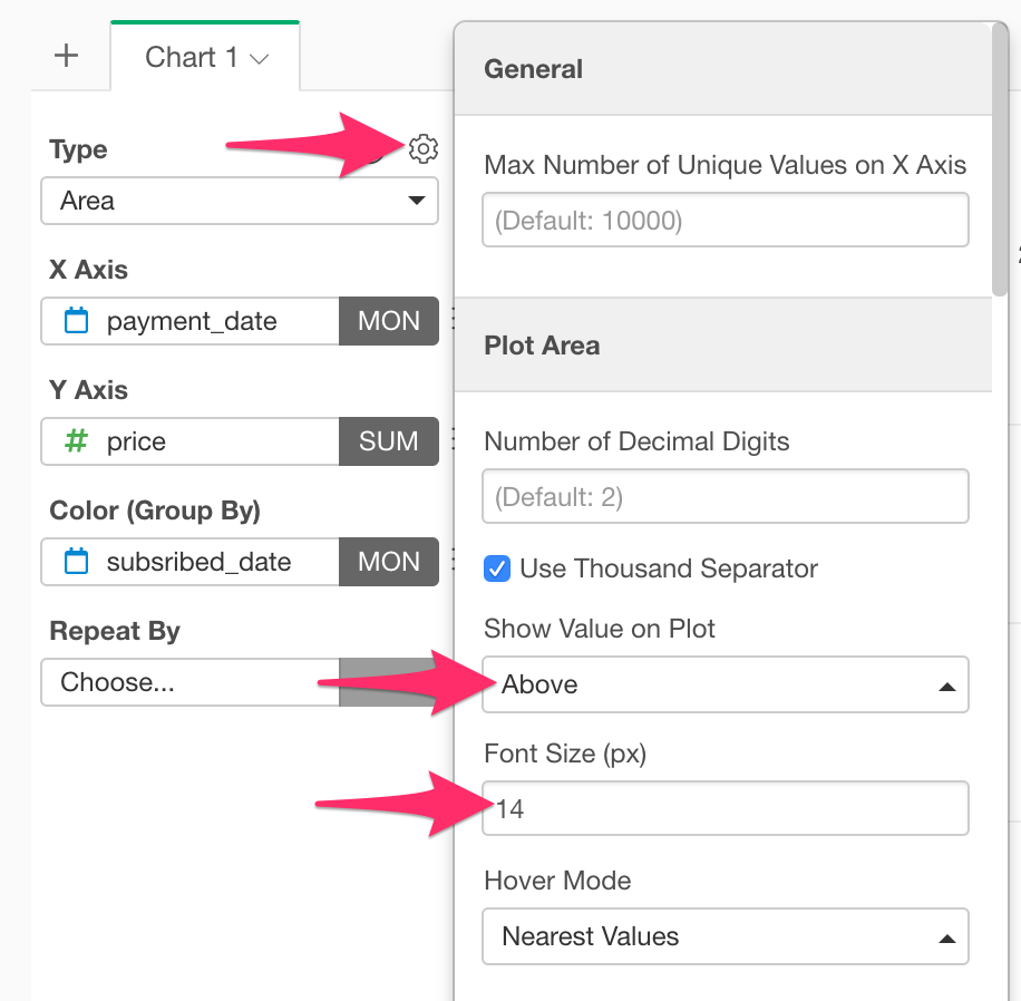
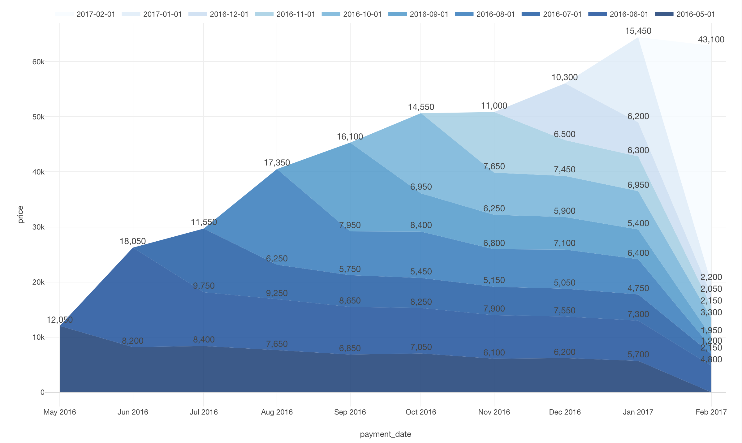
Next, let’s display the values in the chart. Click the gear icon and move to Show Value on Plot and select “Above”. After that, let’s change the font size to “14”.
Now you made it. With a layer cake chart, you can find that many customers have churned and acquired new customers a lot in February 2017.
It would be nice to summarize such a chart for fixed-point observation on a dashboard and update it using the schedule feature. This will save your time creating charts every time.
Layer Cake’s Trap
In this case, it was easy to find the trend change because it was so drastic in February 2017. But when you’re in business, the changes aren’t as drastic as this one. The layer cake chart can capture major changes, but it is still difficult to compare the service continuity of each cohort (A group divided by subscription start timing). In such cases, cohort analysis using survival curves is effective.
We will leave that topic to another post so please stay tuned!