 Photo by Patrick Tomasso on Unsplash
Analyzing Our Text
By Marian Tes
Understanding the Data
In this dataset, Perusall captured students’ names and IDs (removed from the table below), submissions (what they wrote), type (comment/question), automated scores, when the submission was create/edited, number of replies, upvoters, status (on-time/invalid), page number where comment was made, and finally, the name of the paper by author’s last name.
Examining the Data Distribution
Scores
Replies
Upvoters
Page Numbers
Reflection
From reviewing the histograms of the numerical variables in the dataset, there doesn’t seem to be any missing data. This makes sense, since the tool, Perusall, is capturing what input students provide. It doesn’t know what it doesn’t know - in other words, what’s missing here. If a student hasn’t submitted for a particular week, we would have to do some data analysis to verify this. Though, reviewing the Summary section in Exploratory, there are missing values for the variable ‘student ID’ (n=237). I’m unsure how this data is entered or captured in Perusall.
There are more comments (n=654) than questions (n=176).
Loading...The majority of comments are made on pages 1-7. The first 4 pages have about 278 comments, and the next few have about 276 comments.
According to the data, we have collectively read 11 papers. In the Summary of this column, you’ll find 830 rows but 11 unique values.
Tokenizing the Text
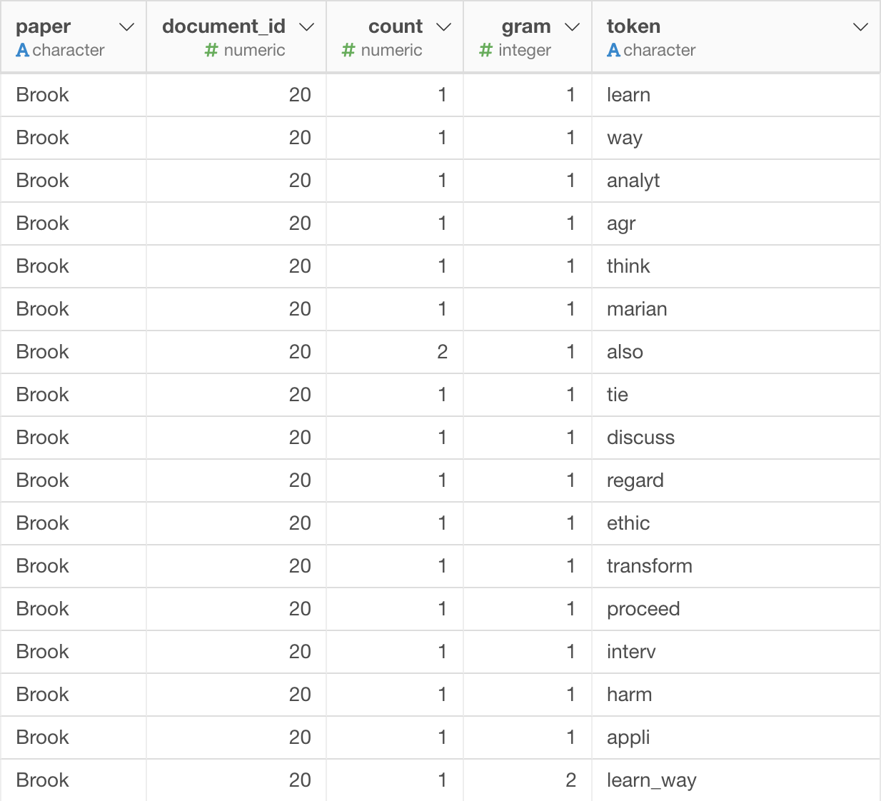
- First, I divided the submissions into individual words by tokenizing the text. These new columns (document_id, tokenized text, and count) appear:
The data structure is wide, which means that each row represents a data point, and columns contain the attributes of those. In this dataset, each row represents an individual instance of a comment or question made by whom, and the columns are values related to this such as: the actual submissions (what they wrote), type (comment/question), automated scores, when the submission was create/edited, number of replies, upvoters, status (on-time/invalid), page number where comment was made, and finally, the name of the paper by author’s last name.
From what I gather, you wouldn’t be able to rebuild the original text from the new columns. It’s great that the original column, ‘submission’, was retained when we tokenized the text.
The most frequent words are shown below:
Cleaning the Bag of Words
After cleaning the bag of words by eliminating frequent but uninformative words (“the”, “a”, “in”, etc.) and number words (“0.712”, “68”, etc), the most frequent words are now:
This makes perfect sense that ‘data’, ‘student’, ‘learn’, and ‘think’ are the most frequent since this is a course on Learning Analytics.
I don’t think we lost important information in this cleaning. We removed articles and words that were numbers. Our readings didn’t involve any data analysis so the latter doesn’t matter so much. You might lose some meaning by removing words like (“the”, “a”, “in”, etc.) but nothing significant.
Creating Bi-Grams and Tri-Grams
In order to get information on what pairs or triads of words go together, we generated a new column to contain words, pairs, and triads.
First, the ‘Tokenized Text’ column disappears, while two columns appear: ‘gram’ and ‘token’:
The most common bi-grams are: data_student (n=42), learn_research (n=28), make_data (n=28), student_differ (n=26), and learn_analyt (n=23) as shown in the table:
The the most common tri-grams are: predict_use_model (n=9), howev_data_student (n=9), and predict_explanatori_model (n=8) as shown in the table:
Bigrams (n=12,474) and trigrams (n=11,652) are common compared to simple words (n=13,302):
The most common bigrams and trigrams with the word, ‘student’, are: data_student (n=42), student_differ (n=26), student_group (n=17), make_student (n=13), student_certain (n=11), and averag_student (n=11).
Sentiment Analysis
Class Distribution of Sentiment
Average Sentiment Per Student and Paper
Average Sentiment Per Student (Table, Sorted High to Low)
Average Sentiment Per Student by Type (BoxPlot, Sorted High to Low)
Sentiment scores range between -1 and 1, with -1 as the most negative, 0 as neutral, and 1 as the most positive. According to the analysis, the most negative author is Roxy Ho at an average of 0.07. While, the most positive author is Ailin Zhou at an average text_sentiment of 0.26. The class average was positive but not high in magnitide at 0.15. I think the sentiment analysis isn’t the best tool to use for accuracy as these are fairly complex responses. This doesn’t capture the nuances or whole picture, which can include but not limited to tone and the subject of the article that we’re commenting on, the various modes of the responses (in Persuall, in person, or synchronously online as we moved to remote learning for the second half of the semester), for example. How do the reactions like emojis and upvotes in the Persuall comments account for authors’ and commentors’ sentiment? This analysis is intriguing but doesn’t provide a complete picture of class dynamics and individual interactions with the content.