How to Create Custom Color Palette
In Chart, you can create your own color palette and apply it to any charts you create. Here's how.
1. Assign a Column to Color
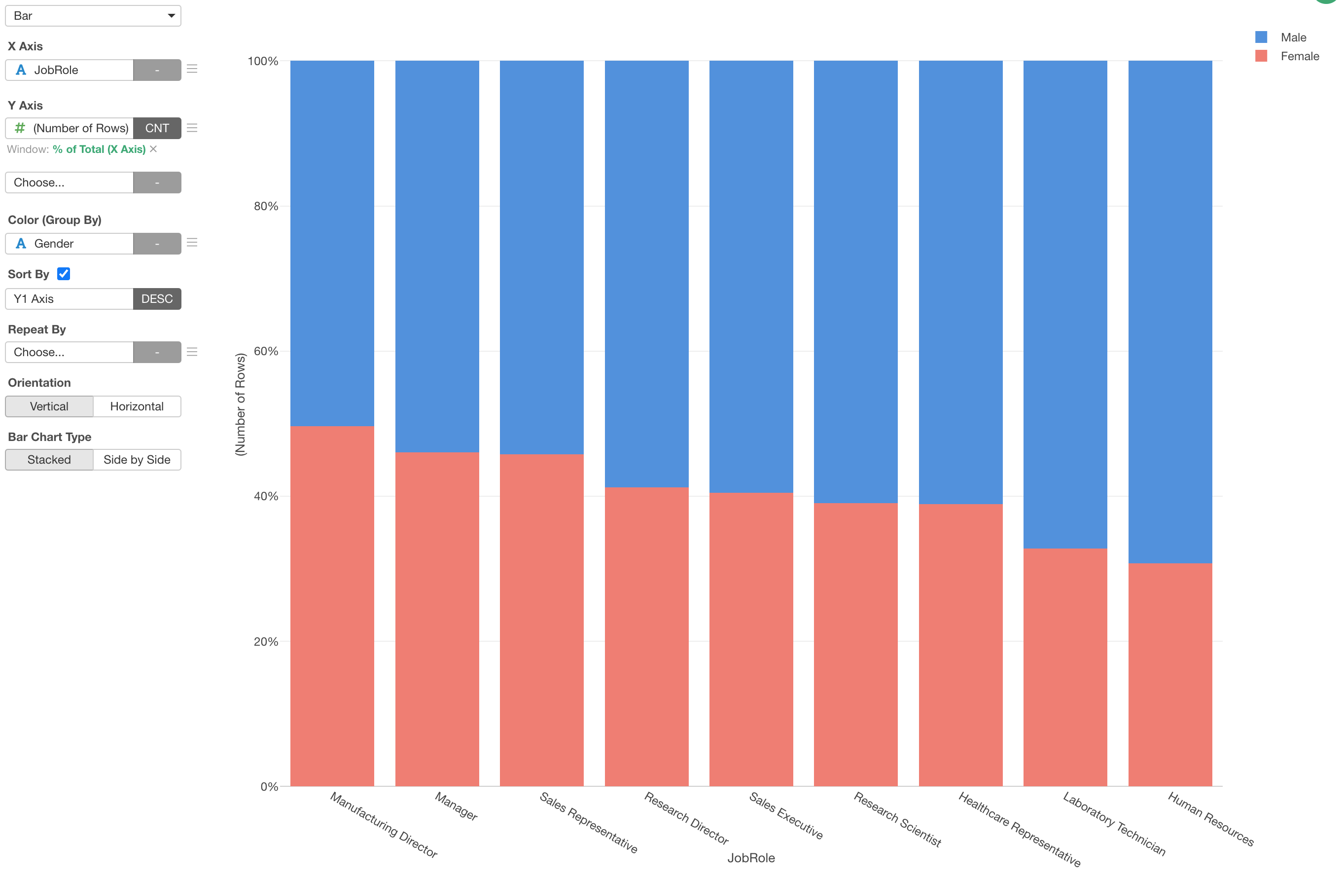
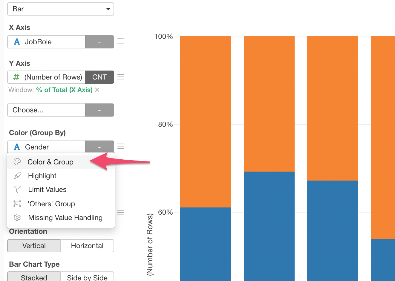
Here is a chart showing the ratio of Male and Female for each Job Role.
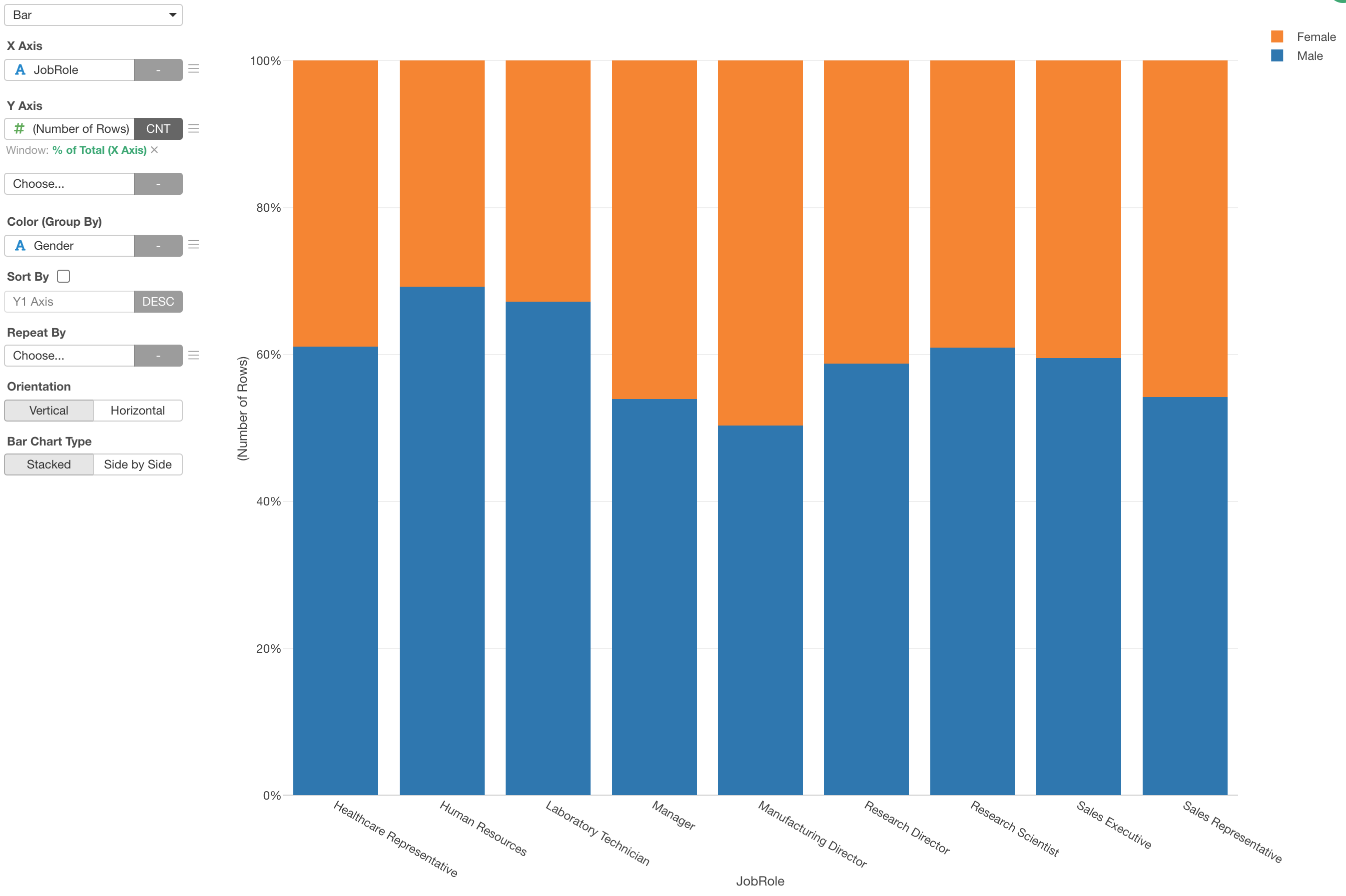
Now we want to change the color. We can change the color by opening the Color configuration dialog if this is the only chart we ever create. But if we know we'll create similar charts in future we can create a custom color palette so that we can simply apply it for any charts we will create.
2. Create Custom Color Palette
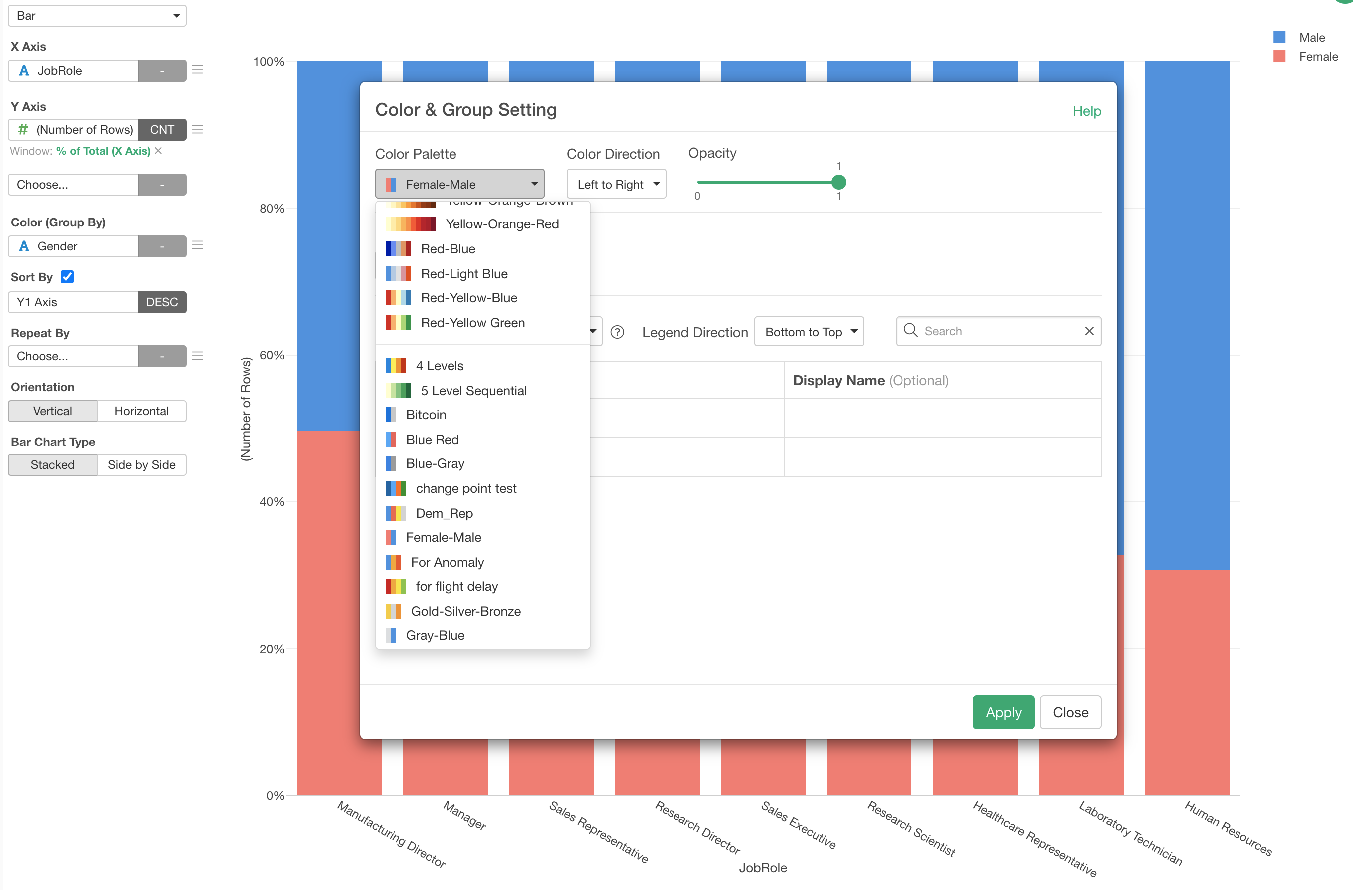
Select 'Color & Grouping' from the Color menu to open the Color configuration dialog.
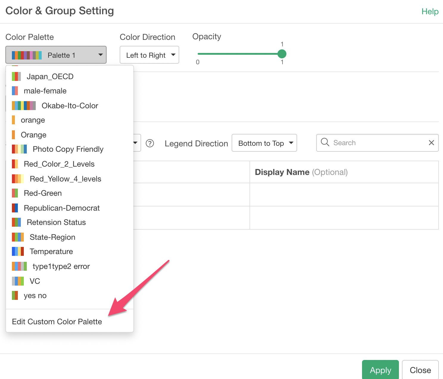
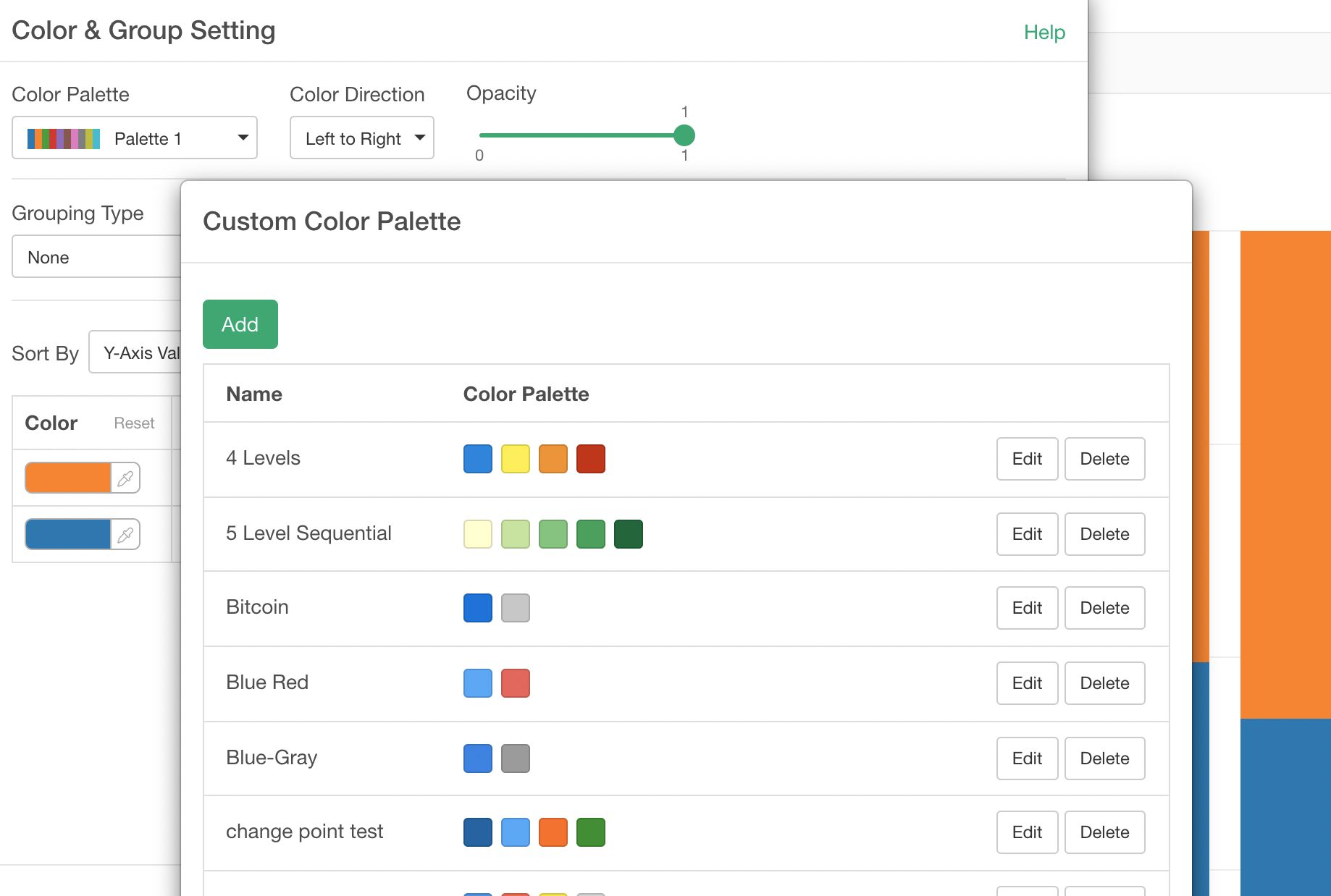
Click the 'Add' button to open Custom Color Palette dialog.
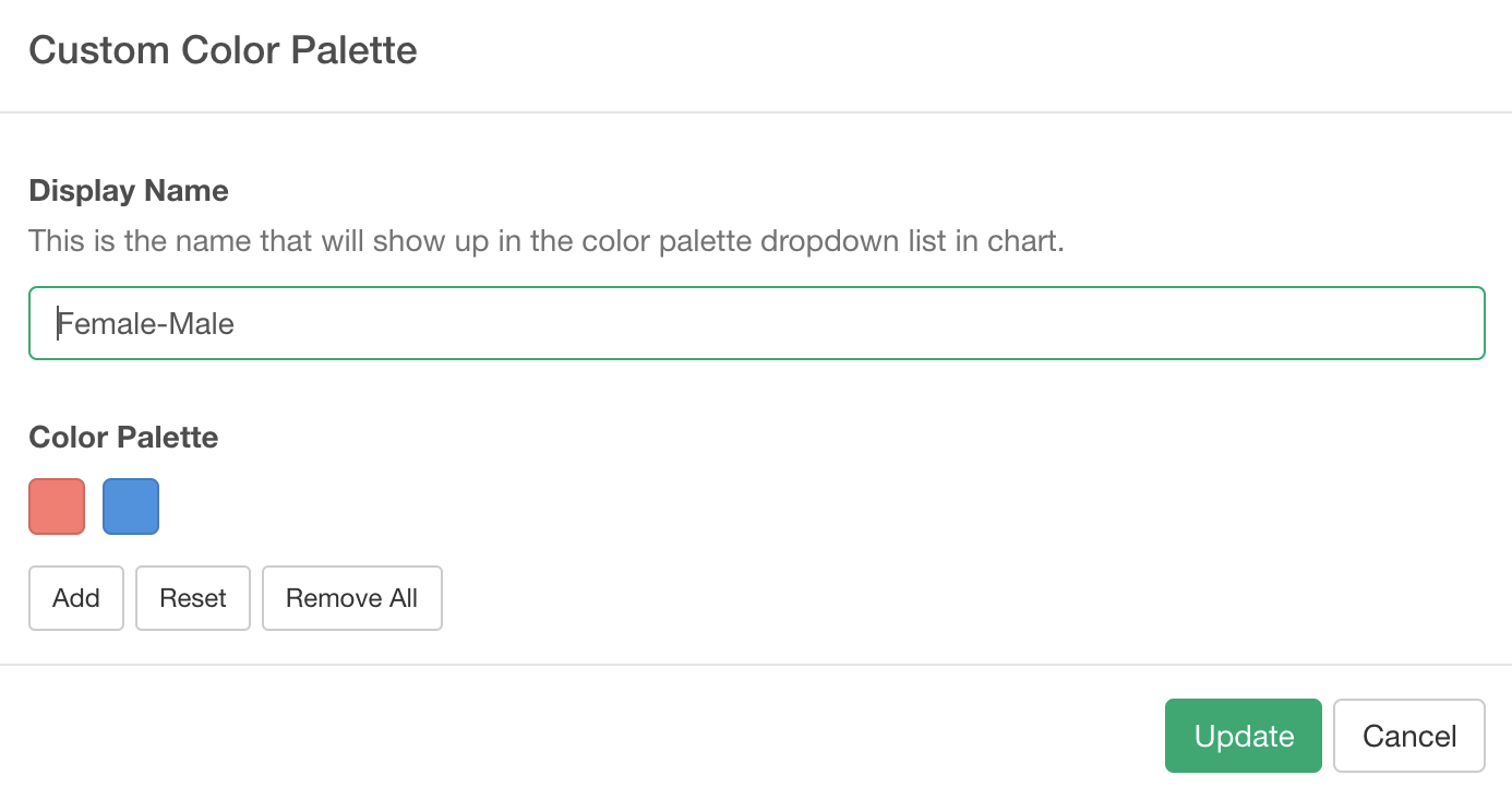
Setup your color palette by giving it a name and selecting colors.
Once it's done, you can select the color palette from the dropdown.
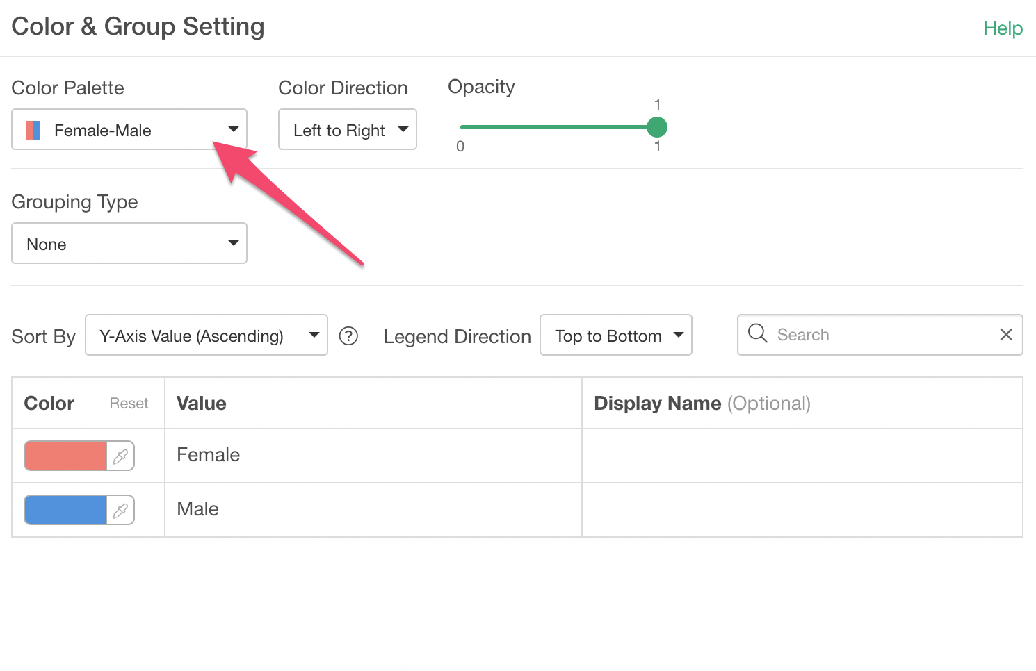
3. Change the Order
If the color is not assigned to the value you like you want to adjust the 'Sort By' setting.
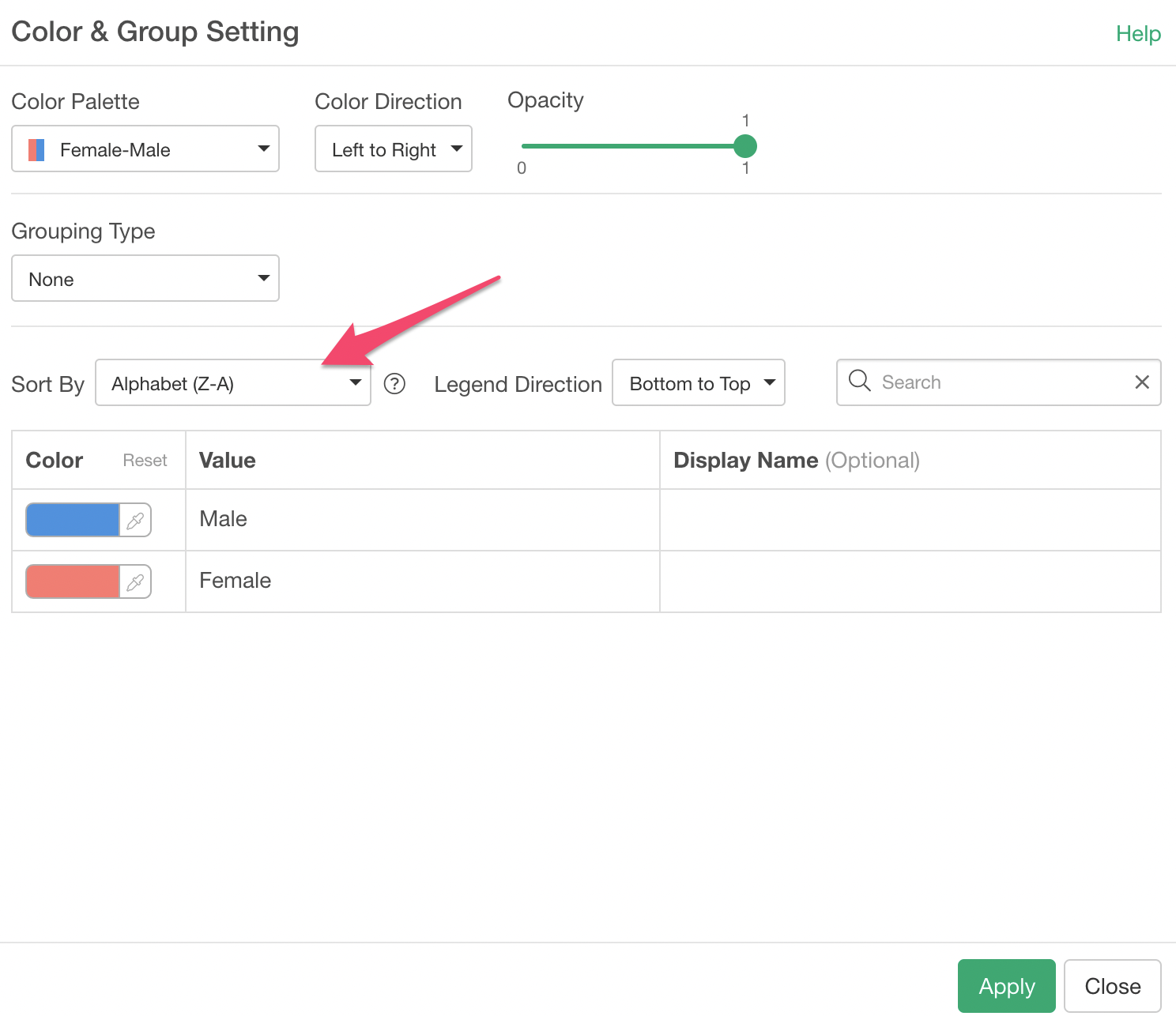
Once the setup is done you can click on the Apply button to see how the chart looks like.
