How to Create a Chord Diagram
A Chord Diagram is a chart that represents relationships and the magnitude of flows between multiple categories in a circular layout. The thickness of the arcs indicates the volume of movement or transition between those categories.
It is particularly effective when you want to intuitively understand flows between categories, such as human migration data or product distribution channels. Note that while it represents the strength of the relationship between two elements, it does not inherently convey directional information.
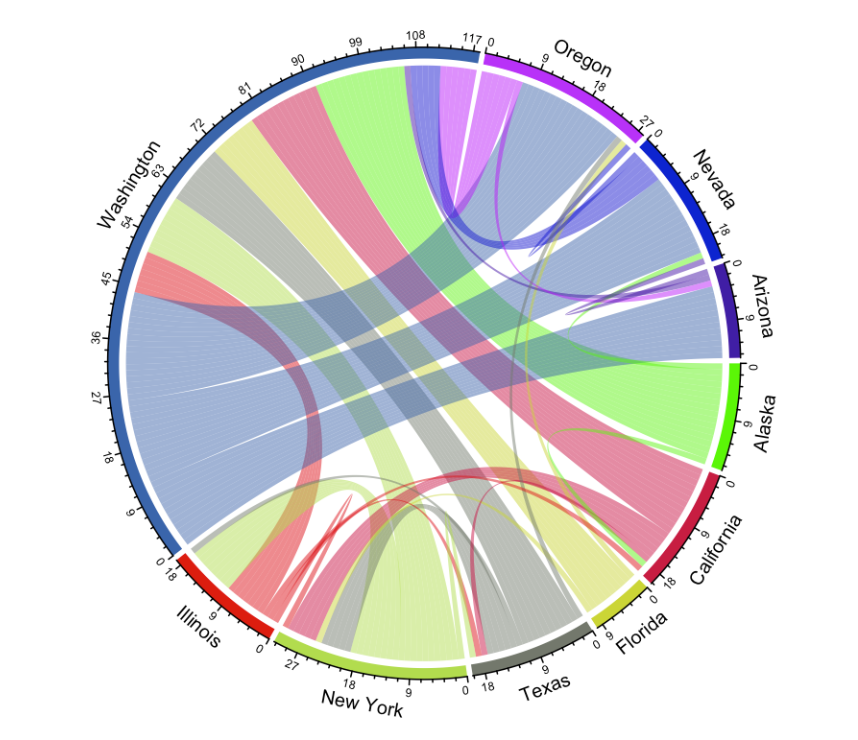
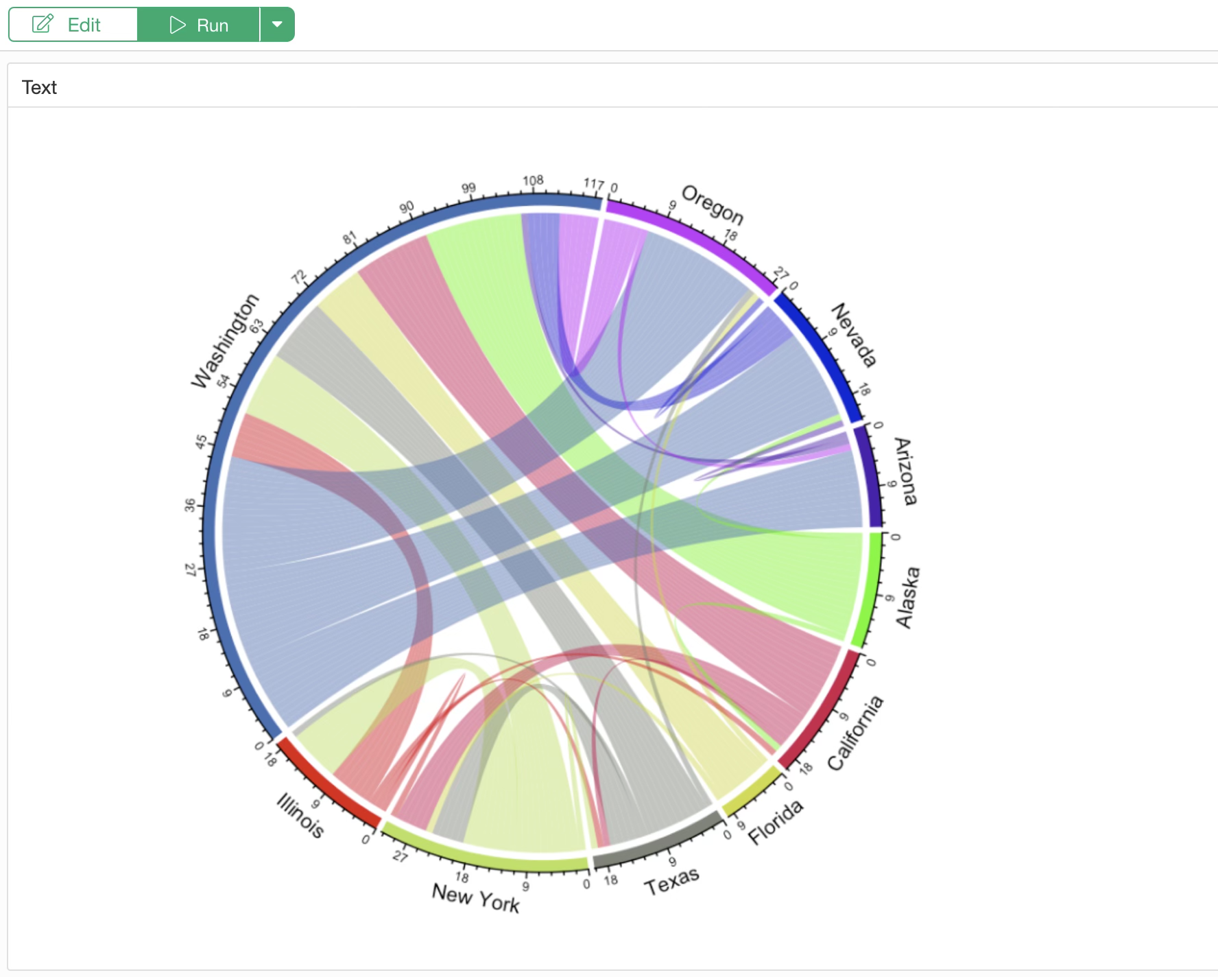
For example, the figure above is a Chord Diagram representing the movement of people between prefectures in Japan. Each prefecture is arranged as a sector, and the volume of movement between two prefectures connected by an arc can be read by the thickness of that arc.
The thicker the arc, the greater the volume of movement between those two prefectures.
Data Required for a Chord Diagram
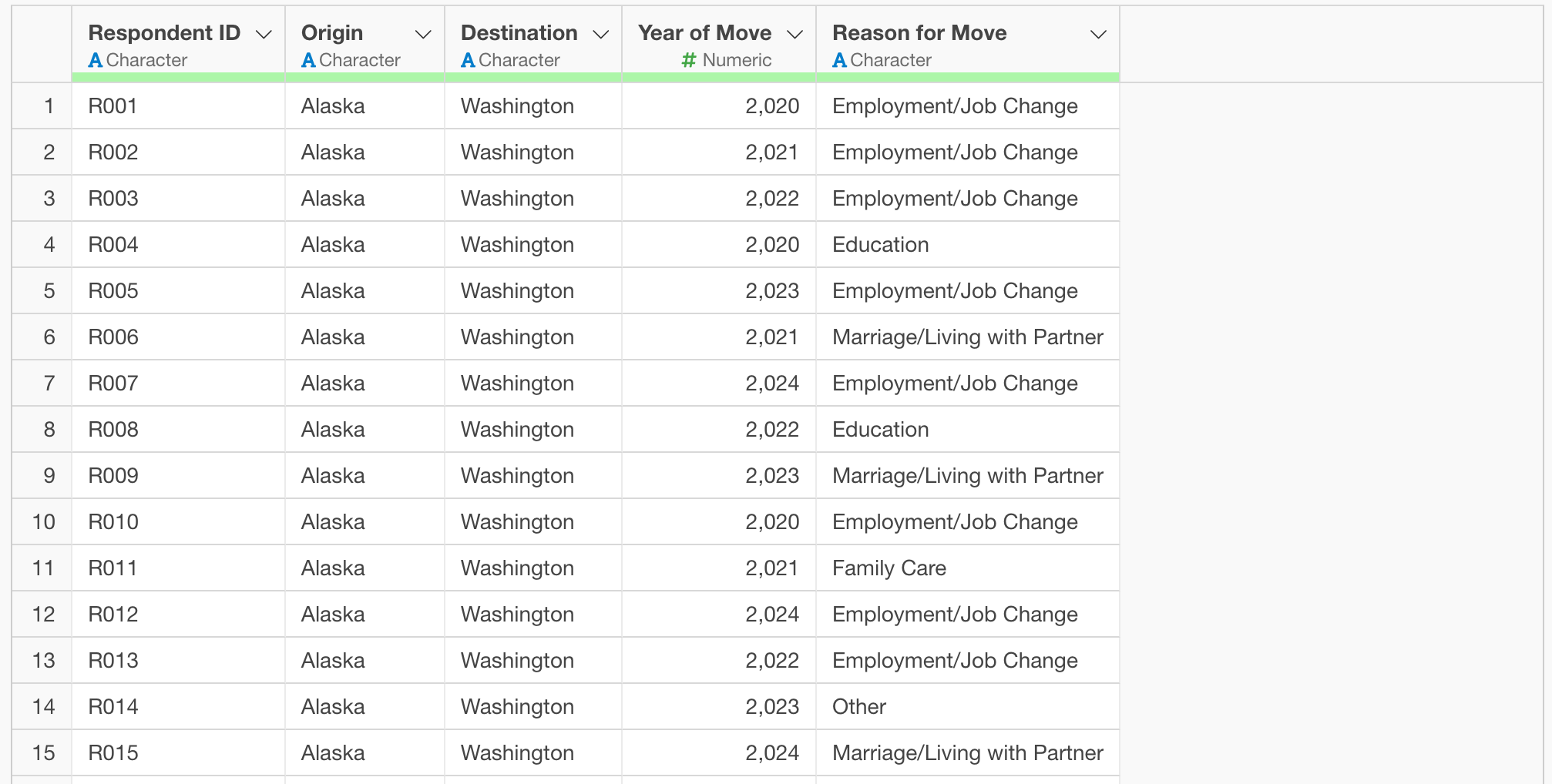
To create a Chord Diagram, you need data where each row represents a movement record.
As a specific example, we will use data where each row represents a single survey respondent, with columns containing information on the origin and destination of their residence, the year of the move, and the reason for the move.
You can download the data from here.
Installing the circlize Library
To create a Chord Diagram, we use the R package
circlize. If it is not already installed, follow these
steps to install it.
From the project menu, select “Manage R Packages.”
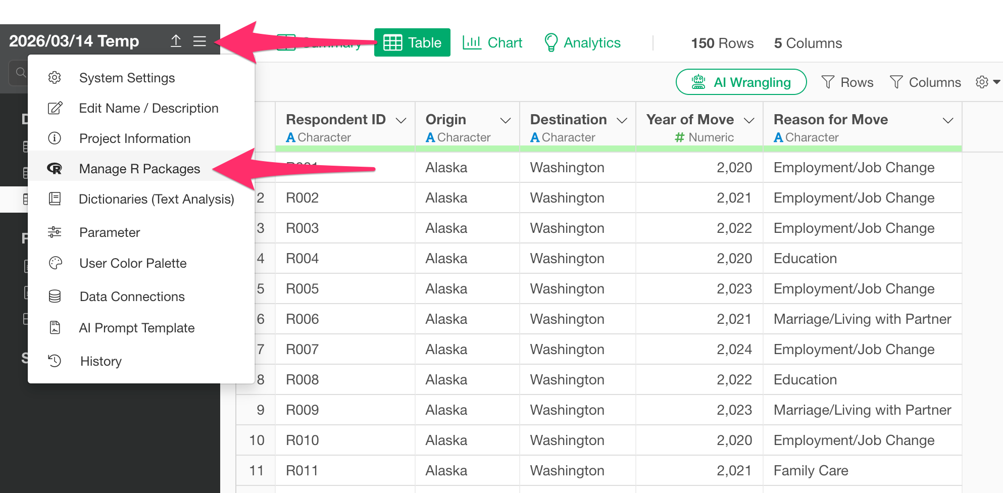
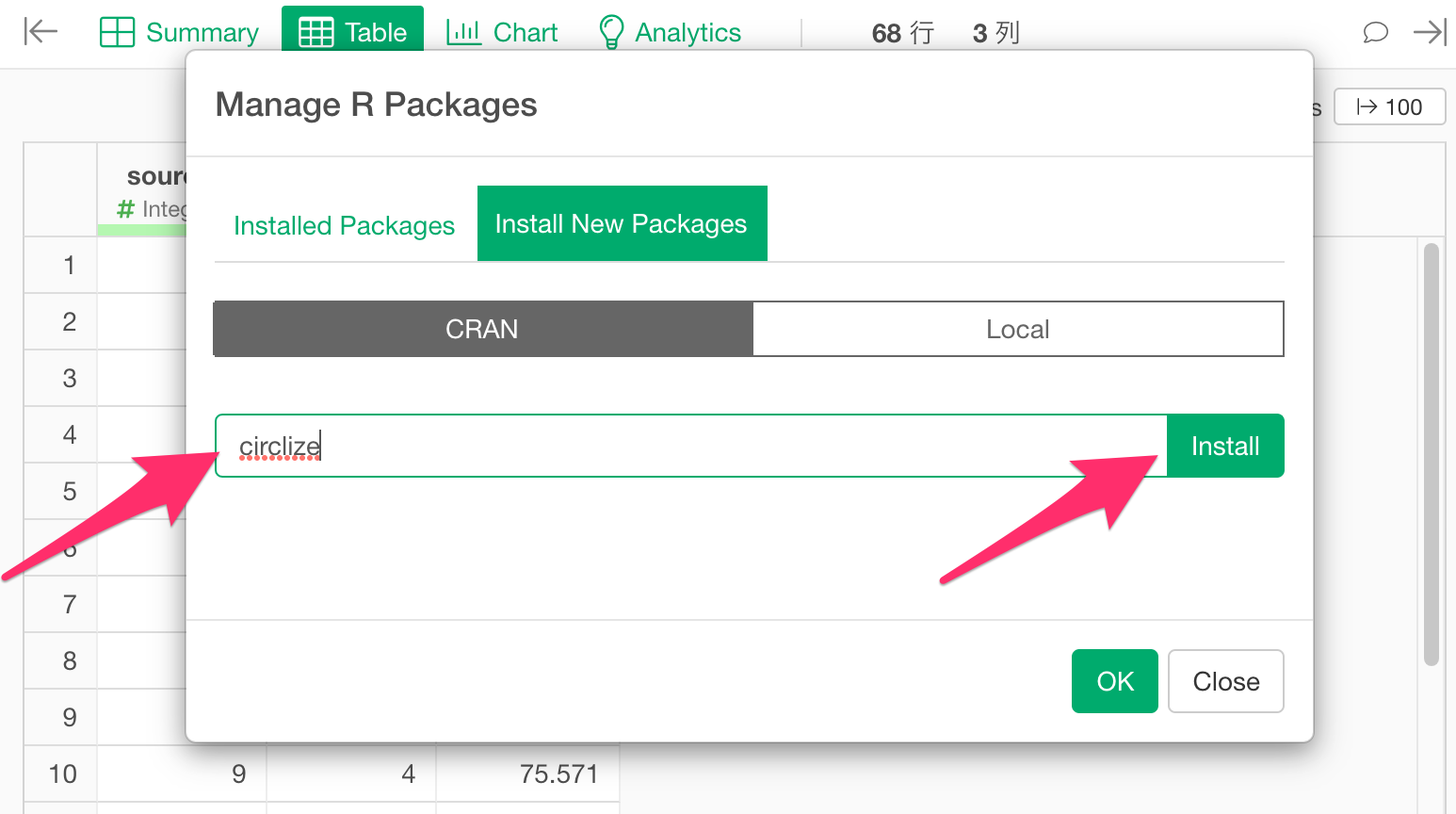
The “Manage R Packages” dialog will open. Select “Install New
Packages,” type circlize into the text box, and click the
Install button.
Once the message “Successfully installed circlize” appears, the installation is complete.
Creating a Chord Diagram
Select “Create Note” from the project menu.
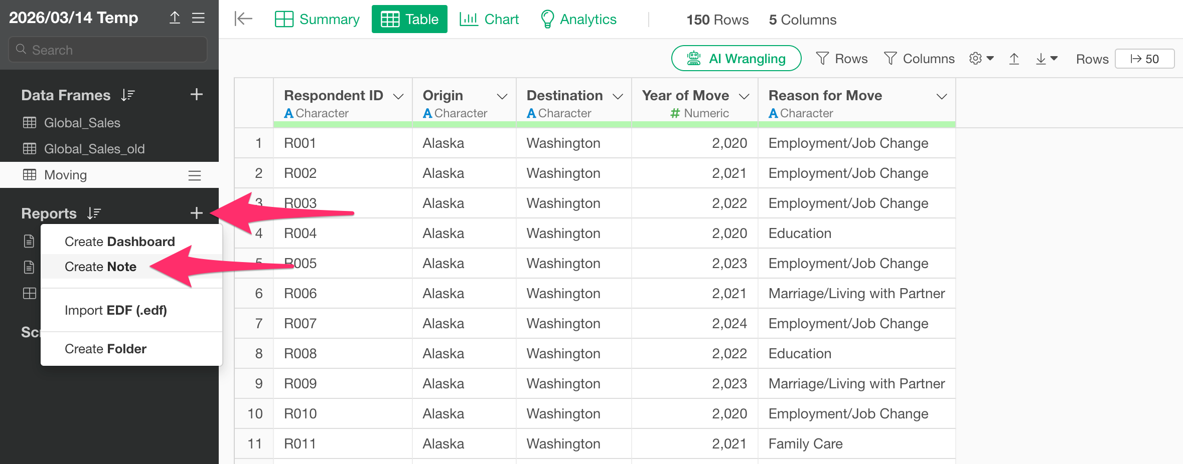
Once the new note is created, click the “Add Content” button and select “R Script.”
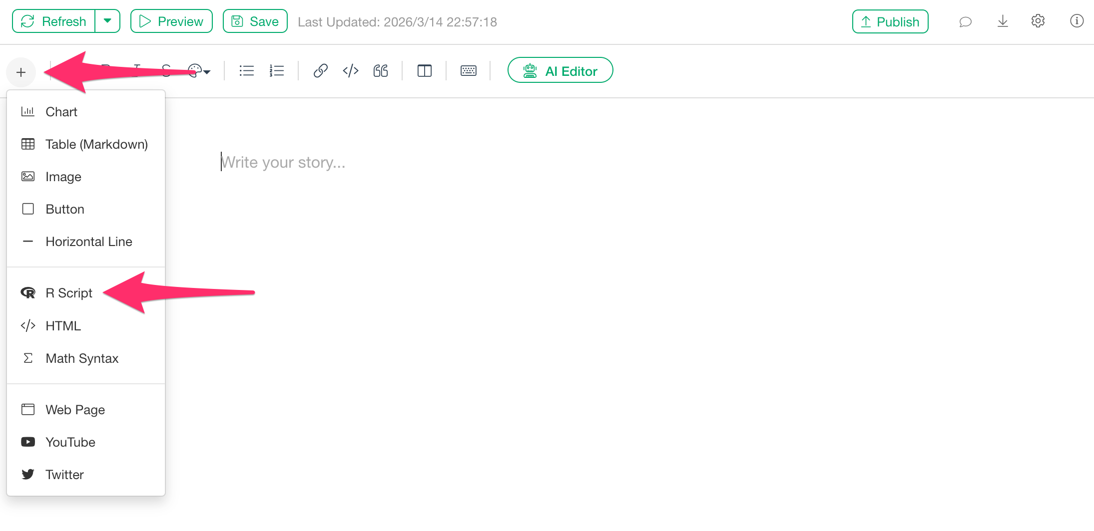
Here, we assume that a data frame containing columns for the starting point and arrival point has already been imported.
When the R script input dialog appears, paste the following code:
library(circlize)

# Since the diagram is undirected, the order of the origin and destination columns doesn't matter.
chordDiagram(dataframe_name[, c("origin_column", "destination_column")], transparency = 0.5)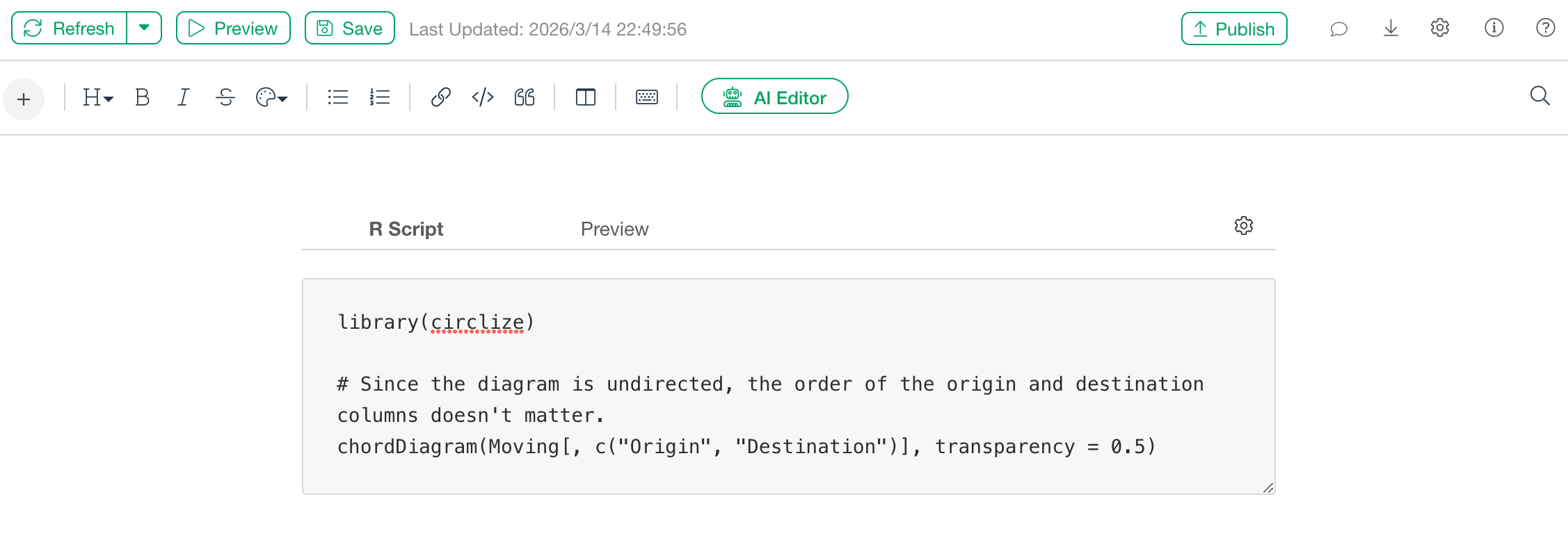
After pasting the code, click the “Preview” button.
The Chord Diagram will then be displayed as shown above.
Adding a Chord Diagram to a Dashboard
A Chord Diagram can also be displayed in a Dashboard.
Once you open the dashboard, click the “Add Text” button from the edit screen.
Once the text panel is added, click the “Edit Text” icon.
When the text editor opens, select “R Script” from the “Add Content” button.

When the R script input dialog appears, paste the same code used previously in the note:
library(circlize)

chordDiagram(dataframe_name[, c("origin_column", "destination_column")], transparency = 0.5) # Since the diagram is undirected, the order of the origin and destination columns doesn't matter.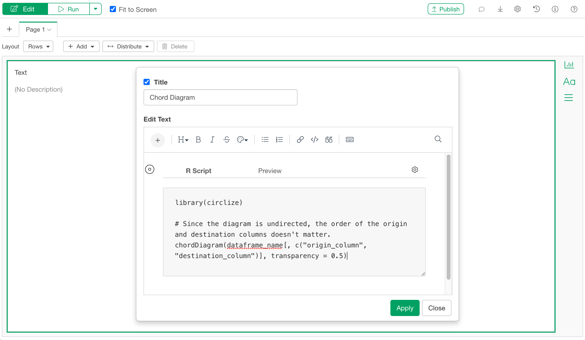
After pasting the code, apply the changes and run the dashboard.
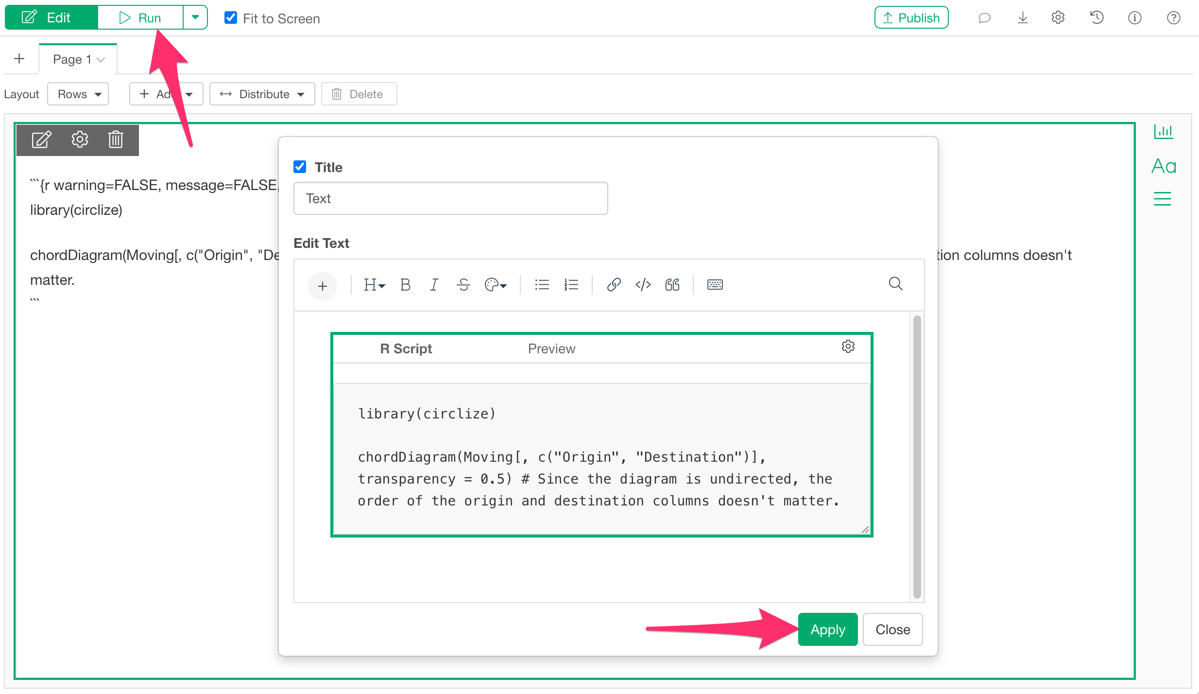
You have now successfully displayed a Chord Diagram on the dashboard.
Frequently Asked Questions
Q: When I try to create a Chord Diagram, I get an error:
simpleError in eval(substitute(expr), data, enclos = parent.frame()): object 'Column_Name' not found
This error may occur if the specified column name does not exist in the data frame, or if there is an issue with how the data frame name is specified.
If the data frame name is a number (e.g., 99), R may
interpret it as a literal numeric value. In such cases, you can avoid
the error by enclosing the data frame name in backticks
(`).