How to do Pareto Analysis with AI Prompt
Pareto analysis (Pareto chart) is a powerful tool for visualizing the “Pareto principle” discovered by Italian economist Vilfredo Pareto, which states that “a small number of factors account for the majority of the whole.”
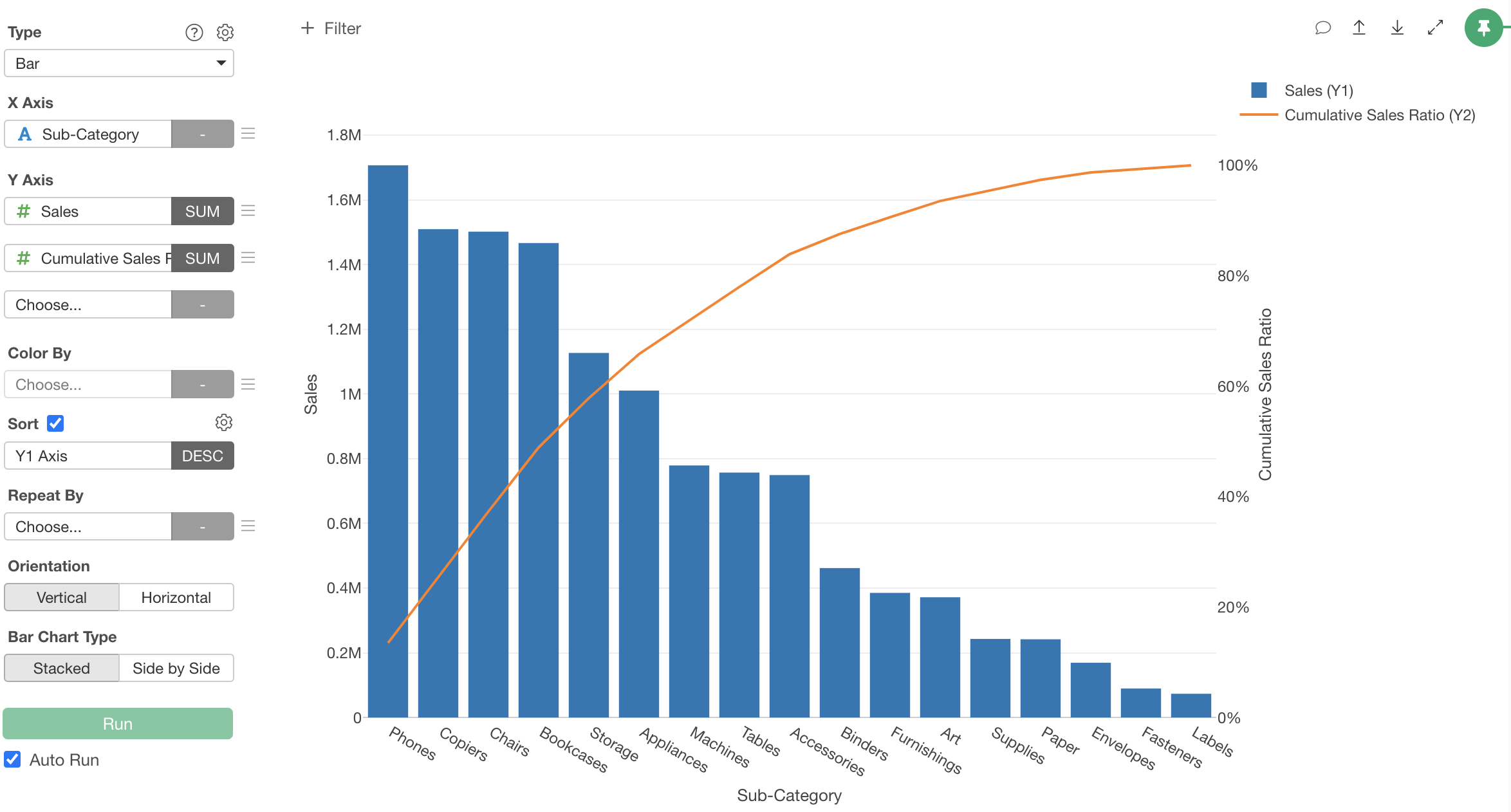
In Pareto analysis, numerical values by item (such as sales or defect counts) are displayed in descending order as a bar chart, with a line showing the cumulative percentage overlaid. By combining these two graphs, you can instantly identify “which items to focus on.”
This chart is called a Pareto chart. For example, creating a Pareto chart of sales by product allows you to visually identify the few key products that generate the majority of overall sales.
Similarly, a Pareto chart of defects by cause visually identifies the few causes that account for the majority of defects.
Applications of Pareto Analysis
Pareto charts are used as decision-making tools for efficiently utilizing limited resources (time, personnel, budget, etc.) across various industries and departments.
Sales and Marketing Personnel
In sales and marketing departments, Pareto charts can be used to analyze sales and profit structures to develop effective strategies.
By creating Pareto charts with different perspectives such as by customer, product, or region, you can make objective data-driven decisions about “which customers, products, or regions to focus on.”
For example, if a Pareto analysis by product category for an e-commerce site reveals that 20% of all categories account for 85% of sales.
Based on this analysis, to efficiently expand sales, you can decide to strengthen the product lineup in key categories and implement focused SEO strategies and promotions.
Quality Control and Improvement Personnel
For those involved in quality control and improvement activities, Pareto charts are essential tools for identifying the root causes of defects and problems.
When analyzing the causes of defects in a production line with a Pareto chart, the few causes that account for the majority of overall defects become clear. Focusing on these “vital few” allows you to achieve maximum improvement with minimal effort.
For example, if an automotive parts manufacturer used a Pareto chart to analyze defect causes and found that 60% of all defects were attributed to just two causes: “setting errors” and “material defects.”
Based on this analysis, they can focus on resolving these two issues to reduce the defect rate in a short period.
Project Managers
In project management, Pareto charts are useful for analyzing the causes of progress delays and problems.
By analyzing the causes of project delays with a Pareto chart, you can identify the few factors that account for the majority of overall delays and take effective countermeasures.
For example, if a Pareto analysis of delivery delays in a system development project revealed that “specification changes” and “resource shortages” accounted for 70% of all delays.
Based on this analysis, to significantly improve the on-time delivery rate for future projects, you can improve the specification change process and review resource allocation.
Performing Pareto Analysis with AI Prompt
In this example, we’ll use data where each row represents one order line item to perform a Pareto chart of sales by product category using AI Prompts.
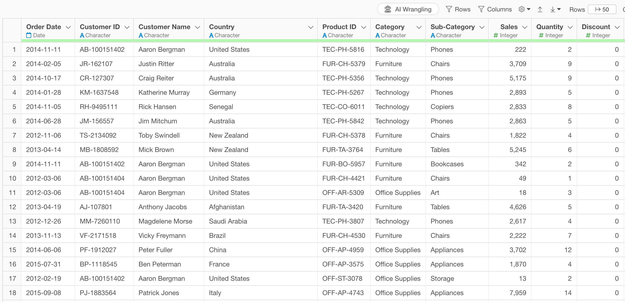 The
data includes information such as order date, product category,
sub-category, product id, sales, and more.
The
data includes information such as order date, product category,
sub-category, product id, sales, and more.
Click the “AI Wrangling” button.
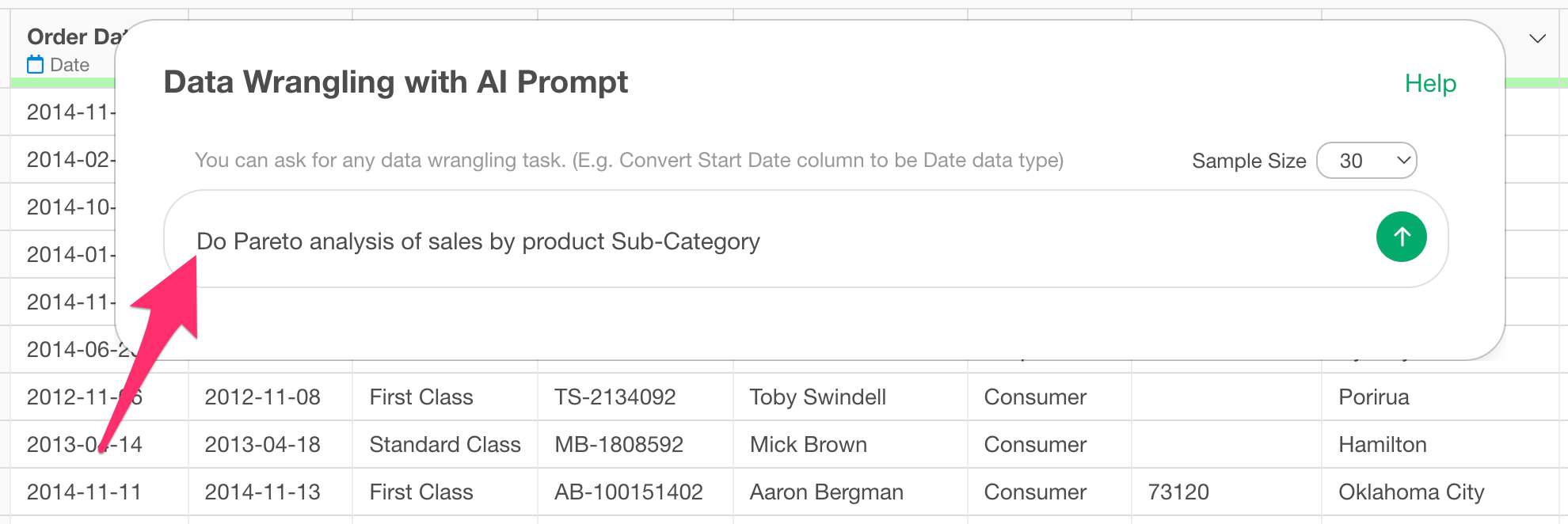
 When
the AI Prompt dialog opens, enter text like the following and
execute:
When
the AI Prompt dialog opens, enter text like the following and
execute:
Do Pareto analysis of sales by product Sub-Category
This will generate code to create a Pareto chart.
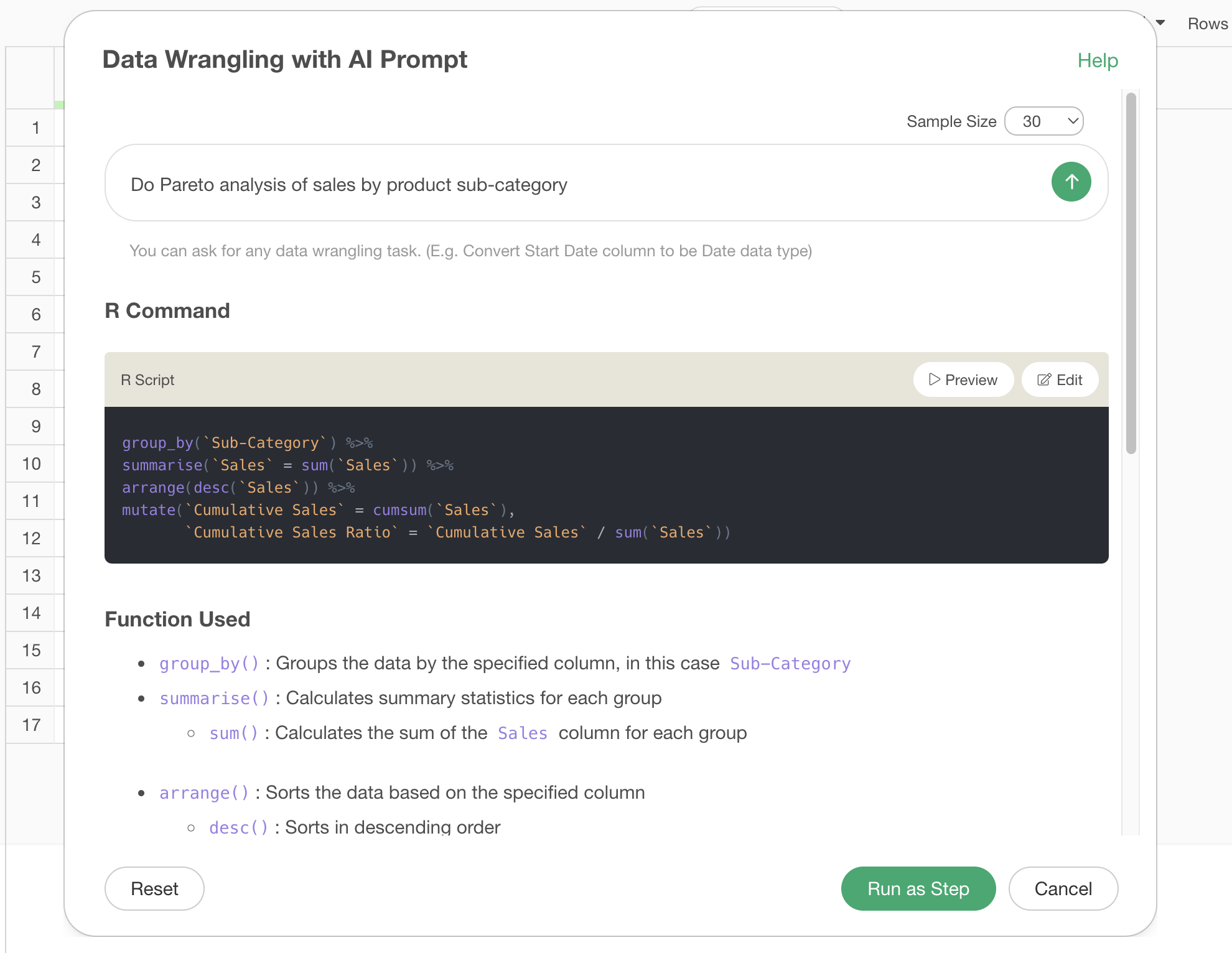
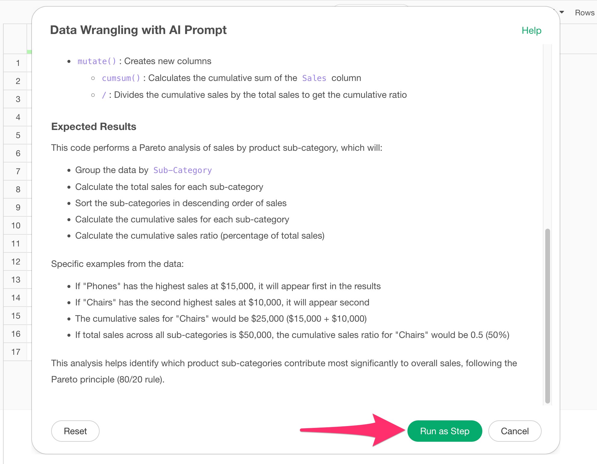
Review the explanation of the functions used and the expected results to ensure the Pareto analysis will be executed properly, then click the “Run as Step” button.
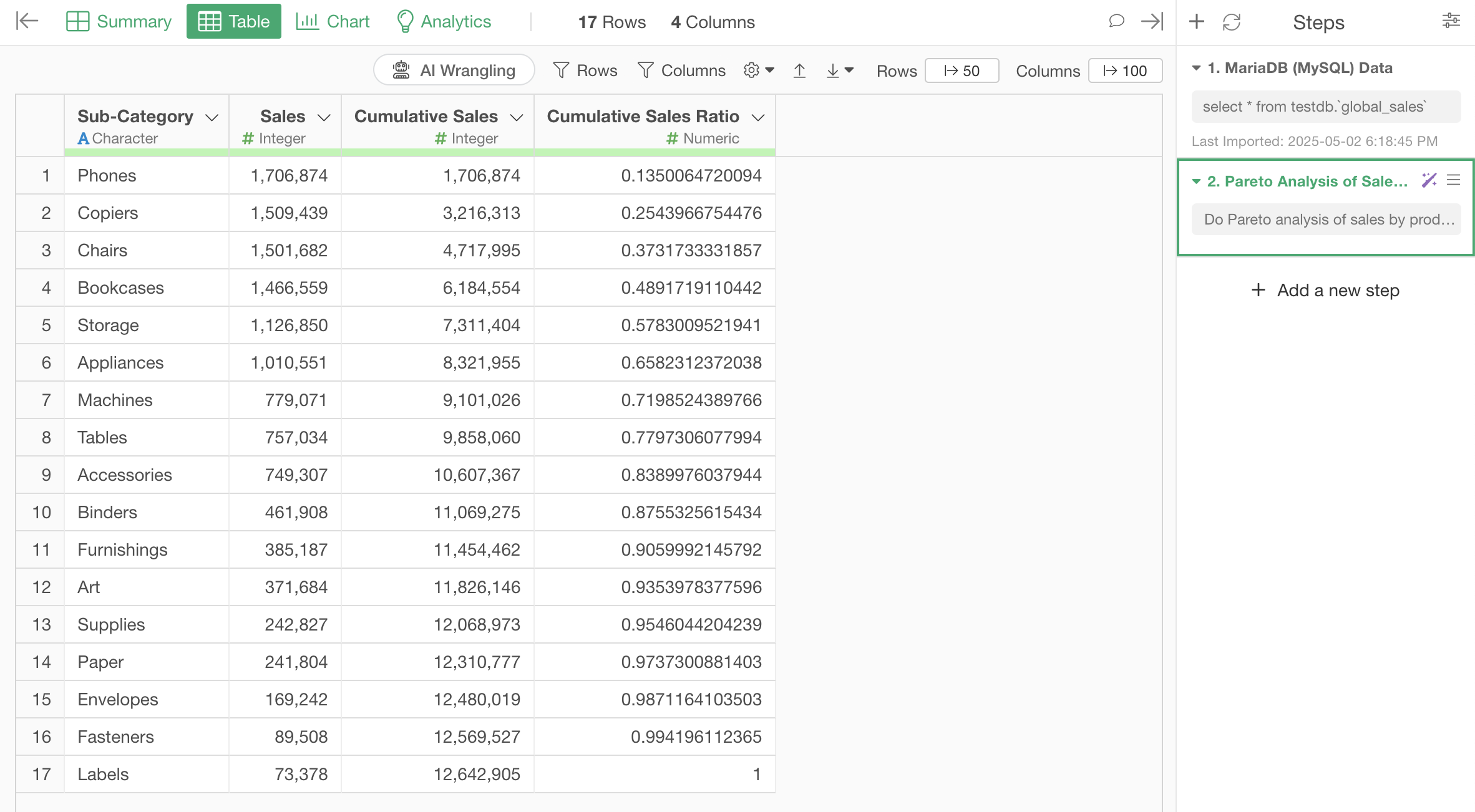
The step is added, and you’ve created the data needed for the Pareto chart.
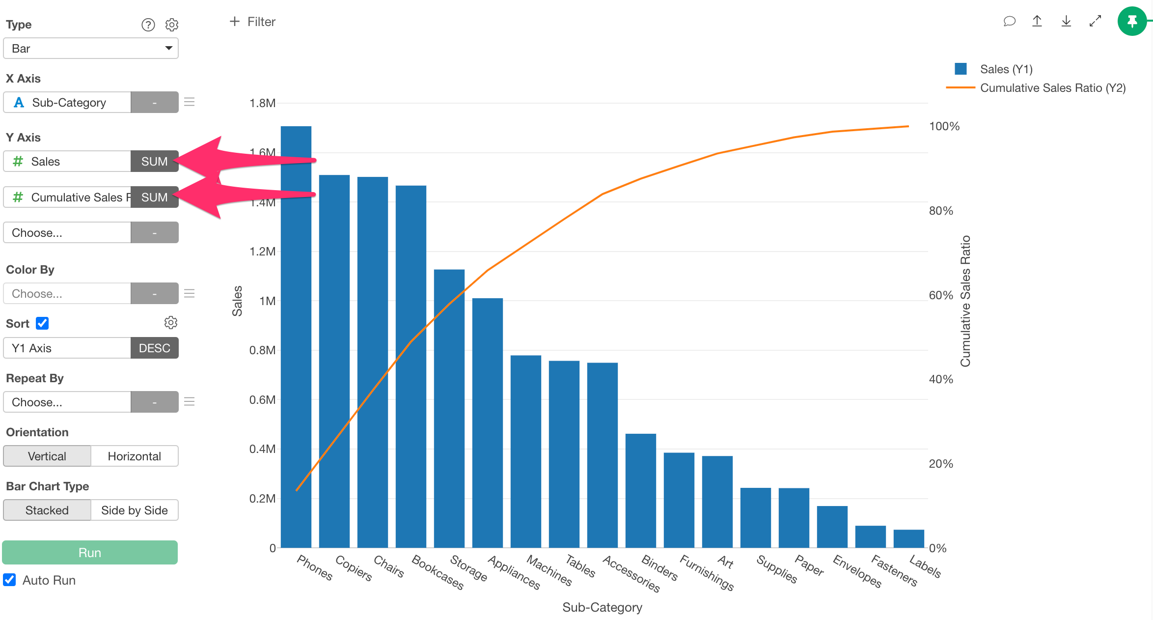
Now you just need to select the category (in this case, product subcategory) for the X-axis, “Sales” for the Y1-axis, and “Cumulative Sales Percentage” for the Y2-axis in the chart to create a Pareto chart.
Summary
In this article, we introduced how to perform Pareto analysis using Exploratory’s AI feature “AI Prompt.”
Previously, creating a Pareto chart required knowledge of how to aggregate data, calculate cumulative percentages, and the skills to implement these calculations. However, with Exploratory, you can quickly create Pareto charts using natural language!
If you haven’t used Exploratory before, please try the 30-day free trial!