
How to Use Exploratory - Trial Tour
Using Exploratory’s modern and simple UI, you can easily and efficiently perform the following data science tasks:
- Accessing various types of data
- Data wrangling
- Data visualization
- Analysis using machine learning and statistical algorithms
- Report automation and sharing using dashboards and notes
To help you experience Exploratory’s basic operations and useful features in a short time, we have prepared a trial tour for “How to Use Exploratory.”
There are seven “How to Use” notes for each theme, designed for hands-on learning with actual sample data, with each part taking about 20 minutes to complete.
Please bookmark this page and try Exploratory!
Installing Exploratory
If you haven’t installed Exploratory yet, please first try installing it by referring to the following installation guide.
- Installation Guide - Link
If you have trouble with the installation, please feel free to contact us by emailing support@exploratory.io or through the chat window on our website.
7 Steps
1. Basic Usage
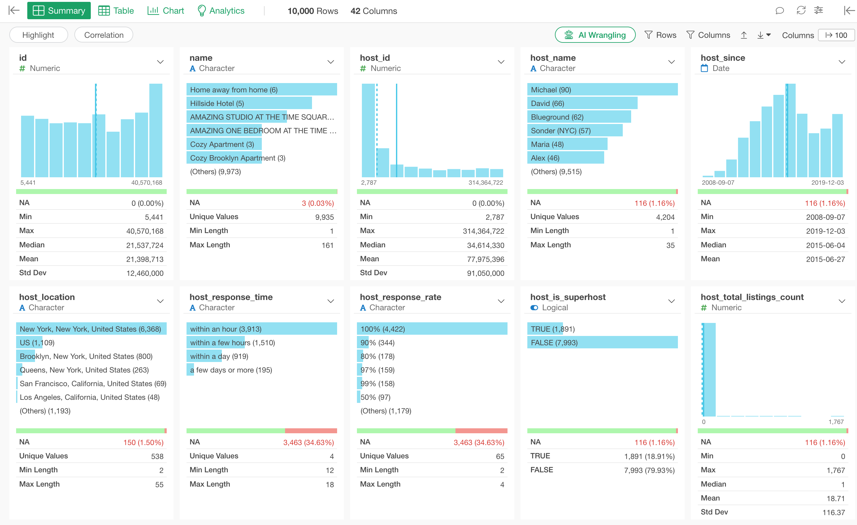
This note is designed to help you experience Exploratory’s basic functions so that you can start using Exploratory efficiently.
Starting with “data import,” you can learn how to view the Summary View, create calculations, and create charts.
- How to Use Exploratory Part 1 - Basics - Link
2. Visualization
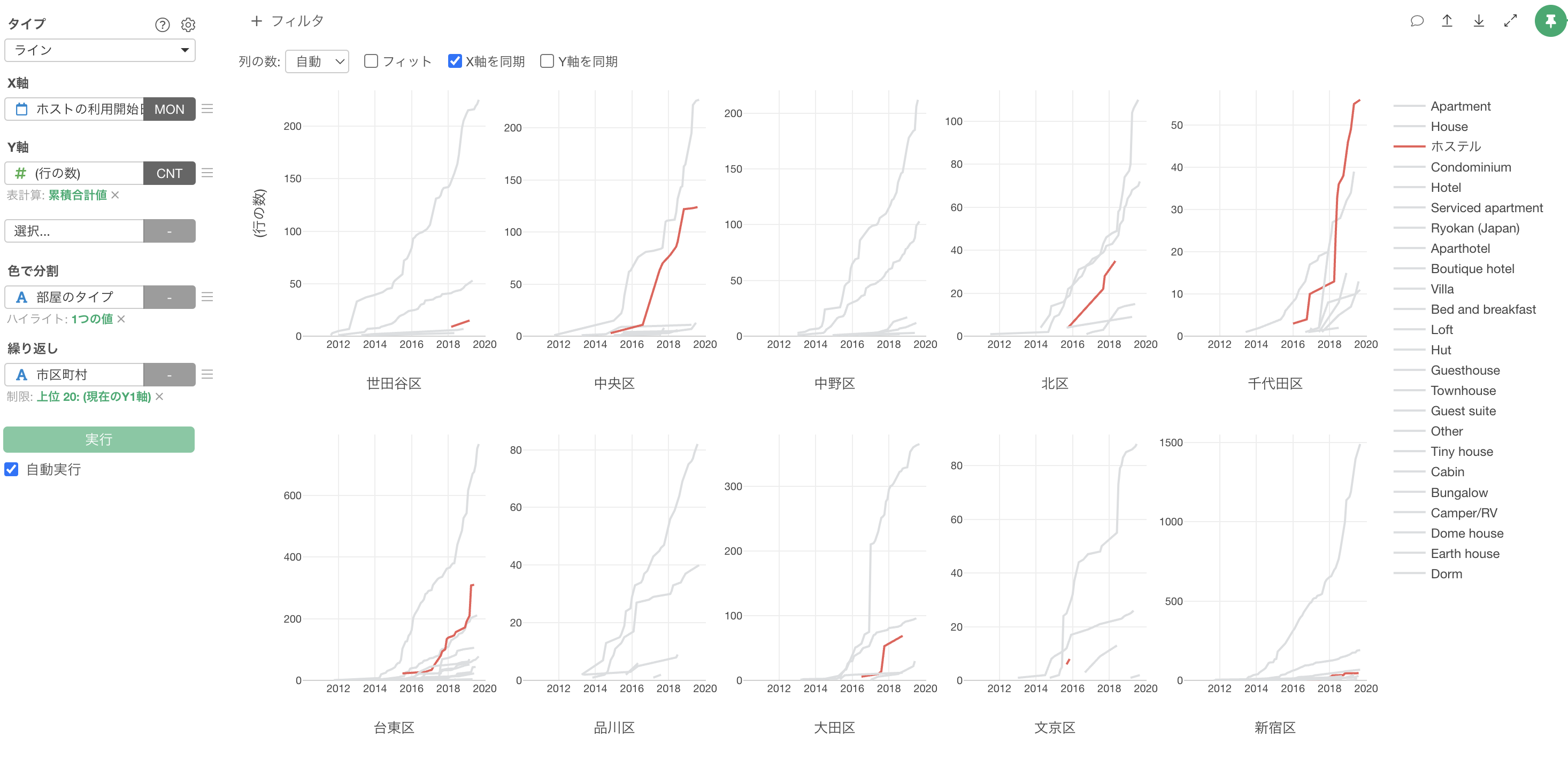
Using Exploratory, you can quickly and easily create charts and visualize data from various angles.
This note is designed to help you easily experience Exploratory’s basic chart functions necessary for effective data visualization.
- How to Use Exploratory Part 2 - Visualization - Link
3. Data Wrangling
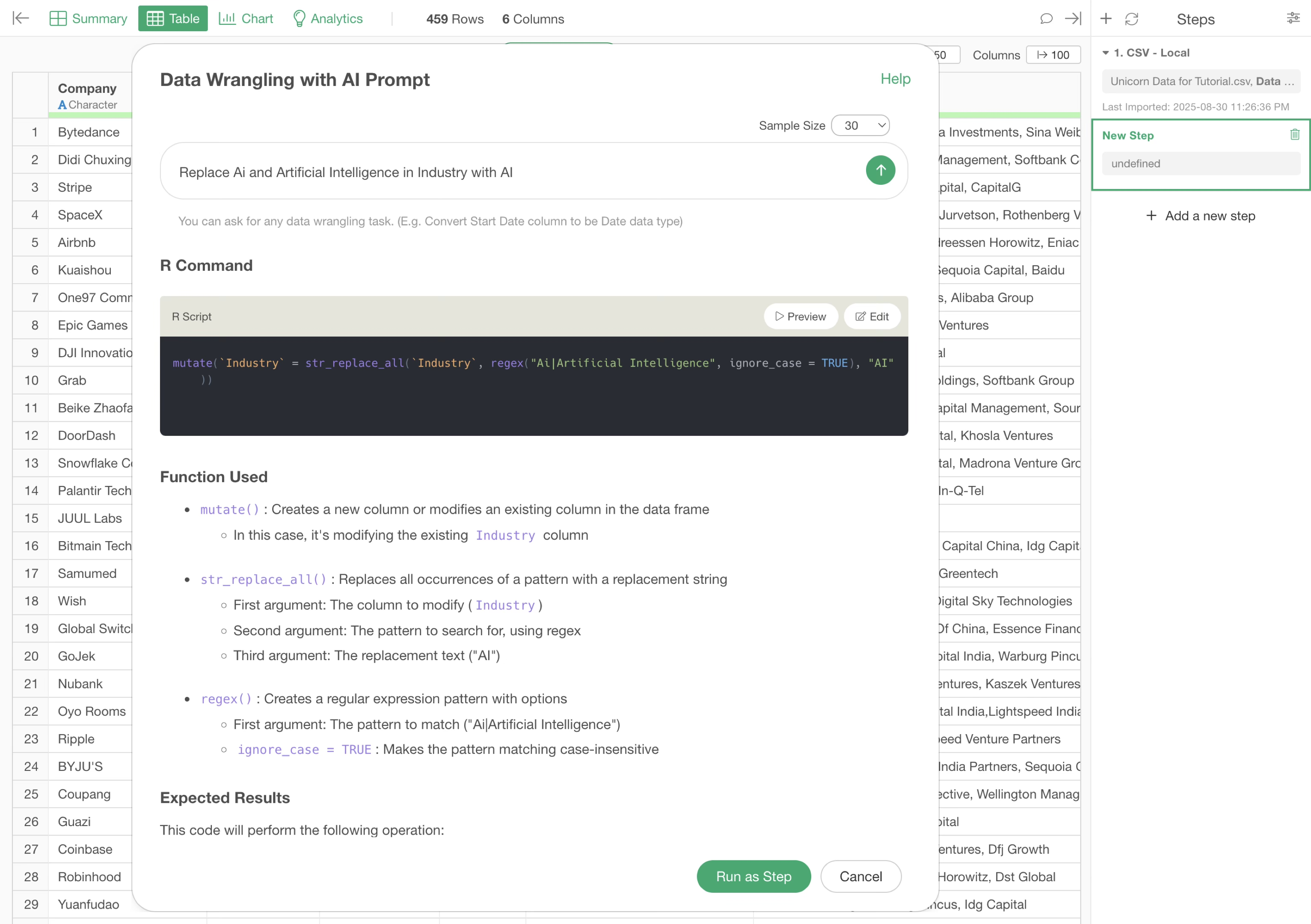
It is often said that 80% of the time spent on data visualization and analysis is devoted to “data wrangling”.
Therefore, Exploratory provides an environment where you can perform data formatting and processing easily and efficiently while maximizing “reproducibility” and “readability.”
This note allows you to easily experience Exploratory’s data wrangling functions that are useful to know, through data “Join,” “conditional calculations,” and “Work with Text Data” for correcting notation variations.
We have prepared two versions: a “UI version” through menu operations and an “AI Prompt version” that can process data in natural language.
4. Analytics
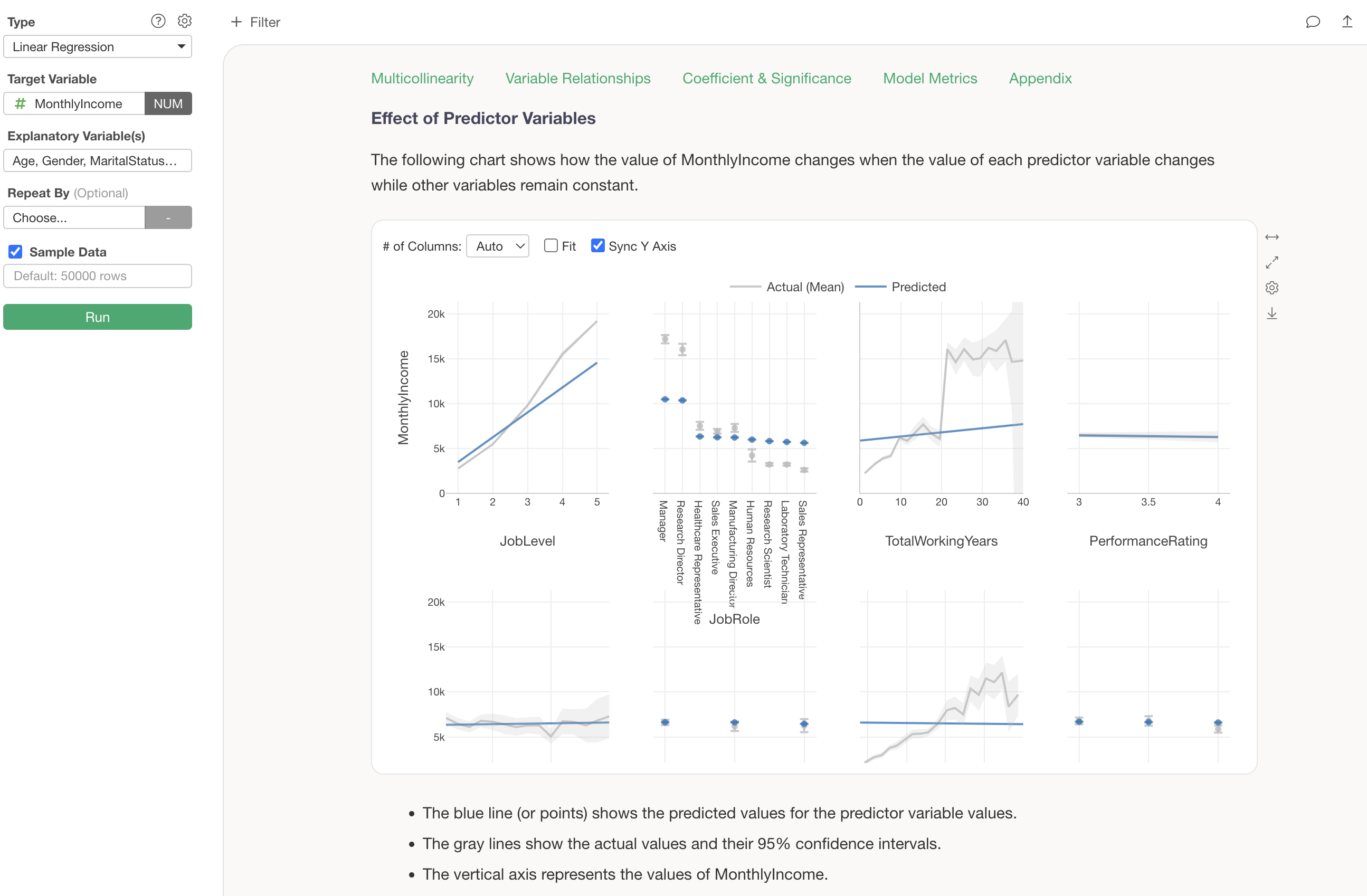
Exploratory provides various analytics functions using “statistical” and “machine learning” algorithms so that you can analyze data efficiently.
This note allows you to easily experience the analytics functions that Exploratory provides by actually working with “correlation analysis” and “predictive models”.
- How to Use Exploratory Part 4 - Analytics - Link
5. Dashboard
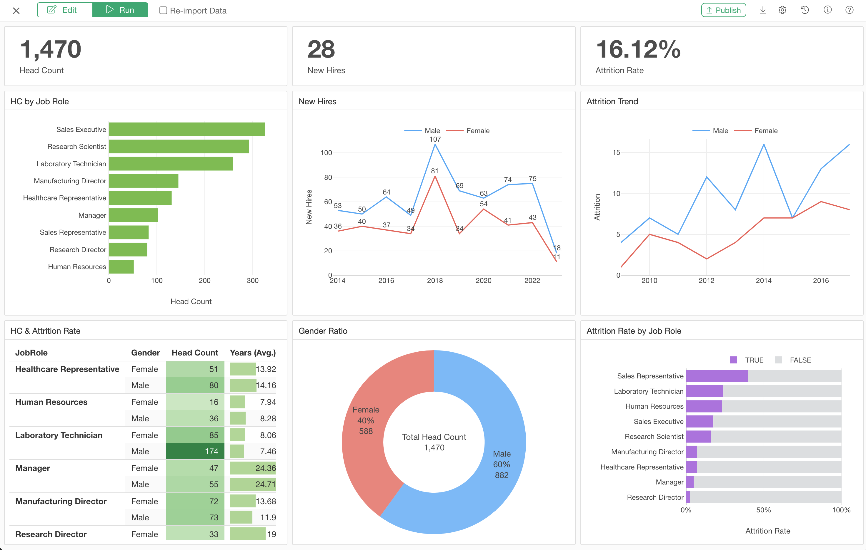
Using Exploratory, you can quickly and easily create dashboards by adding various types of content and flexibly designing layouts.
Furthermore, by publishing the dashboard to the Exploratory server, you can securely share it with others, automatically update data using the “schedule” function, and provide an interactive environment.
This note allows you to experience creating a simple dashboard and publishing and sharing it on the server.
- How to Use Exploratory Part 5 - Dashboard - Link
6. Note

Insights obtained from charts and analytics in Exploratory can be quickly summarized in “Note” and shared interactively with others.
You will experience how to use the convenient functions when creating and sharing notes.
- How to Use Exploratory Part 6 - Note - Link
7. Parameter
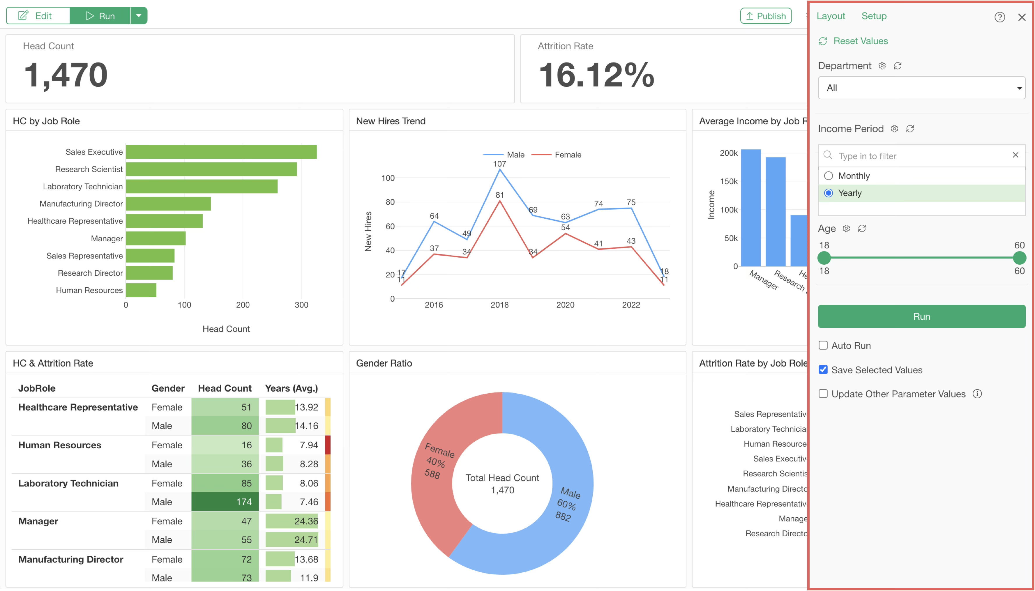
In Exploratory, you can monitor business indicators (KPIs) using dashboards, but if you want to filter data more flexibly within that dashboard, such as specifying date periods or numerical ranges, you can achieve this by using the “Parameter” function.
This note allows you to experience how to create parameters and how to use parameters in dashboards.
- How to Use Exploratory Part 7 - Parameters - Link