Introduction to Correlation
Correlation is a relationship where changes in one variable happen together with changes in another variable with some regularities.
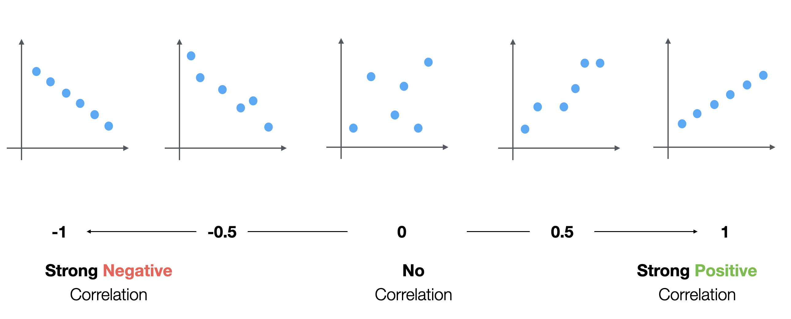
There is a metric called 'Correlation Coefficient' or simply 'Correlation' which indicates how strong the correlation between two variables is.
It ranges between -1 and 1.
- +1 indicates the strongest positive correlation.
- 0 indicates no relationship.
- -1 indicates the strongest negative correlation
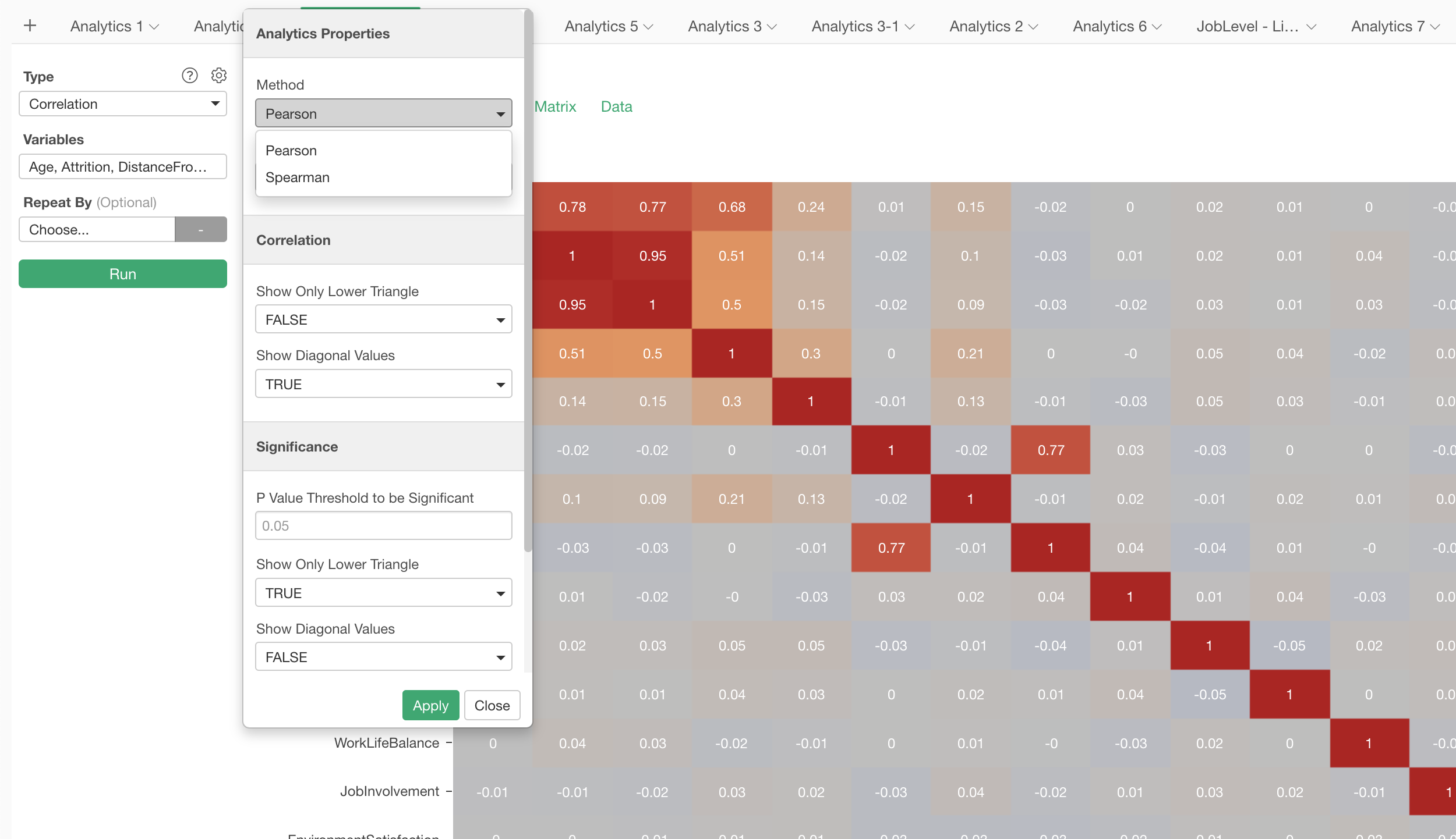
Run Correlation under Analytics view
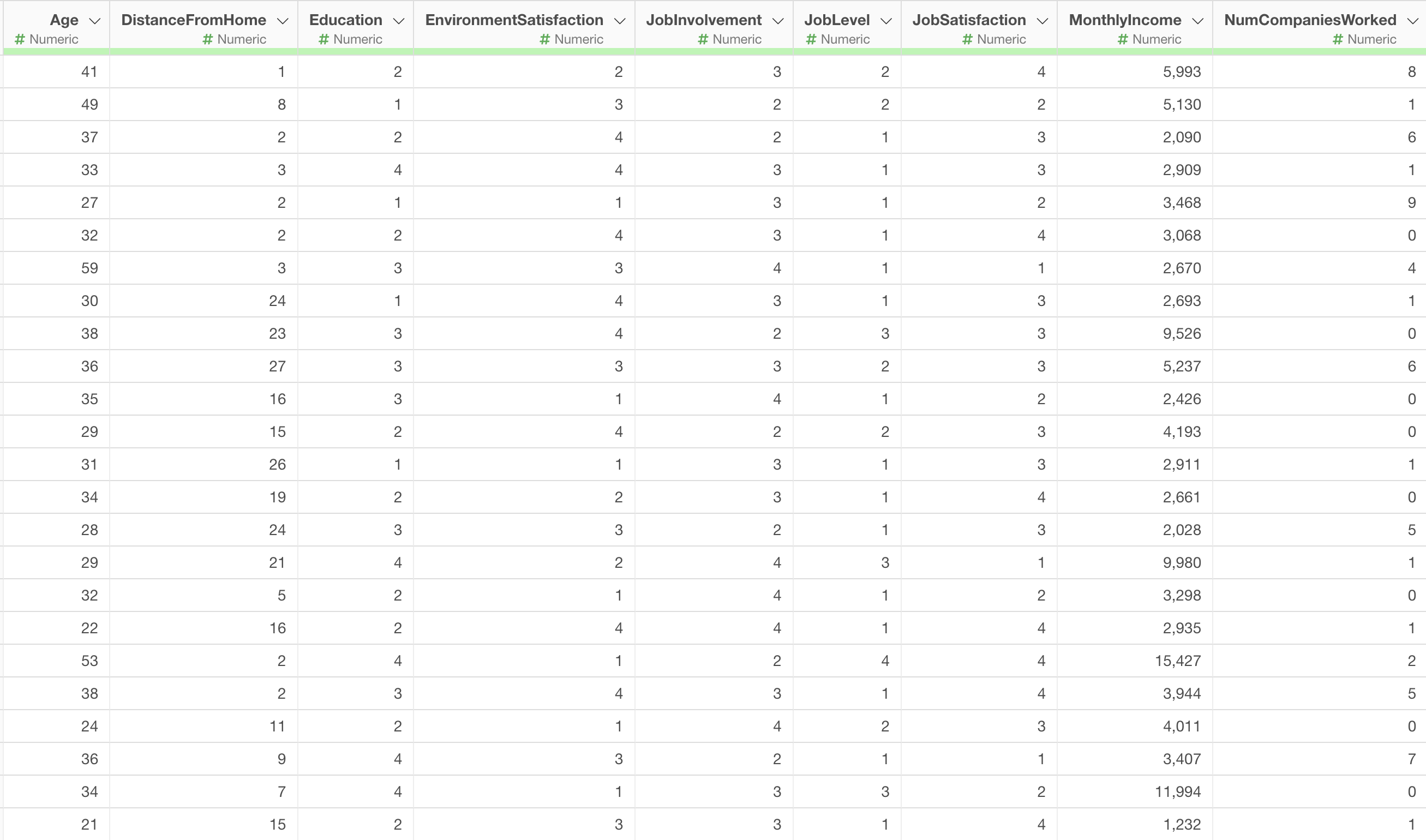
We'll use the Employee data.
We have these numerical variables and we want to see which variables have the strongest correlation.
Select 'Correlation' under the Analytics view.
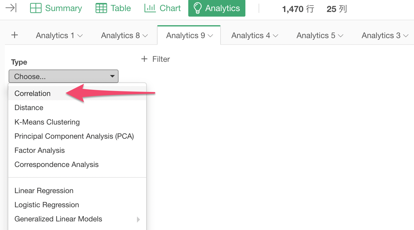
Open the Column Selection dialog by clicking on the 'Variables', and select all the numerical and the logical columns with Shift-key.
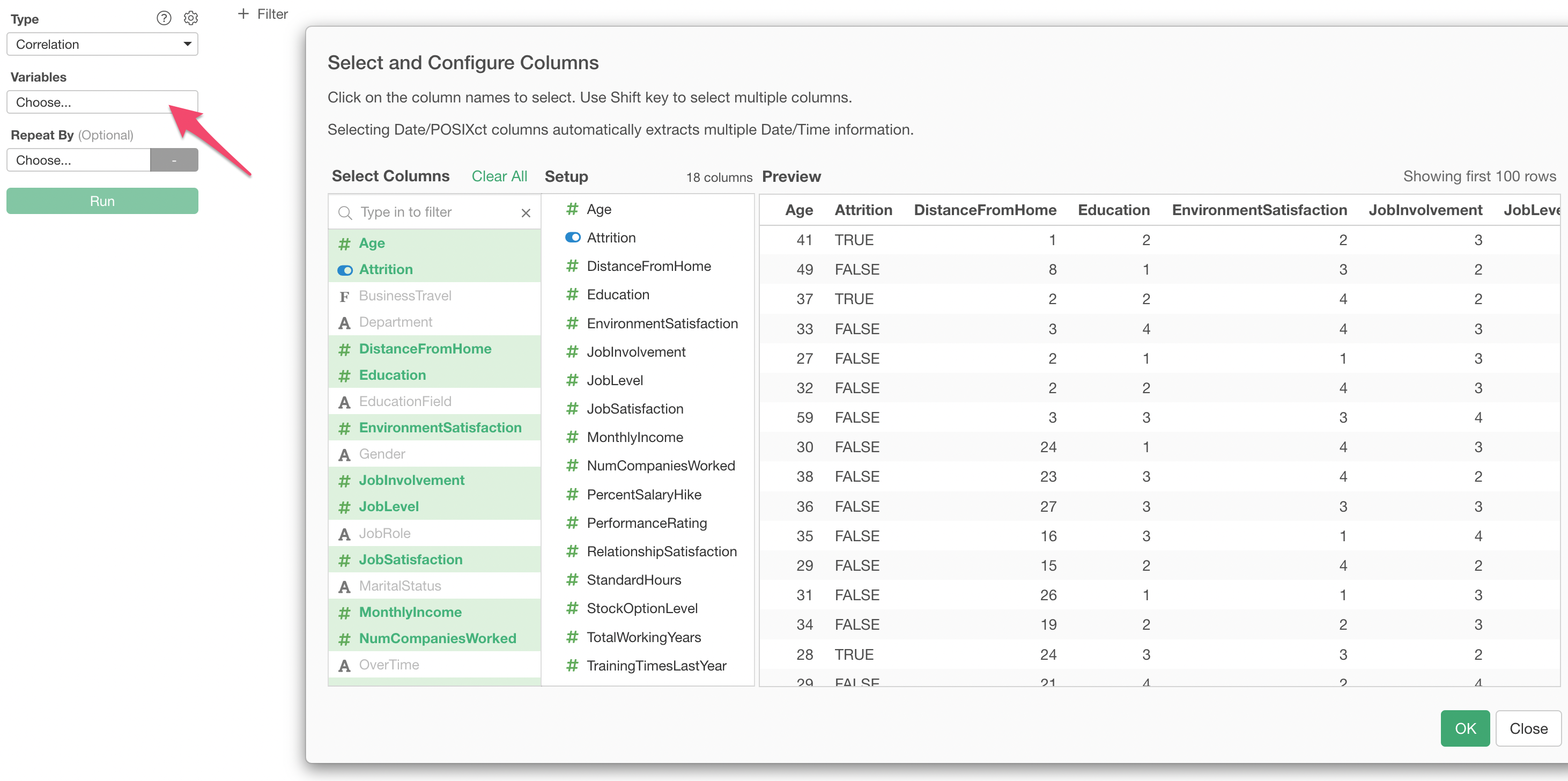
You can select only the numerical and the logical data type columns for Correlation.
Then, click OK button.
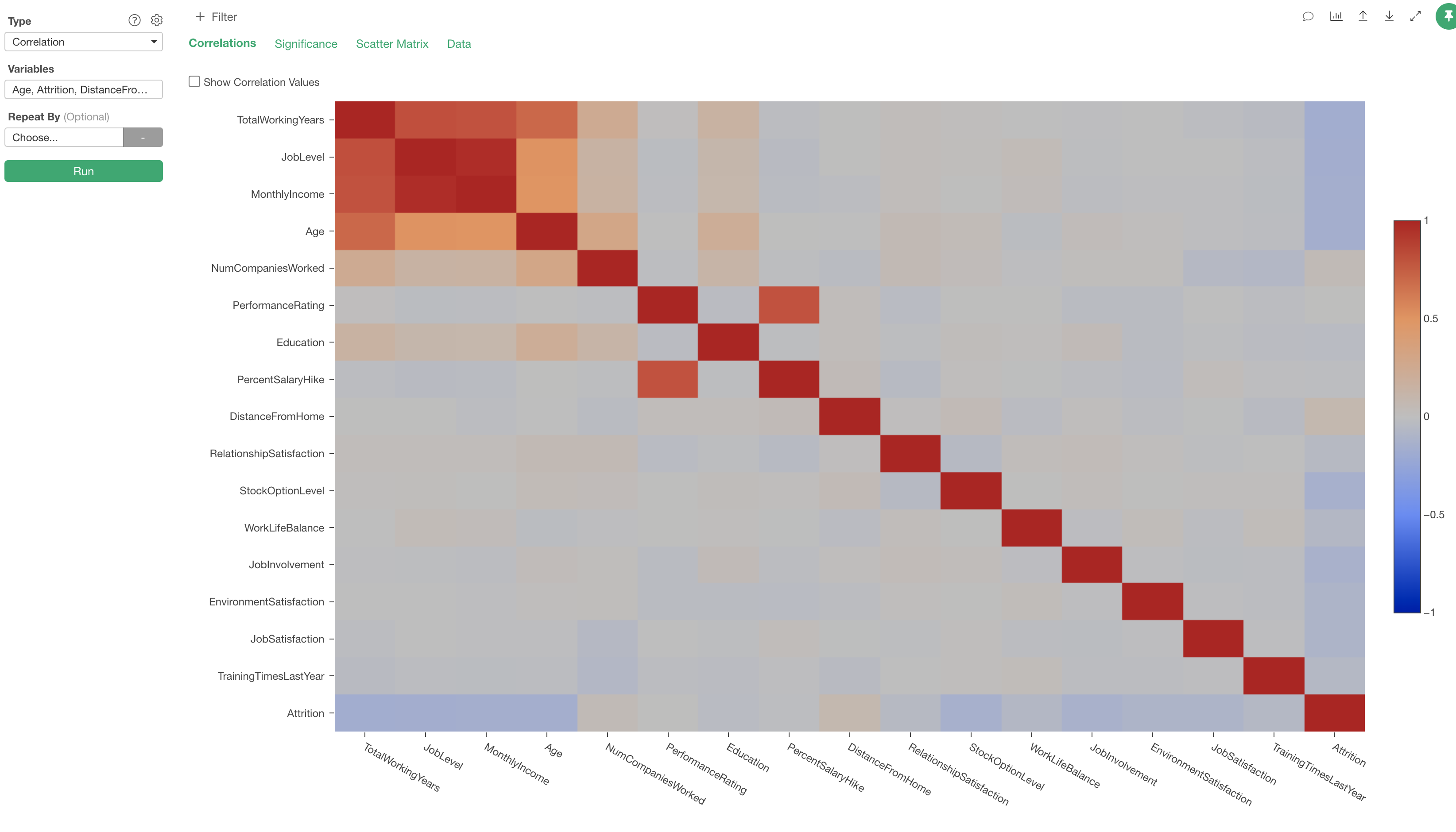
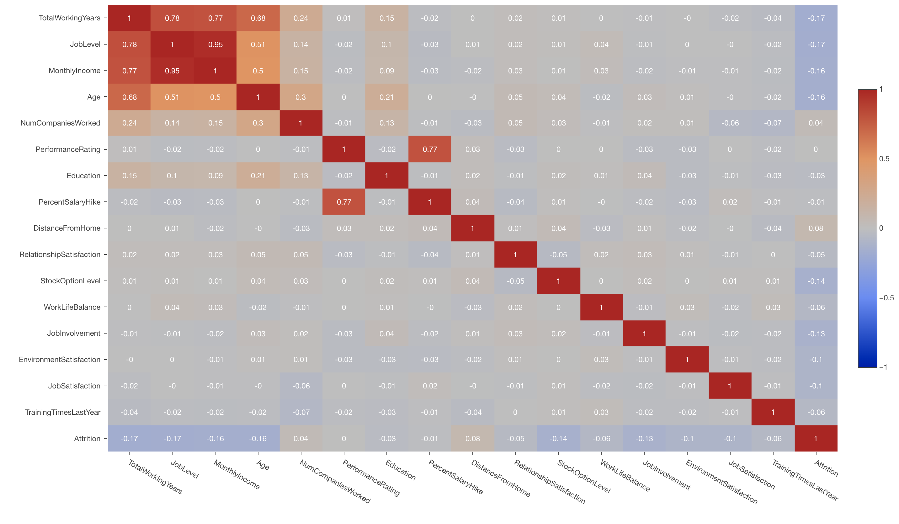
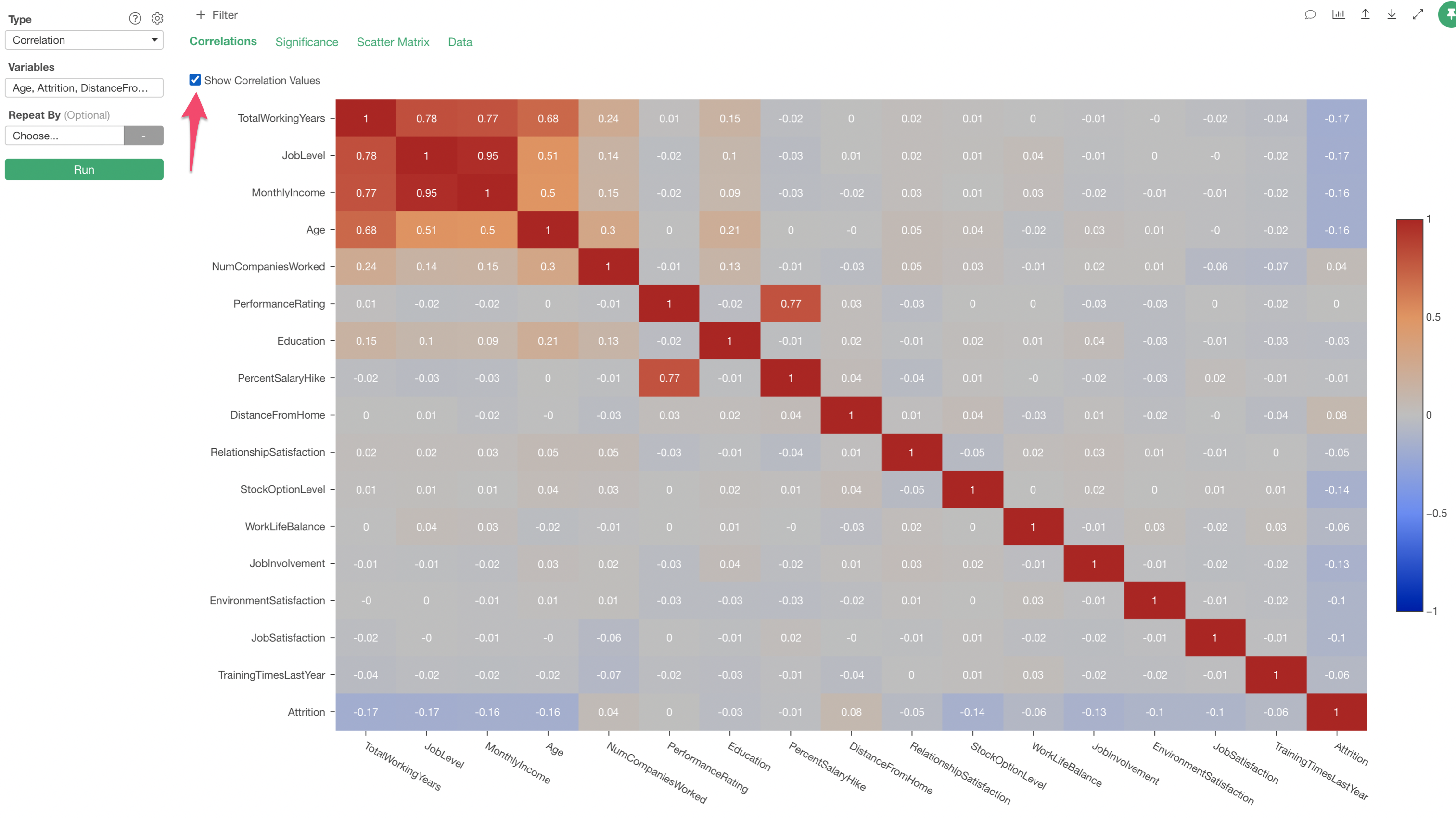
Correlation Tab
Under this tab, you can see the correlation coefficients of all the variable combinations. The correlation coefficient values are color coded. The darker the red is the stronger the positive correlation is, and the darker the blue is the stronger the negative correlation is.
You can check 'Show Correlation Values' to show the Correlation Coefficient values on the chart.
Significance
When you find the correlation on a given pair of the variables you might wonder if this relationship is big enough to take it serious or just a marginal relationship.
In such cases, you can go to the Significance tab and see the P value for each of the correlation.
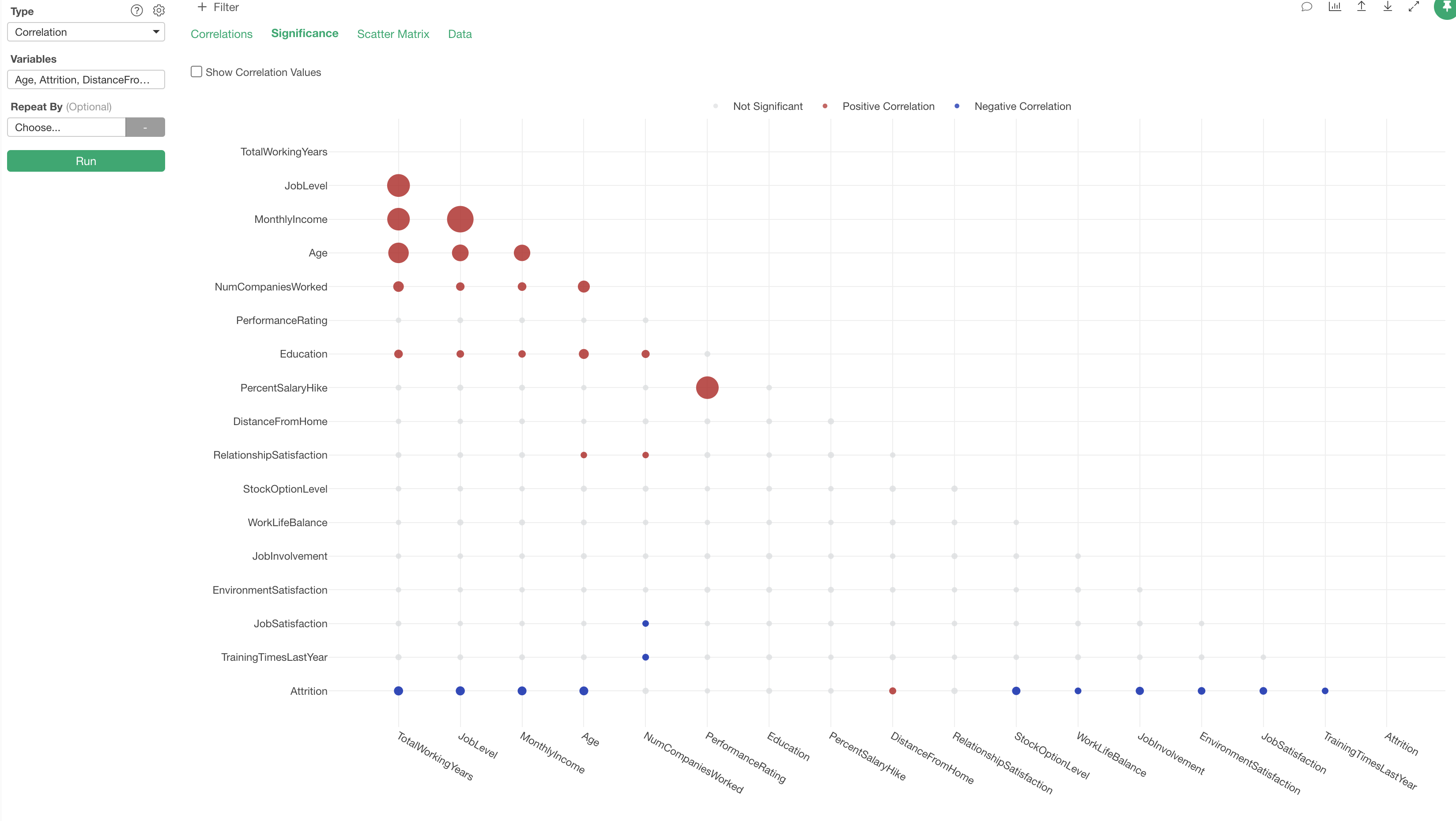
Behind the scene, a statistical test called 't-Test' is run against each of the variables combinations.
The Red color indicates the correlation is significant and Positive and the Blue color indicates that it's significant and Negative. The Gray indicates that a given relationship is not significant.
The circel size indicates the strength of the correlation. The bigger the circle is the storonger the correlaiton is.
Peason vs. Speaman - Correlation Methods
In Exploratory, Peason correlation method is used to calculate the correlation coefficient by default. But another method called 'Speaman' is also supported and you can change it from the property.
Peason correlation is most often used, but it assumes that the underlying data is normally distributed and the relationship between the two variables is linear. However, as you guess, most of the data in this world are not like that.
For that reason, you might want to use Speaman correlation method which doesn't assume the normality nor the linearity of the relationship.
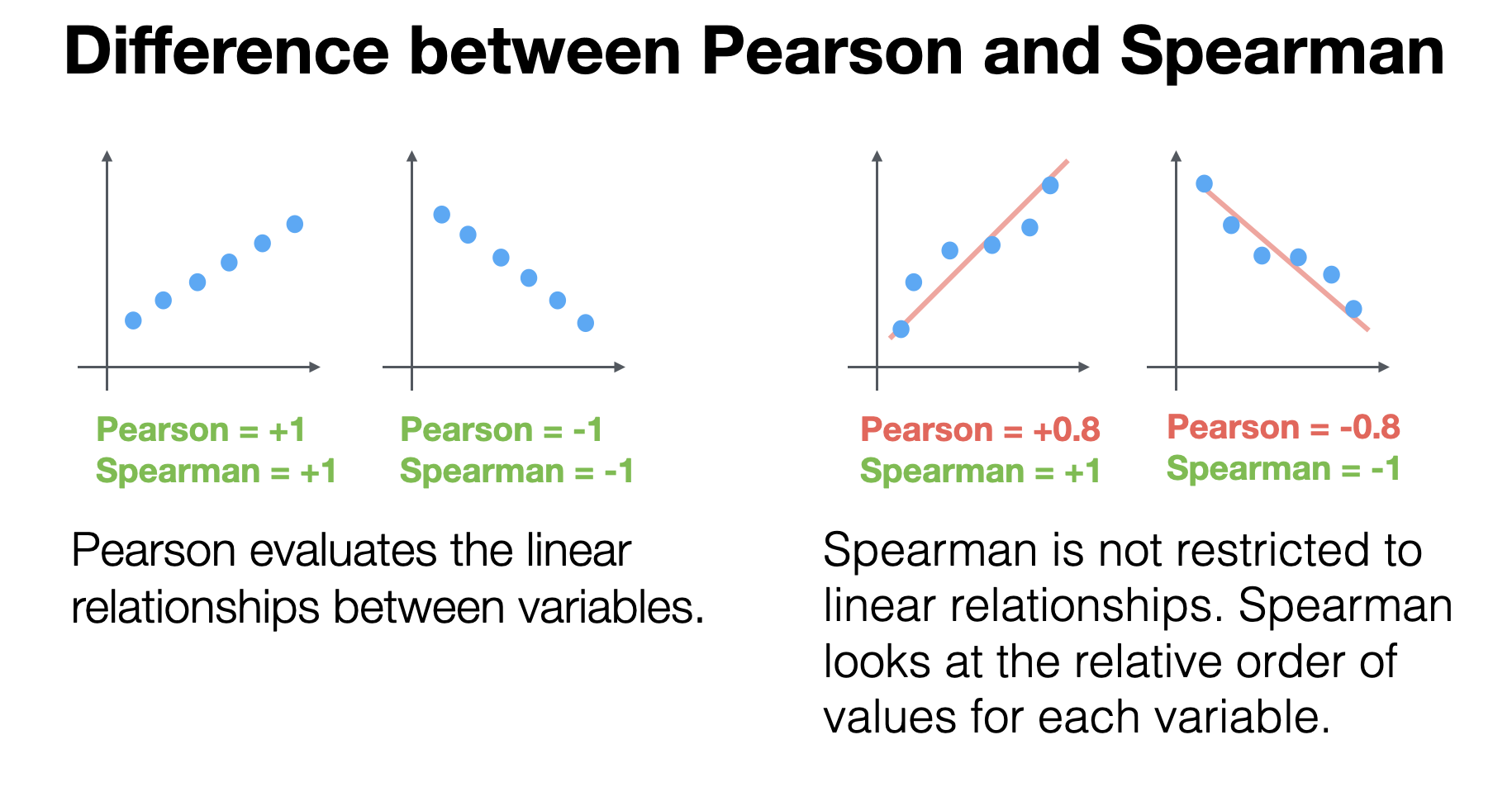
Peason
- Correlation is calculated based on the original values.
Speaman
- Correlation is calculated based on the ranks - ranked numbers after being sorted from the smallest value to the biggest value.
- You can use it for any type of data. The data doesn’t have to be based on the normal distribution.