Introduction to Violin Plot
Violin Plot is basically combining Density Plot chart and Boxplot. It visualizes how the data is distributed and helps you compare the distributions of multiple groups by using the density curve (violin curve) and the boxplot inside the density curve.
Sample Data
We'll use this Flight Delay data. You can download it from this page.
In this data, each row represents each flight that departed one airport and arrived another airport. It has the delay times for both departure and arrival of each flight.
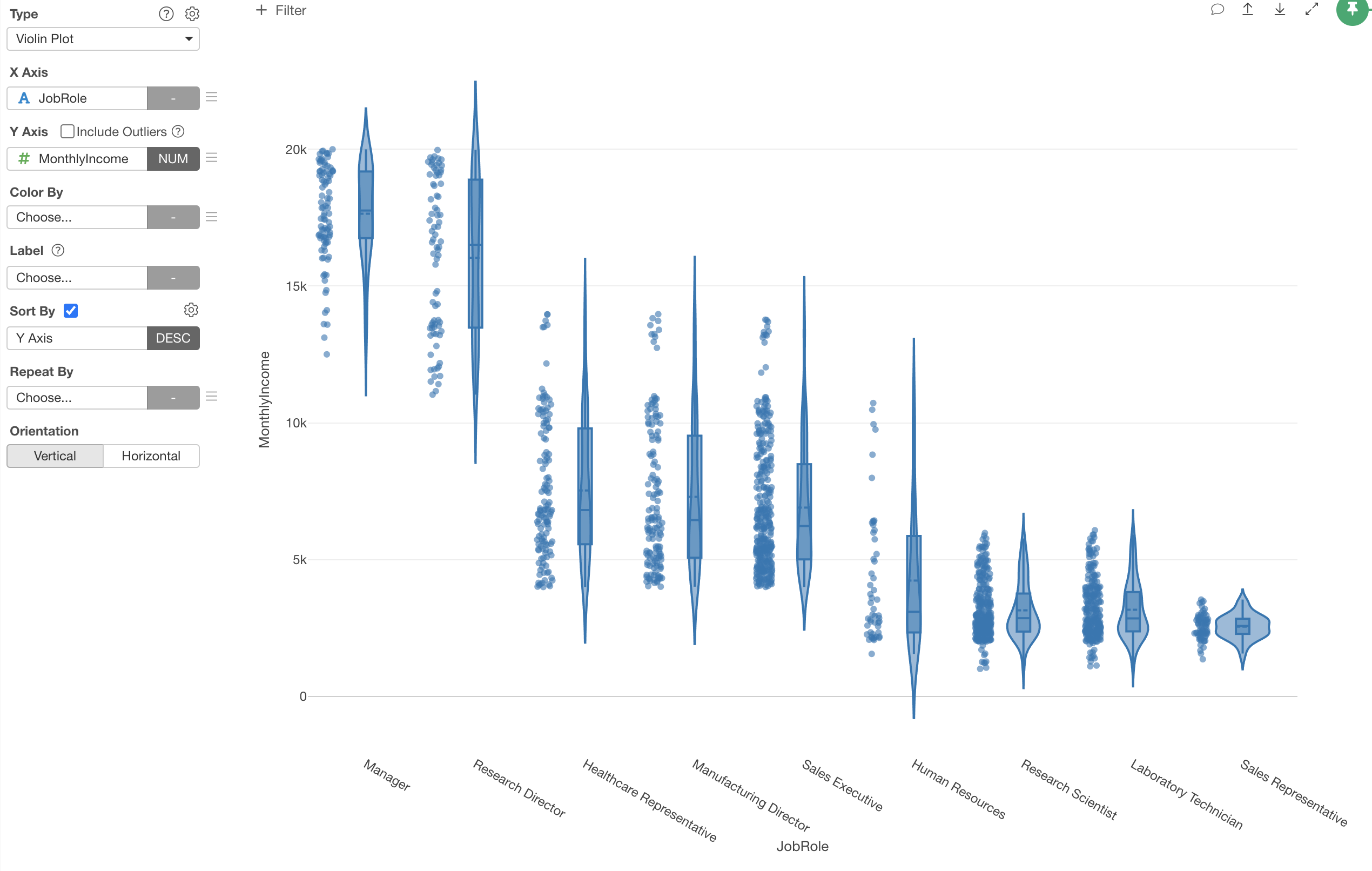
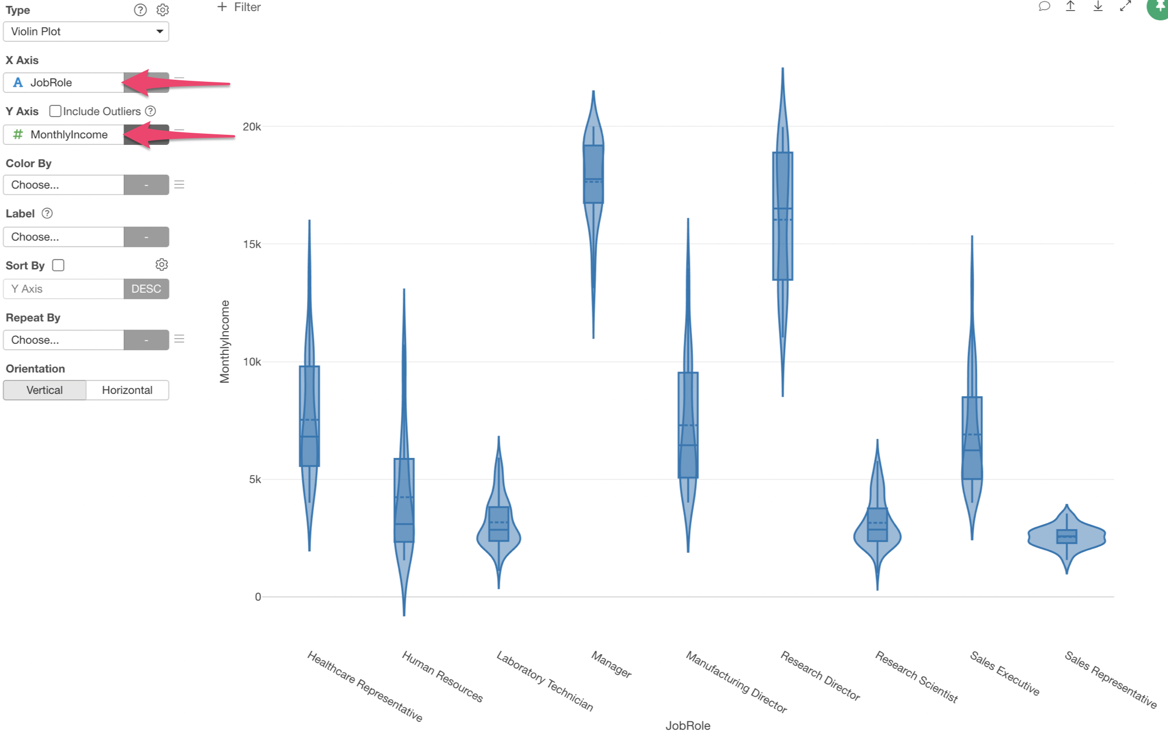
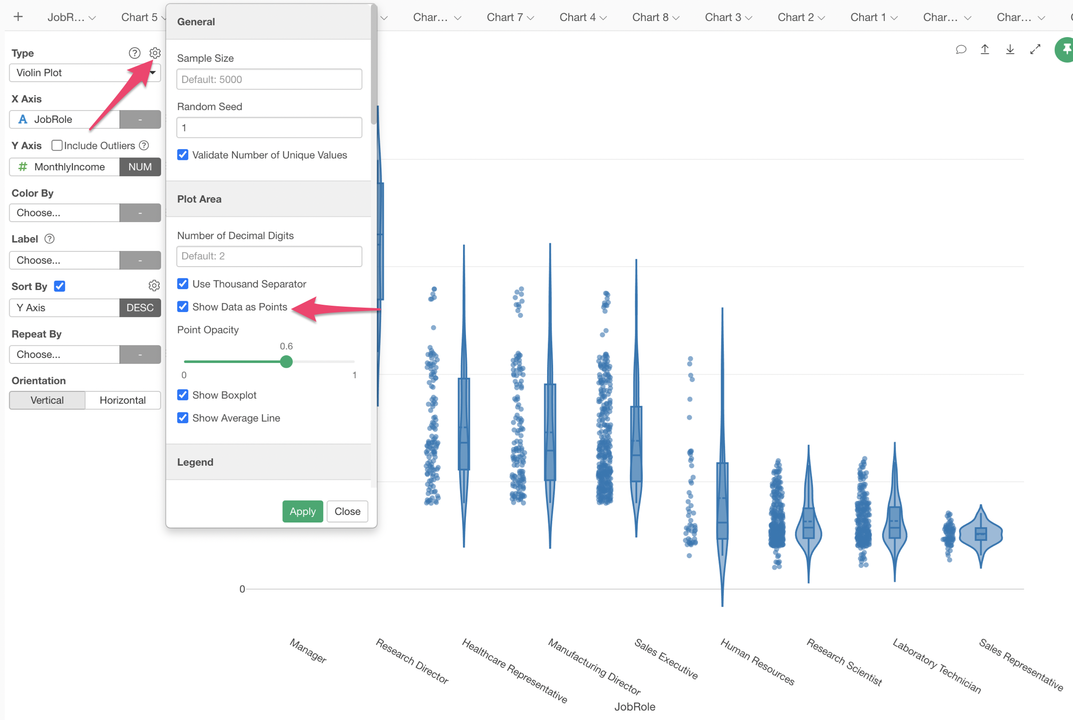
1. Create Violin Chart
Select 'Violin Plot' from the Chart type and assign 'Job Role' column to the X-Axis and 'Monthly Income' column to the Y-Axis.
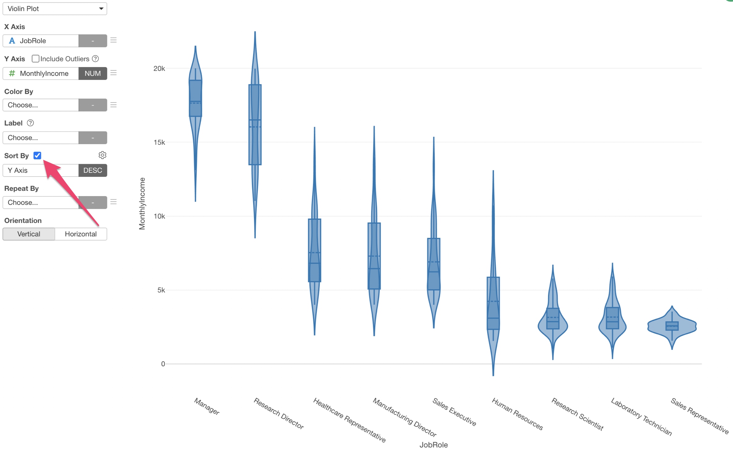
2. Sort the Violins
You can check 'Sort by' to sort the violins from the highest to the lowest based on the median values, which are indicated as the horizontal line inside each of the boxes.
3. Show Points to Visualize Raw Data
You can show each row (employee) as a points on the chart so that you can see how exactly the data is distributed.
Select 'Show Data as Points' from the chart property.
Try it for yourself!
If you want to quickly try it out and you don’t have an Exploratory account yet, sign up from our website for 30 days free trial without a credit card!
If you happen to be a current student or teacher at schools, it’s free! Sign up for Community Plan.
And, if you don’t mind sharing what you create publicly you can sign up for Public edition of Exploratory (FREE)!