Creating Multiple Charts with Repeat By
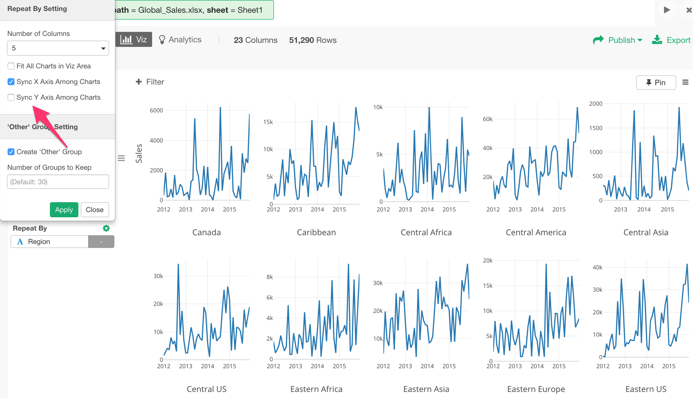
You can use Repeat By to show the chart divided into multile categories and line them up to compare among them.
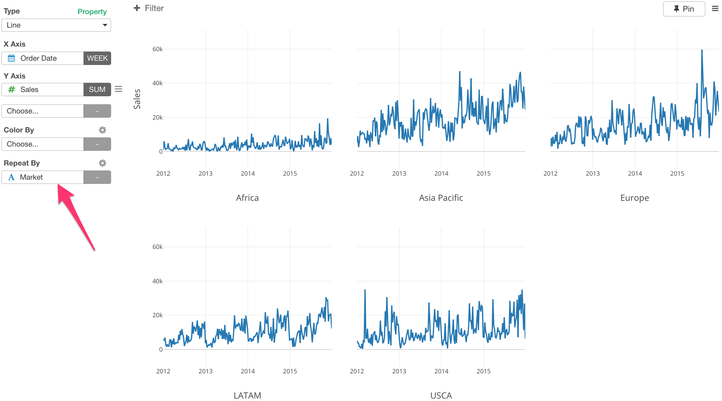
Layout
Sometimes, the charts layout might not be the way you want to see.
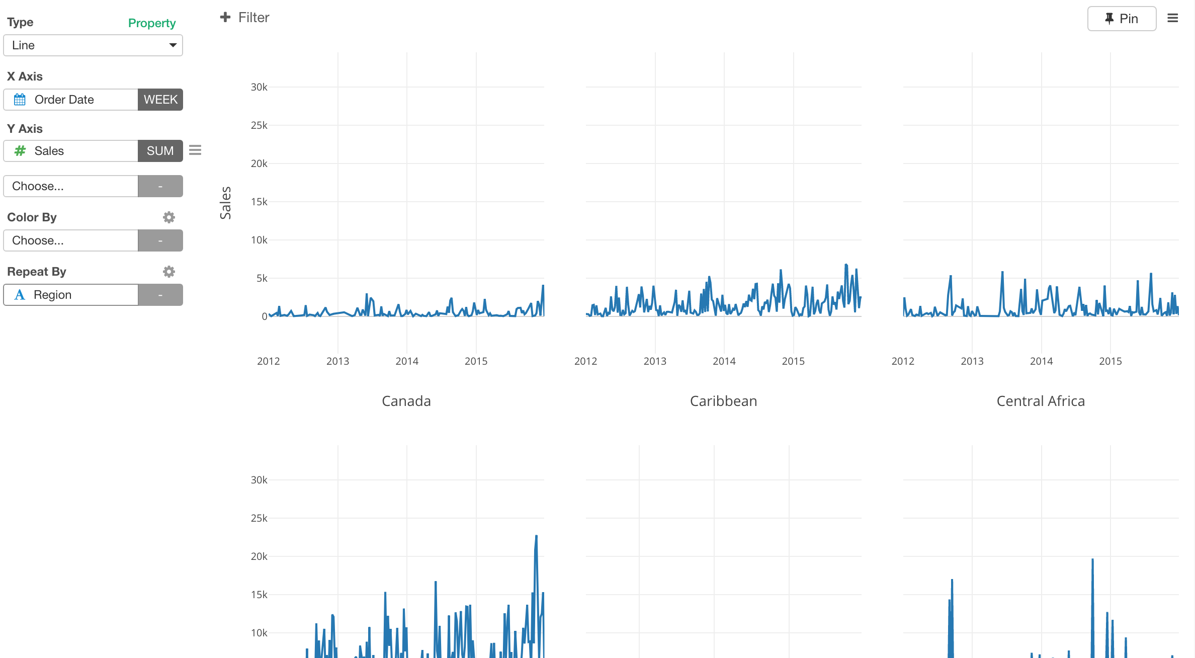
You can adjust the layout.
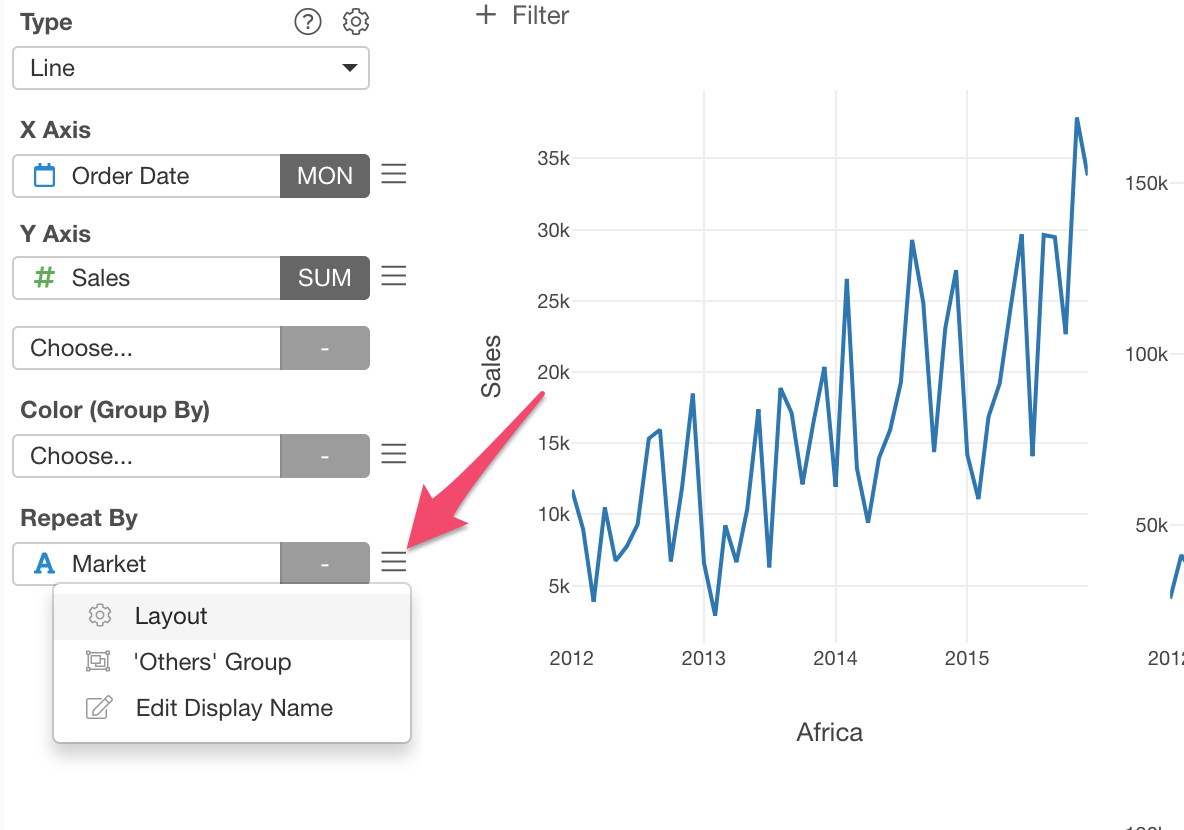
Select ‘Layout’ from the Repeat By menu.
Number of charts per each row
First, you can set how many columns you want to use for the layout. For example, I’m setting it to use 5 columns layout.
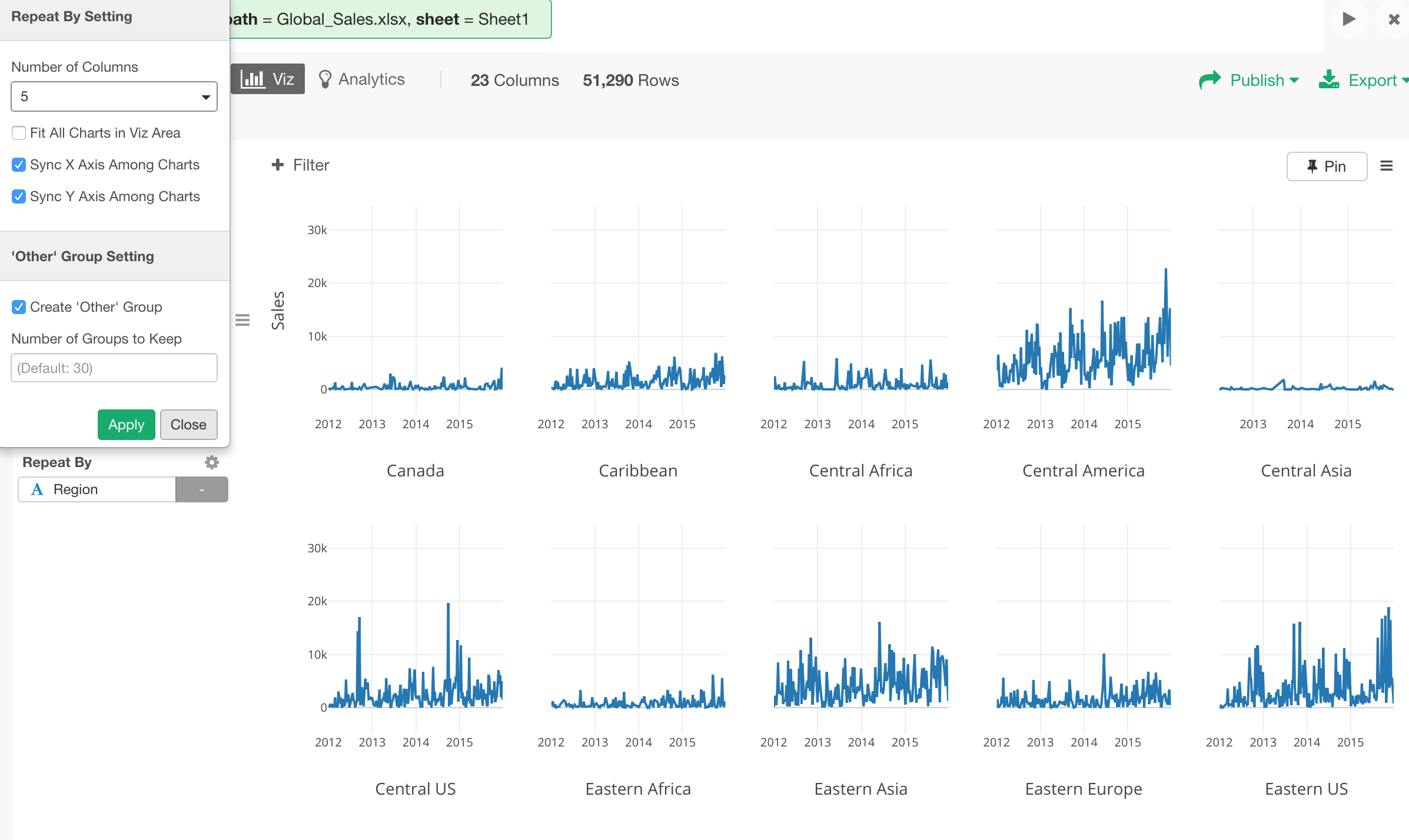
Scale
When you are trying to compare the trend you might not care about the absolute scales. In such cases, you can uncheck ‘Sync Y Axis Among Charts’ to re-adjust each Y Axis scale to match with the data for each chart.
