Introduction to Text Sentiment Analysis
There is a function called ‘word_to_sentiment’ in Exploratory.
It maps a given word to one of the pre-defined sentiment types (positive or negative) or a value depending on how positive or negative the word is.
I wrote a blog post about this as ”Text and Sentiment Analysis with Trump, Clinton, Sanders Twitter data”.
This is useful if we are interested in a simple sentiment analysis focusing only at the word level.
But, there is one problem.
Let’s consider a comment like the one below.
I’m not feeling good. If you break down this sentence into terms (or words) and map them to the pre-defined sentiment types it would look something like this.
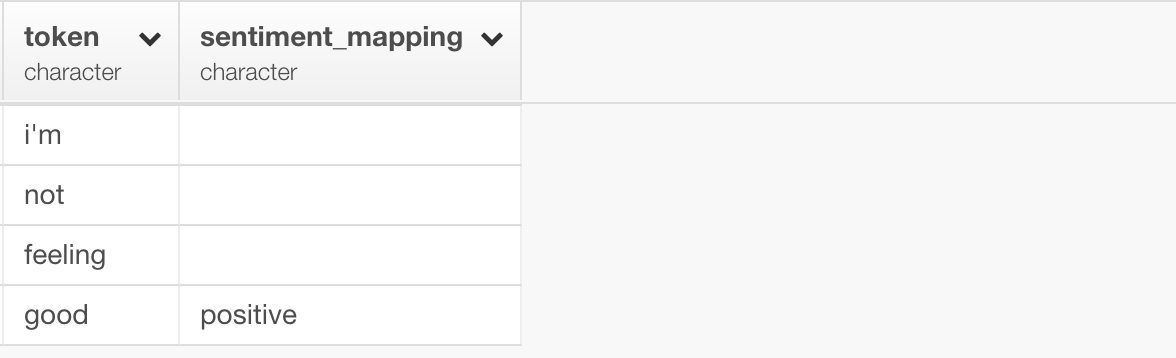
It has the sentiment value only for “good” and that is ‘positive’, therefore this comment would be considered as ‘positive’. But we intuitively know that is not the case.
This is where ‘sentimentr’ package comes in rescue.
There is a function called ‘sentiment’ from this package and it can score the sentiment for a given sentence or multiple sentences.
It goes beyond a simple ‘word-to-sentiment’ dictionary approach and takes into account contextual valence shifters, such as negations and intensifiers.
It produces the results with great quality without sacrificing the performance as long as we are seeing.
We have created a wrapper R function called ‘get_sentiment’ so that it can be used easier in Exploratory.
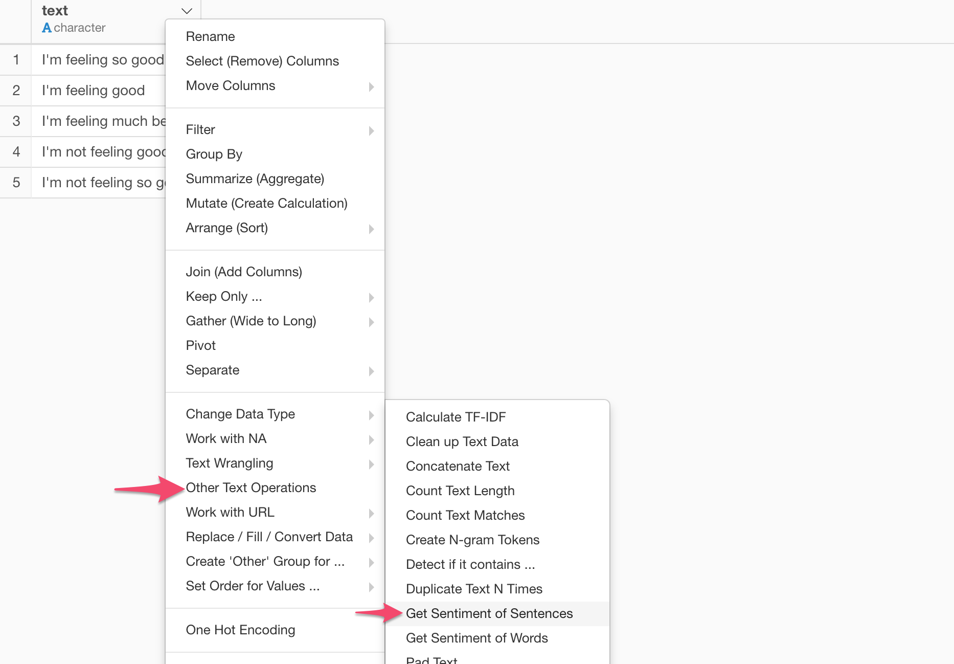
You can access it by selecting ‘Other Text Operation’ and ‘Get Sentiment of Sentences’ from the column header menu.
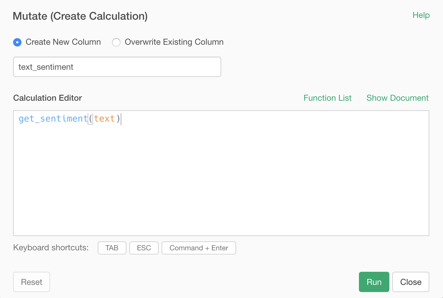
This will pre-populate the function inside the ‘Mutate (Create Calculation)’ dialog.
When you run it, you will get the result like below.
We can see negations and intensifiers in the sentences are influencing the result.
Now, let’s try it out with the real-world data using Exploratory.
To demonstrate, I’m going to use the tweets from the president of the United States, Donald Trump, and the most promising democratic candidate Mike Bloomberg.
Import Tweets for Trump and Bloomberg
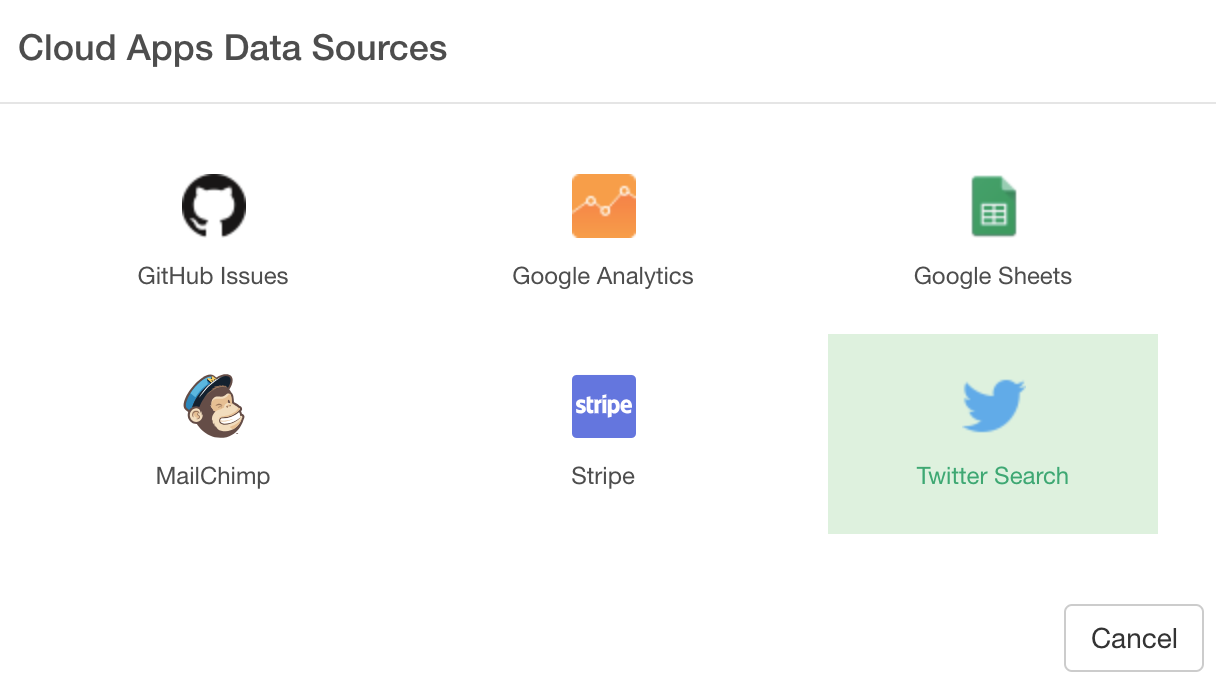
Select ‘Cloud App’ from the Data Frame menu.
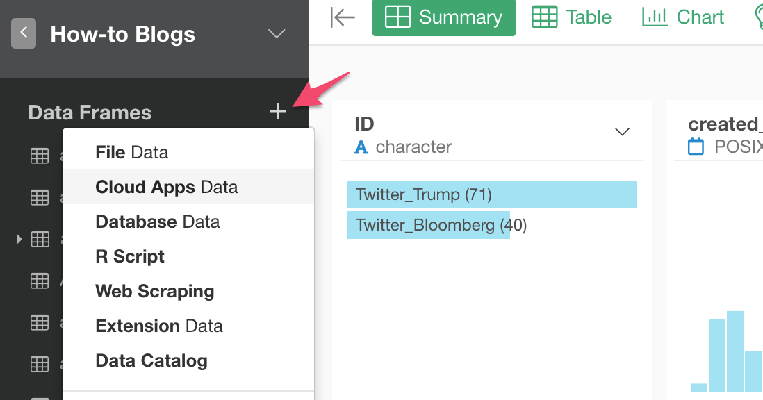
And select ‘Twitter’.
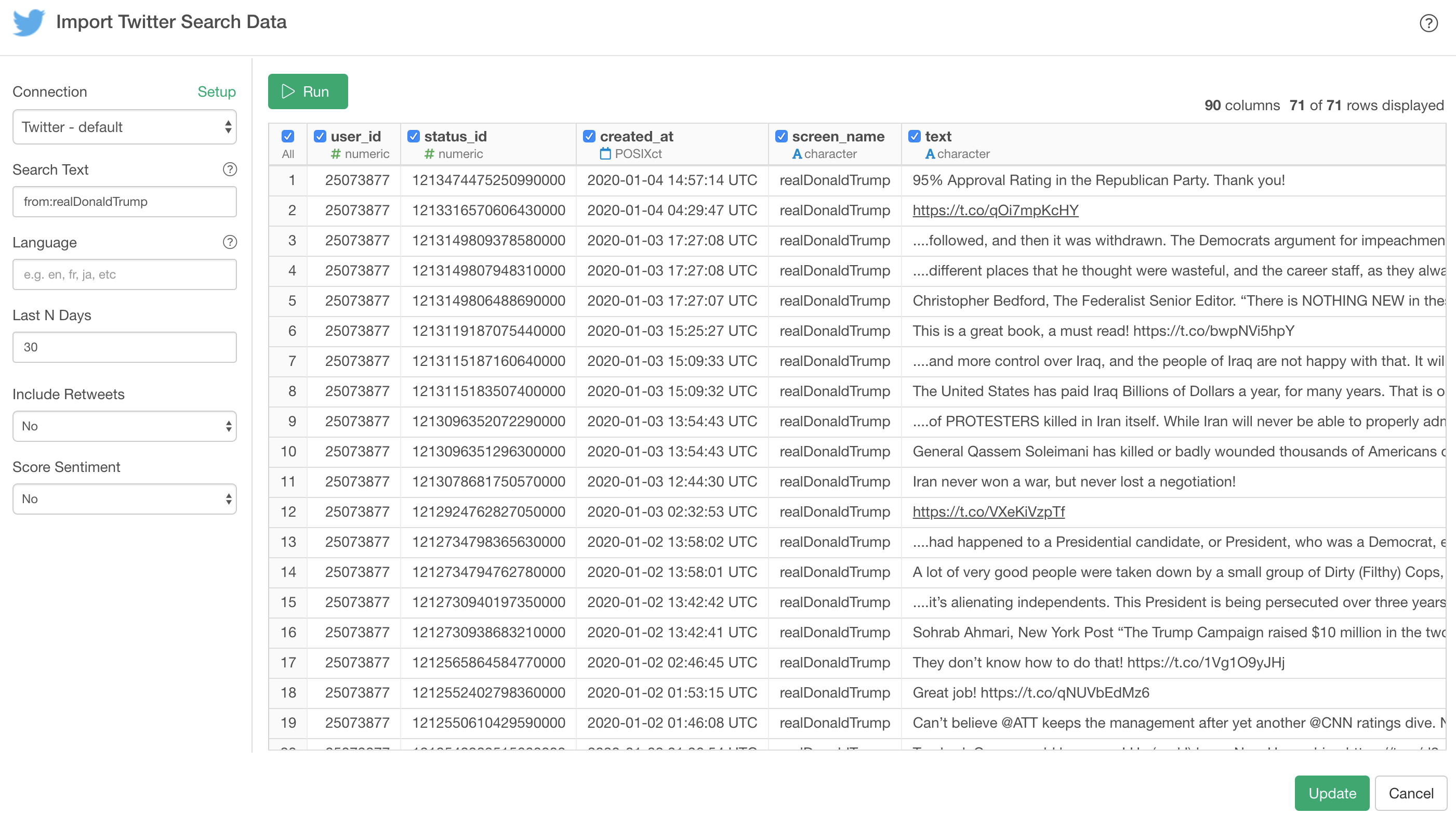
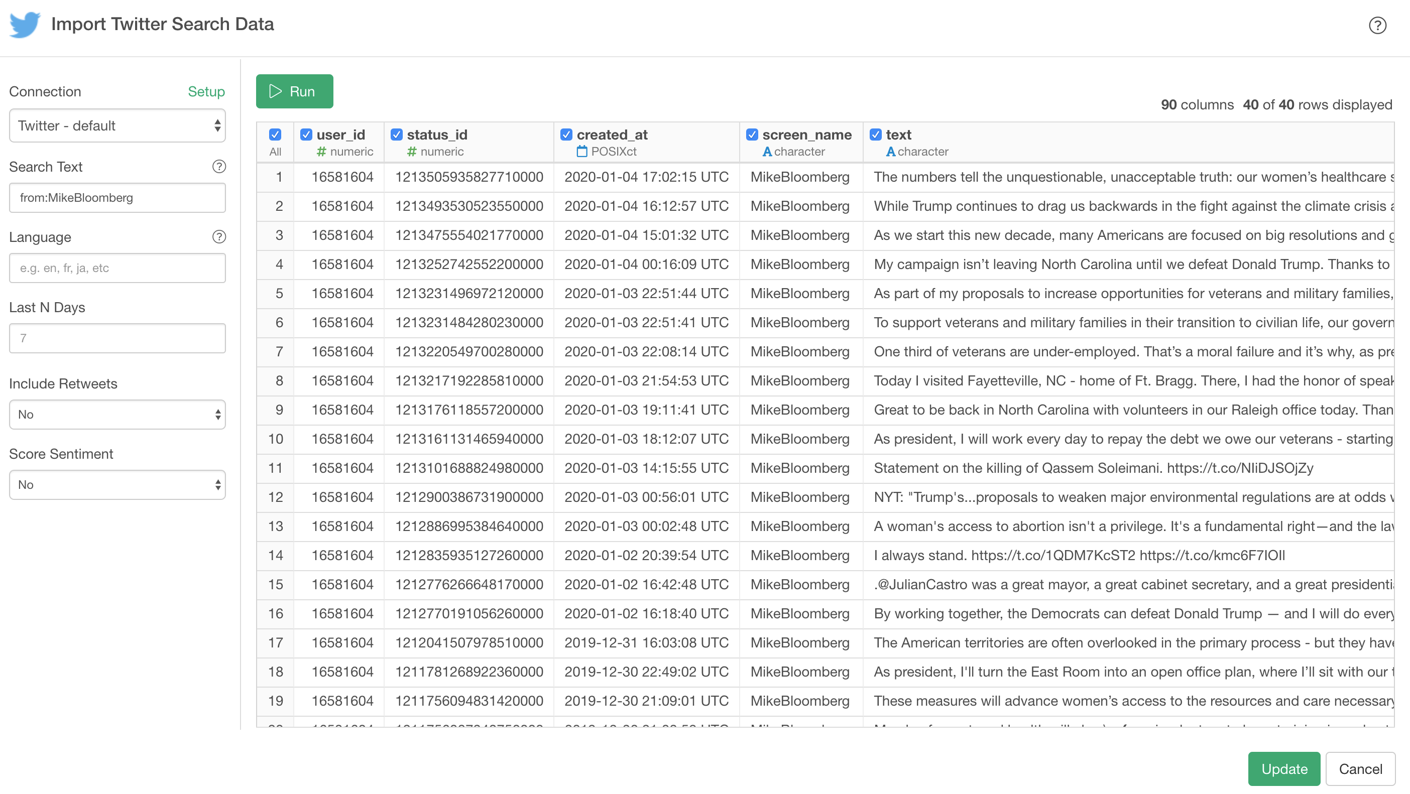
Here, I’m searching the tweets from Trump by typing ‘from:realDonaldTrump’ into the Search Text.
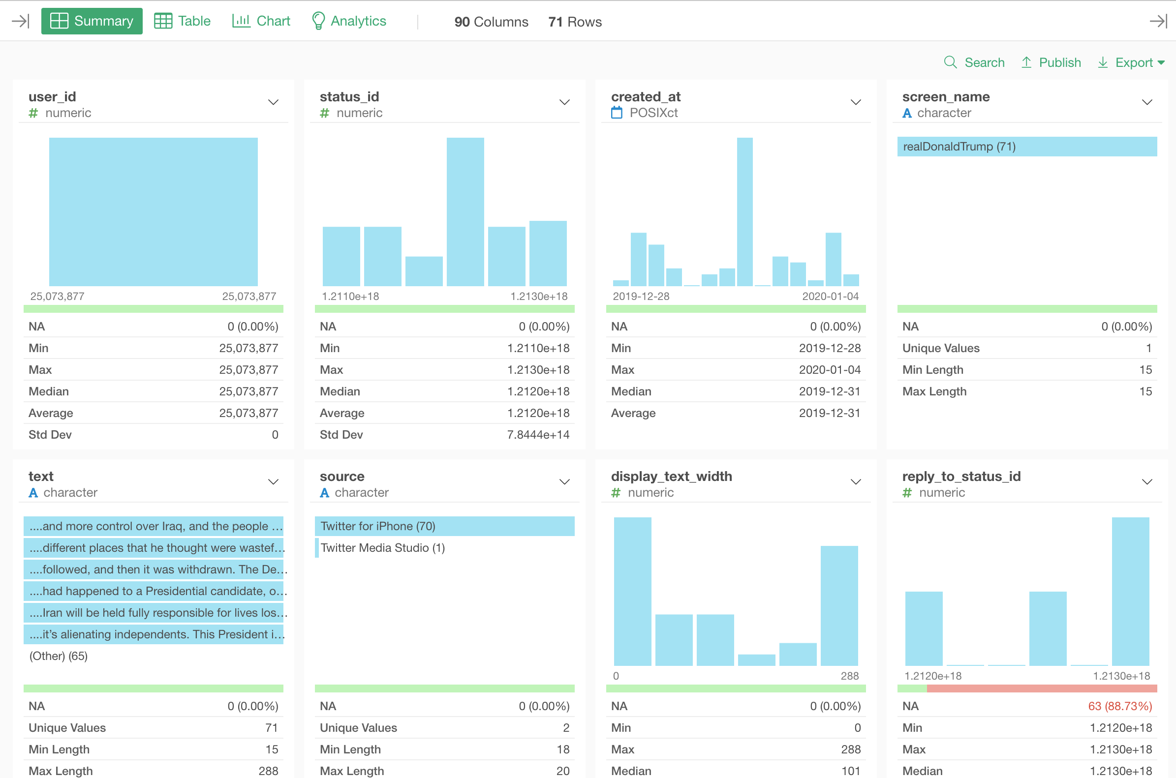
And this is how it looks in Summary view after importing the data.
And I’m going to do the same for Bloomberg by creating a new data frame and setting ‘from:MikeBloomberg’ as Search Text.
Now that we have two data frames, one for Trump’s tweets and one for Bloomberg’s tweets, we can merge the two.
Merge 2 Data Frames
Go back to the Trump data frame.
And select ‘Merge’ from the Step menu.
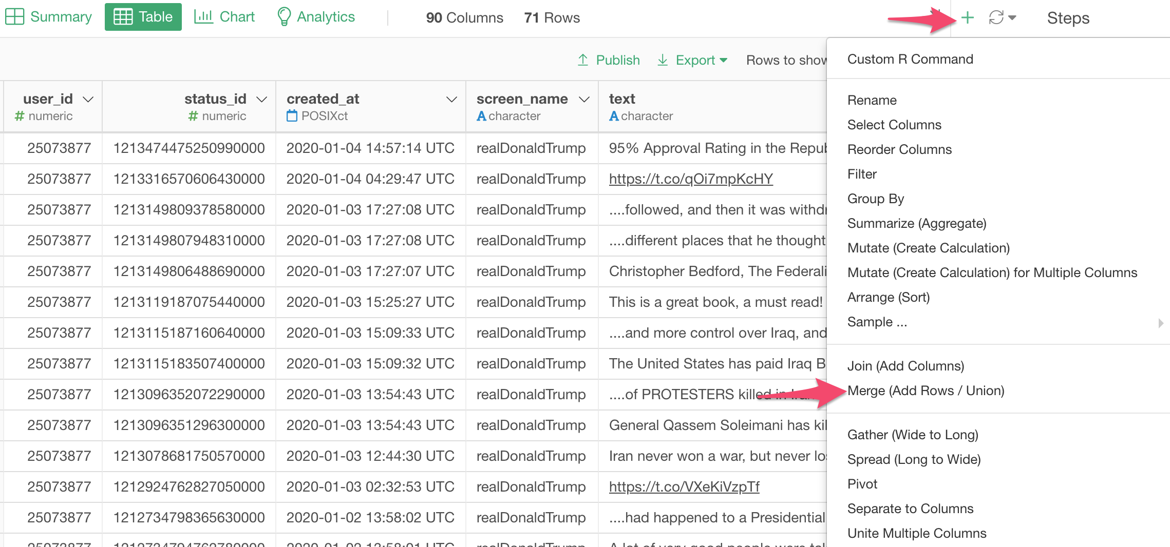
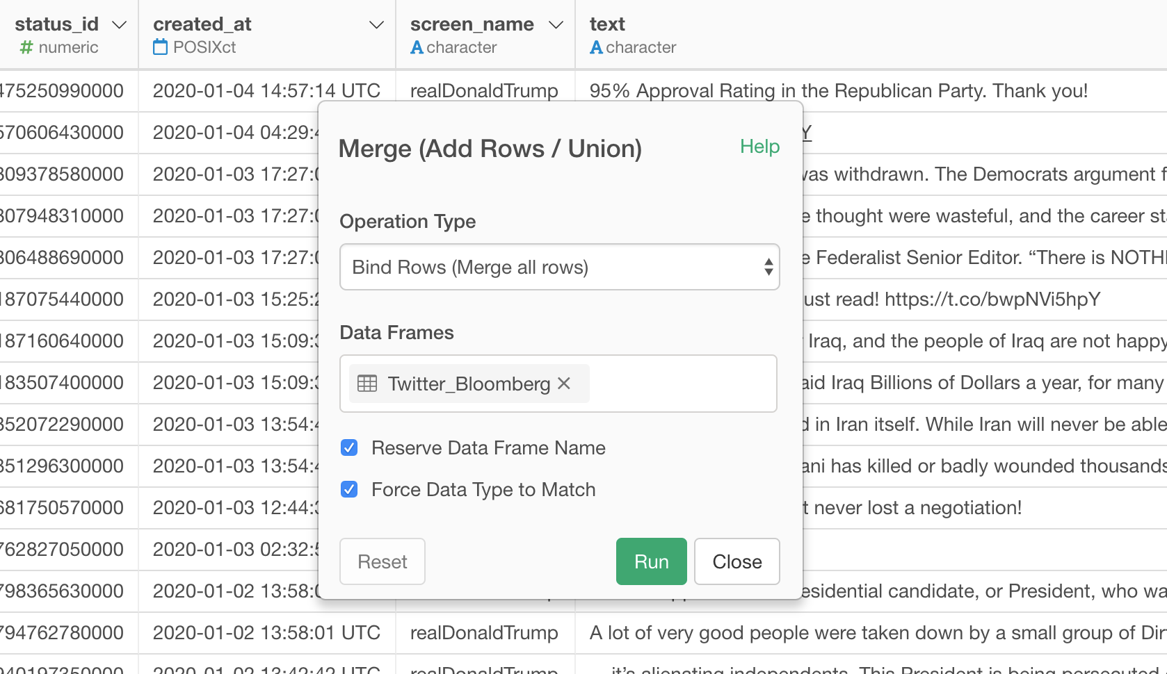
Select the Bloomberg’s tweet data frame and click the Run button.
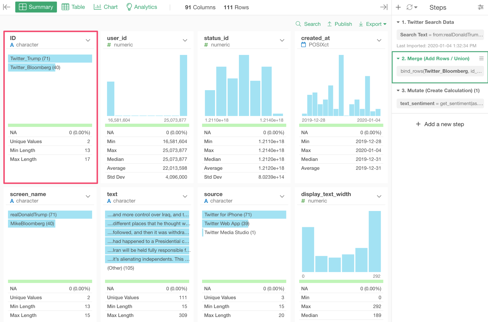
The Bloomberg’s data frame has been added to the Trump’s data frame. We can confirm that by looking at ‘ID’ column, which has the original data frame names.
Score the Sentiments of the Tweets
Now, let’s score the tweets!
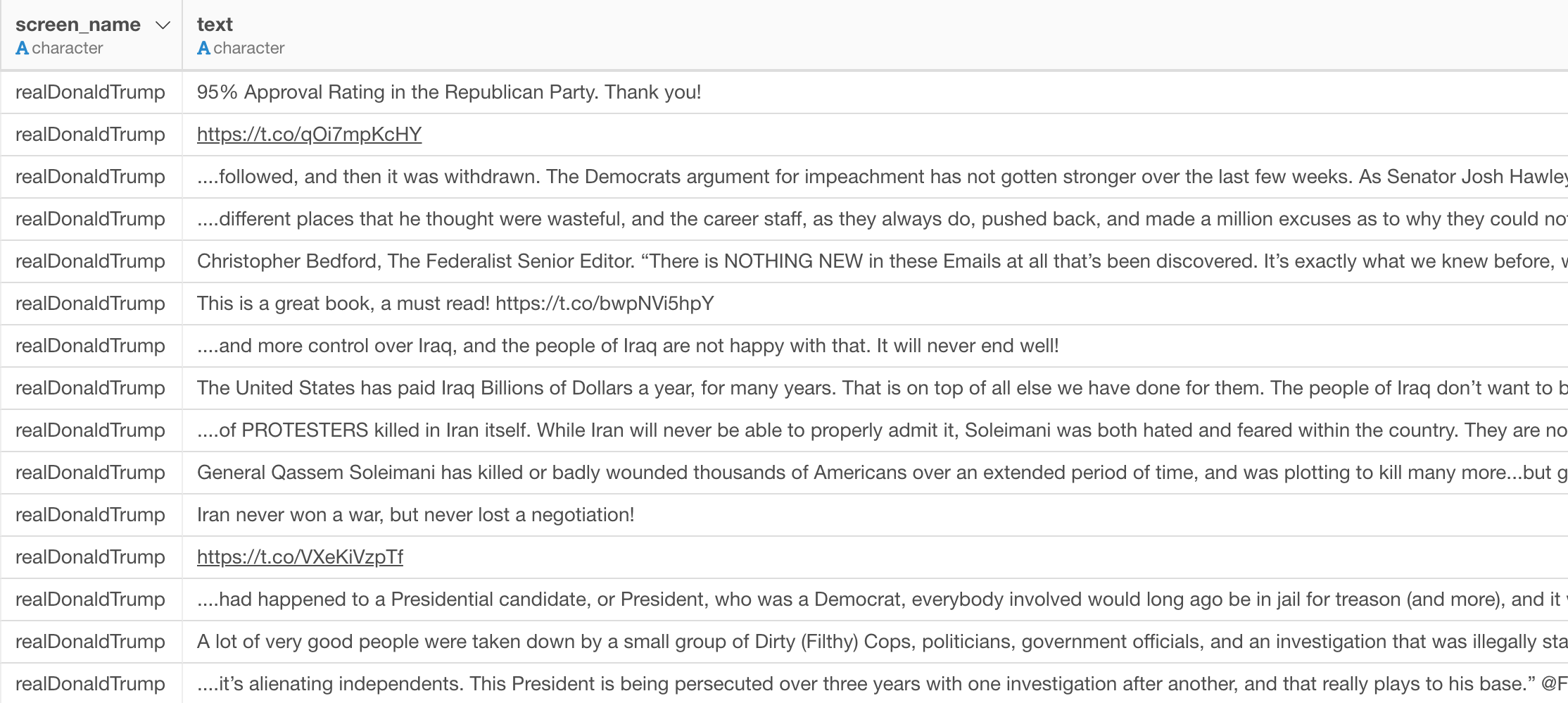
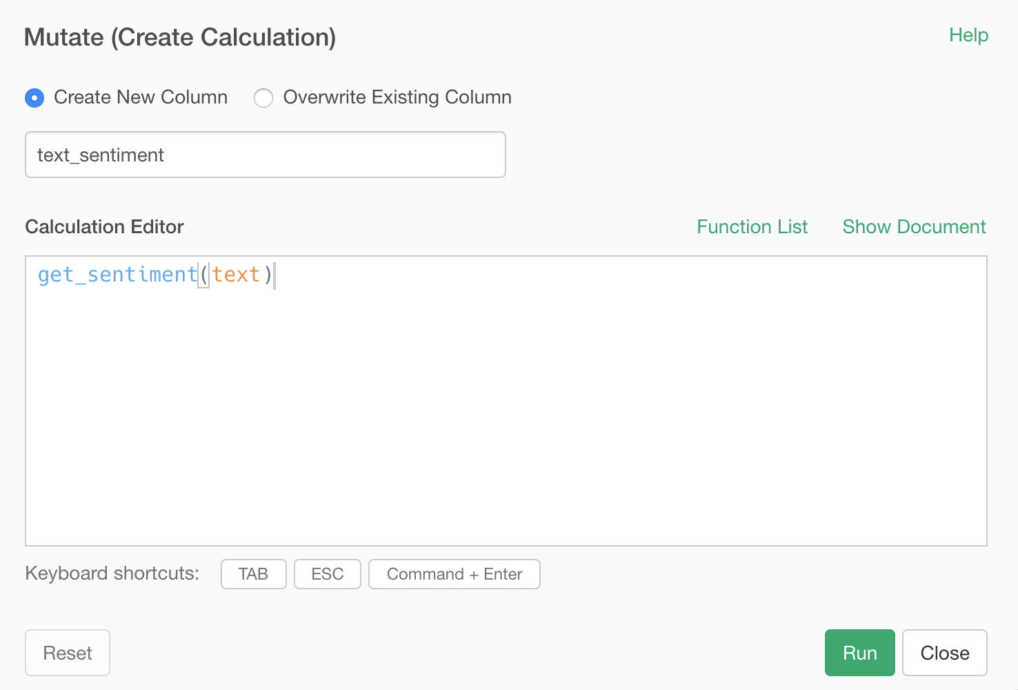
Select ‘Other Text Operations’ and ‘Get Sentiment of Sentences’ from the column header menu of the ‘text’ column.

This will open ‘Mutate (Create Calculation)’ window with ‘get_sentiment’ function pre-populated like the below.
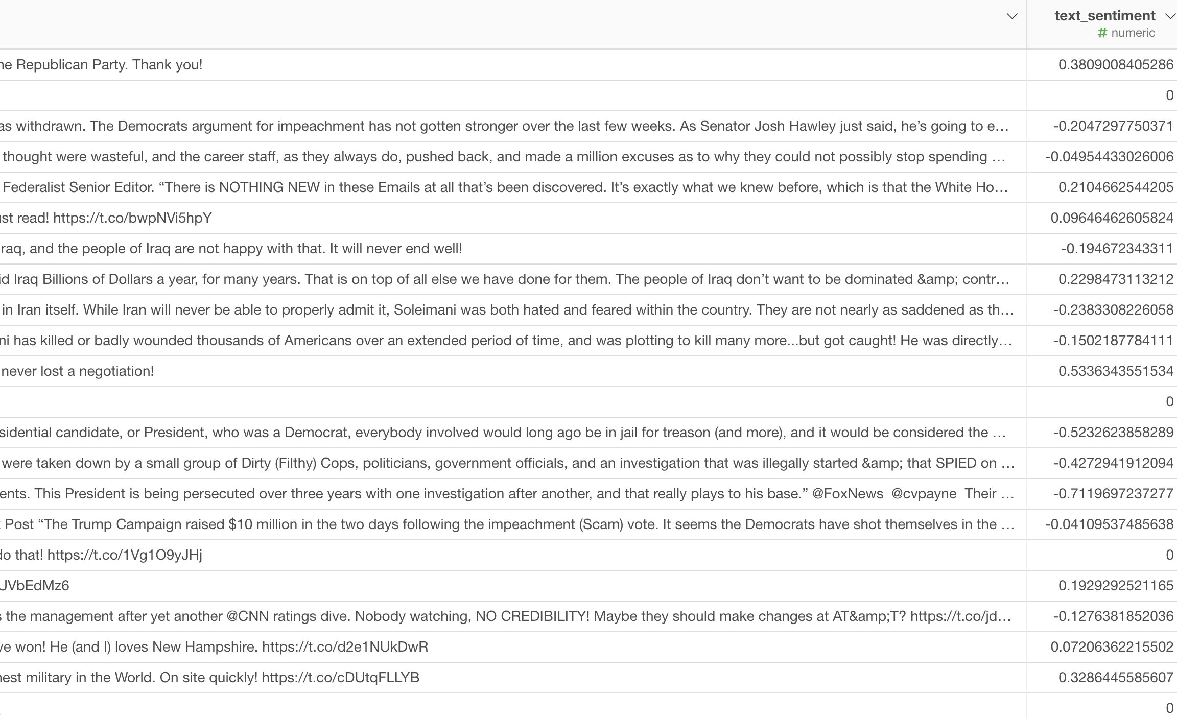
Once you run it, you will have a new column ‘text_sentiment’ that has the sentiment score for each tweet text.
And we can see the distribution of the sentiment score under the Summary view.
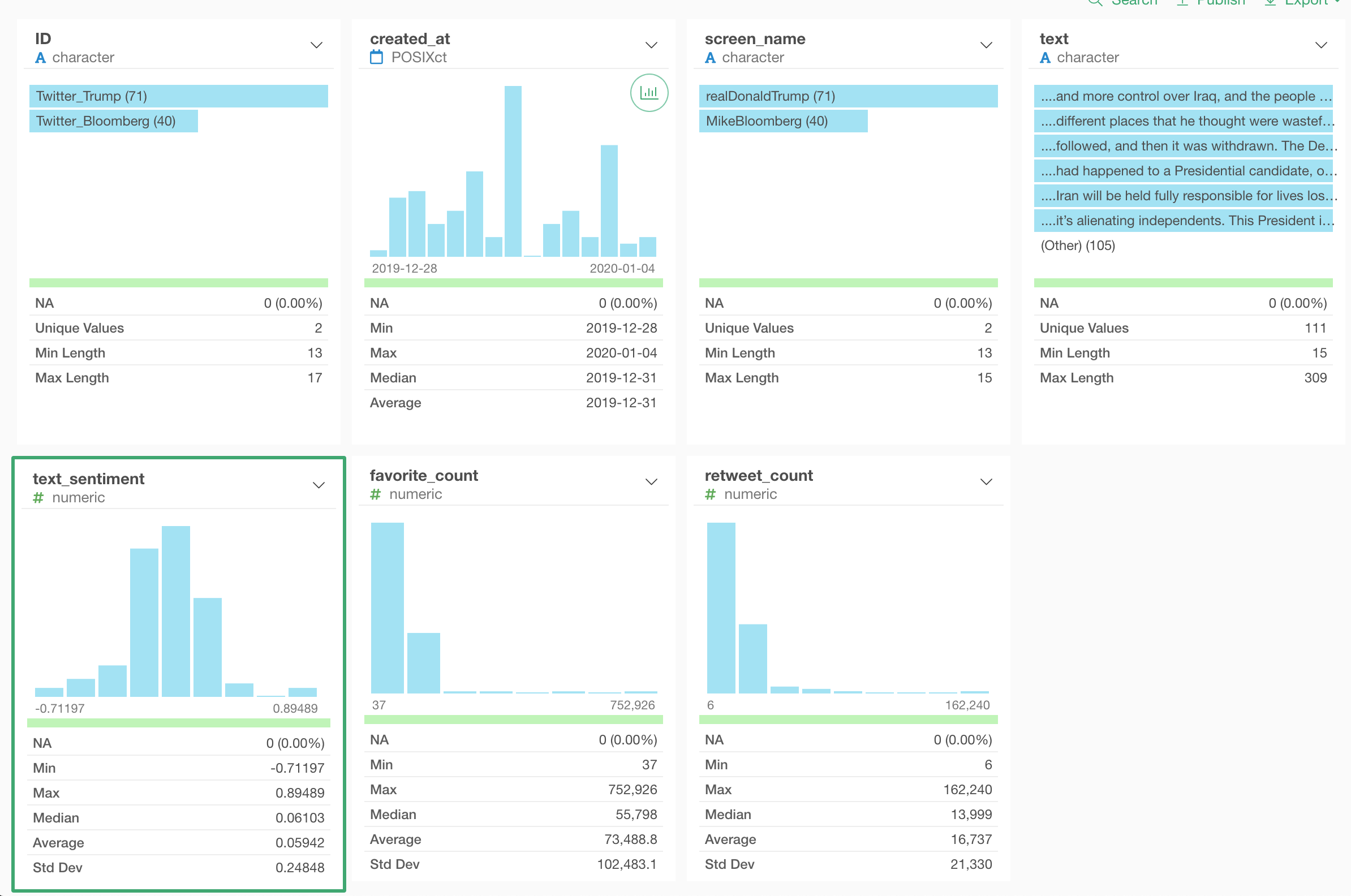
The sentiment scores range between -1 and 1, -1 as the most negative and 1 as the most positive, and 0 is neutral.
Note that the new column would be created at the most right-hand side, but to take the screenshots above I’ve changed the column order so that it will come right after the ‘text’ column.

But this is not necessary for this sentiment analysis.
Visualize the Sentiment Scores
Now that we have the sentiment scores for all the tweets, let’s visualize them.
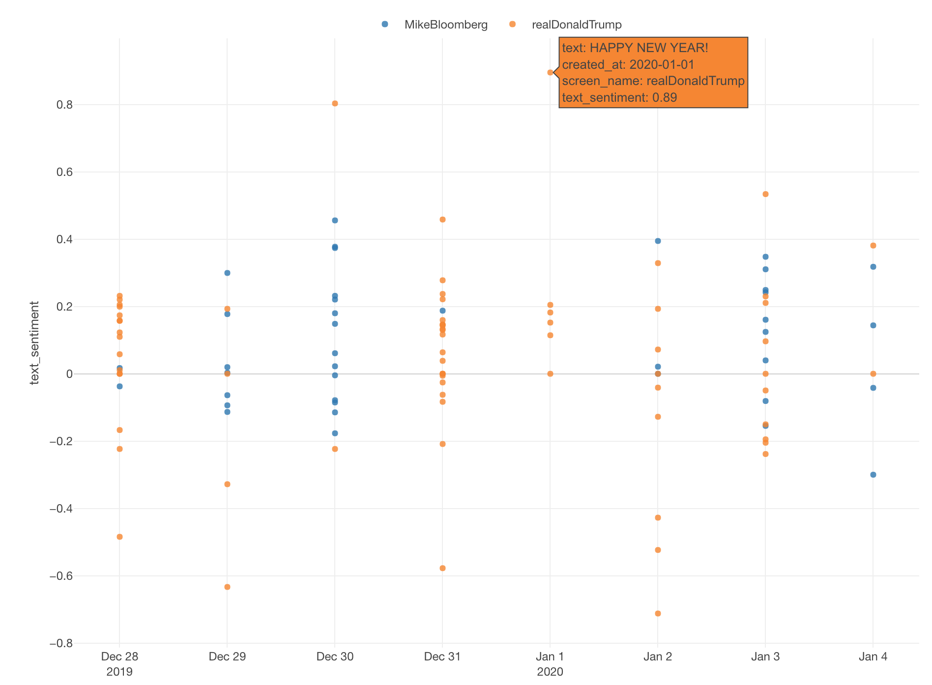
First, I’m using the Boxplot chart, assigning ‘created_at’ column to the X-Axis, the sentiment score to the Y-Axis, and the screen name to the Color.
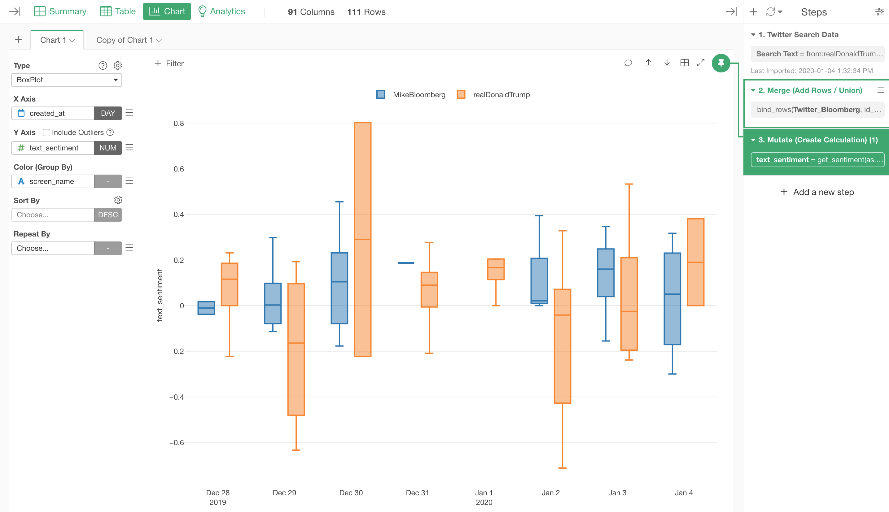
We can see that the variance for the sentiment scores of the Trump tweets is a lot bigger than the one for Bloomberg.
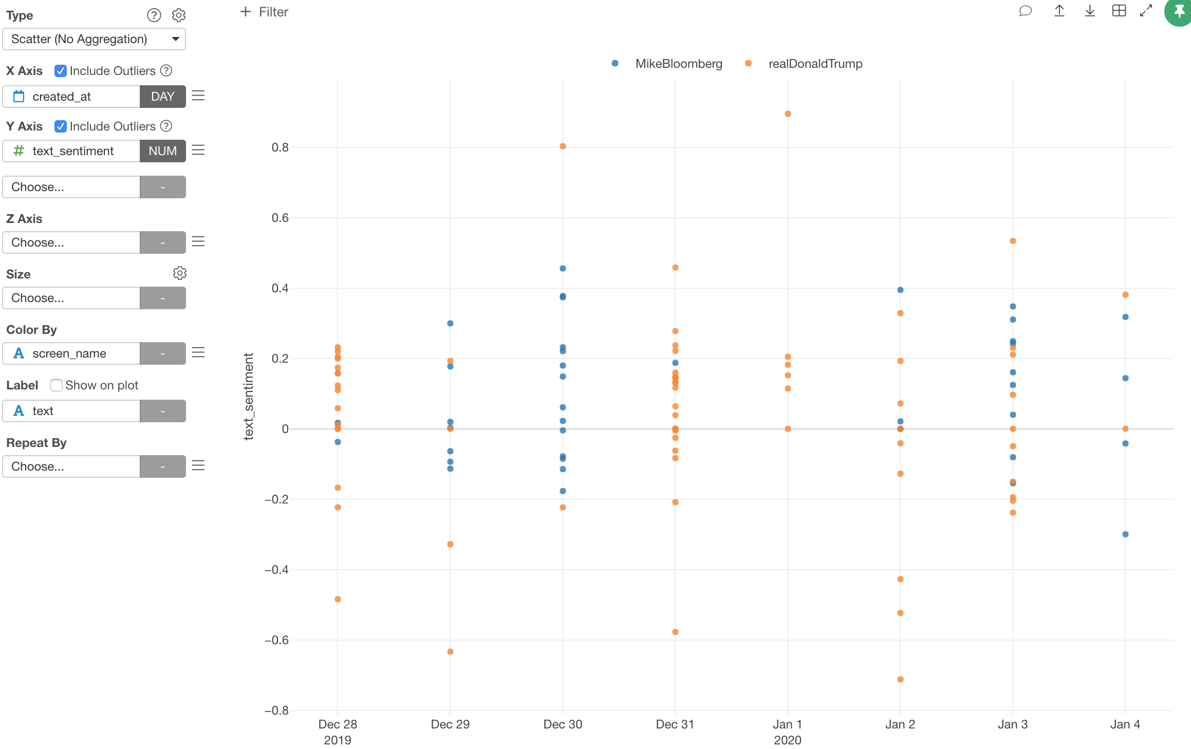
We can also use the Scatter chart to visualize the sentiment scores for all the tweets by assigning ‘created_at’ column to the X-Axis, ‘text_sentiment’ to the Y-Axis, and the ‘screen_name’ column to the Color.
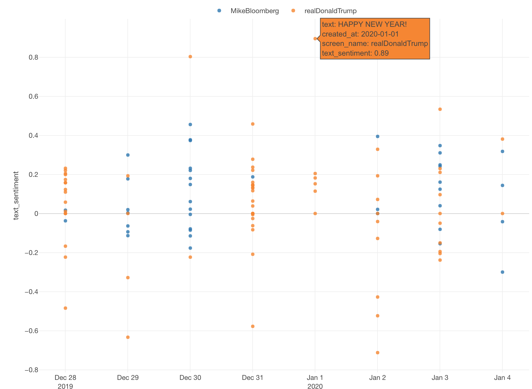
Here is the most positive tweet from Trump.
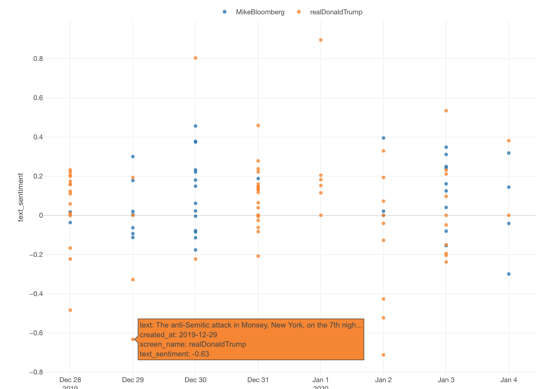
And, here is one of the most negative tweets from Trump.
Try it yourself!
If you are interested in trying this out with Exploratory you can sign up for a 30-days free trial from our home page!